Daily UI #010 (Social Share)

Day 10 of #100daysofUI is very relevant, as I coincidentally had to describe what a “share” icon looks like to someone today! Check out below why I had such a hard time doing so 😭
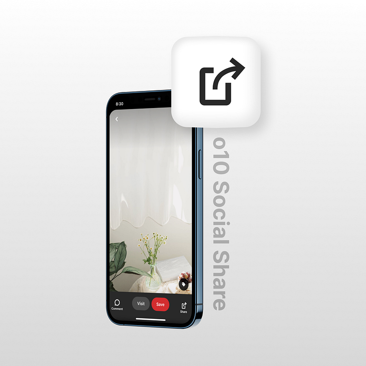
Day 10: Social Share
Key Learnings:
There is no universal standardized share icon - from Apple to Android, and even across social media platforms, it varies widely. In addition, the icons for uploading and downloading can also look very similar to the share icon, adding to the overall confusion!
💡 When possible, try to include labels to accompany icons to prevent user confusion!!!
As always, I’m open to any feedback for improvement! (: