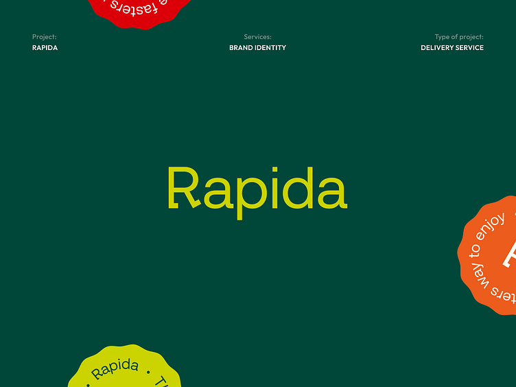
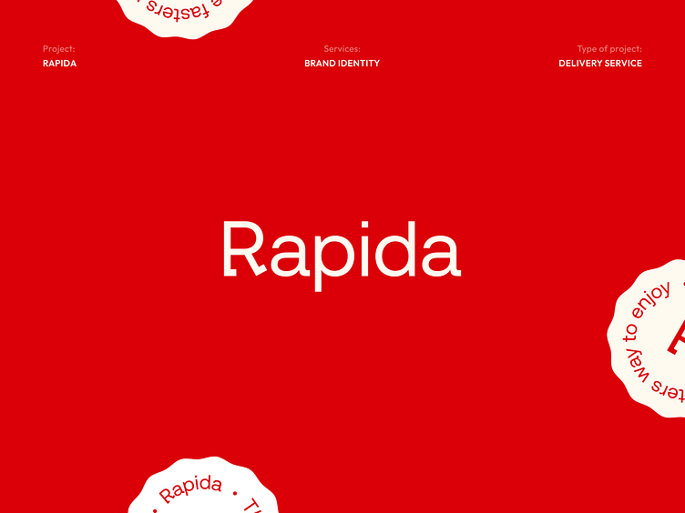
Rapida - Branding for delivery service


Hi, guys!👋
We are super excited to show you our latest branding project!
Rapida is a modern delivery service that uses advanced technology to provide affortable and reliable delivery services. They offer a personalized approach to each order, with a range of delivery options to suit customer needs.
We create a lot of stuff to make this brand bold, visible, and consistent!

Logo idea and execution
The idea of the logo is to show the accessibility of delivery for everyone and to emphasize the main advantages and philosophy of the company. The main visual image is a grapheme – the walking letter R. This metaphor embodies accessibility and openliness.
Primary brand assets
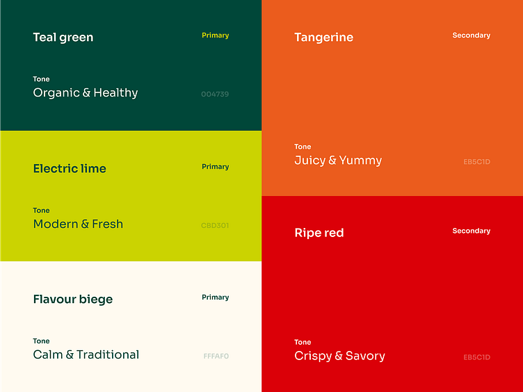
Colors
The main idea of the colors is to bring joy and pleasure to the customers by using the delivery service. To reinforce this effect, we created a palette that reflects a feeling of balance between modern and traditional, passionate and original.
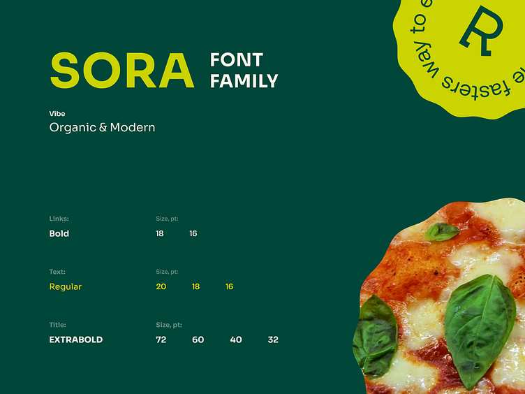
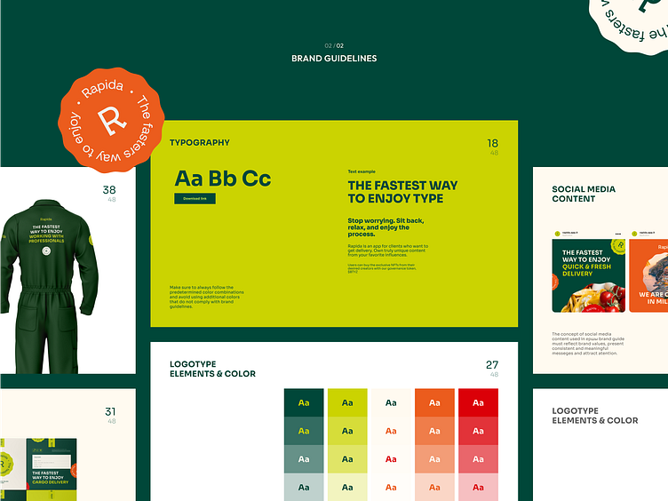
Typography
Our choice of typeface was based on affordable solutions and simple, clean grotesque fonts. This allowed the brand to communicate in the right tone and convey key meanings such as freshness, organicity, as well as modernity and accessibility.
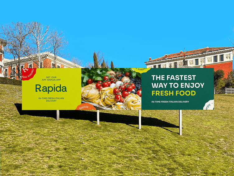
Communication
We made slogan of the brand as a main element of the communication by adding the different content parts depending on the advantage of our delivery that we want to highlight. In this way, the brand assets has become a powerful, convenient and effective communication tool.
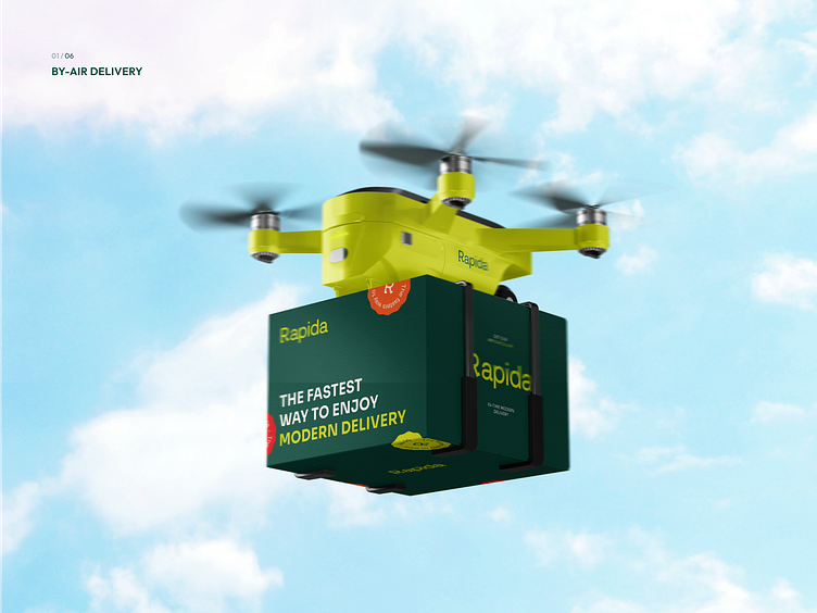
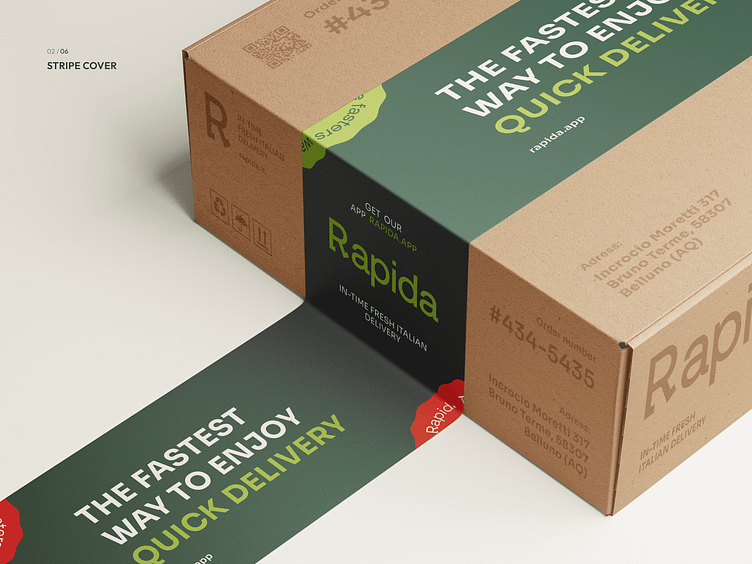
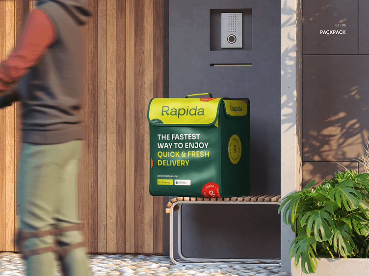
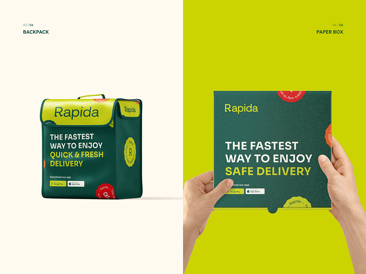
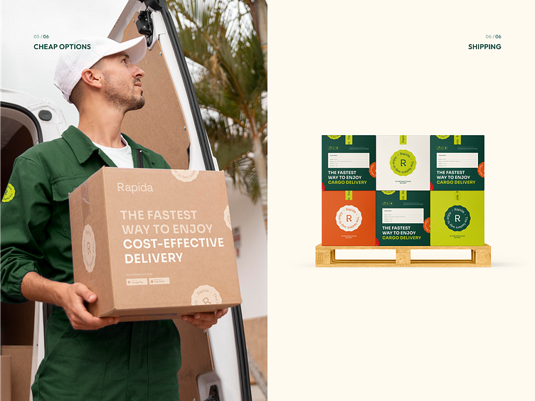
Delivery package
Considering that the packaging is the main attribute of the delivery service, we decided to turn it into a marketing tool that would allow us to communicate with the target audience and make them feel our values. We offered a wide range of packaging and delivery options.
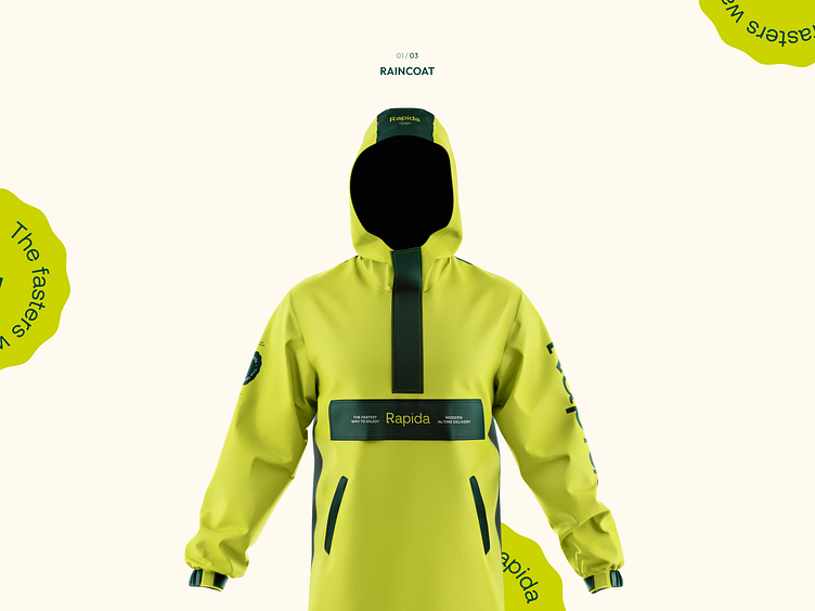
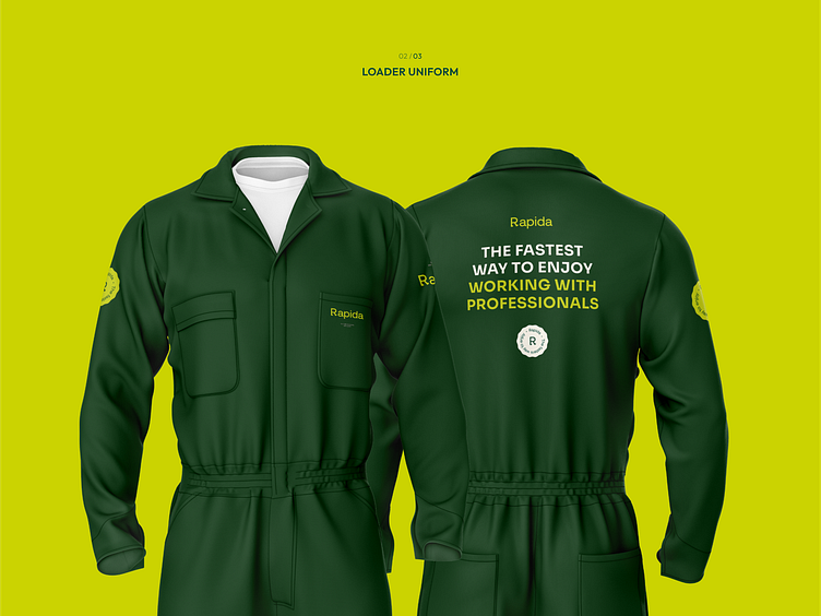
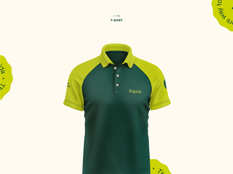
Outfit
We take care of our employees, so we have provided a lot of options for uniforms for different types of weather conditions.We provided a communicative model into a uniform to create a crew spirit in the team and make it more coherent, because the loader is a team work.
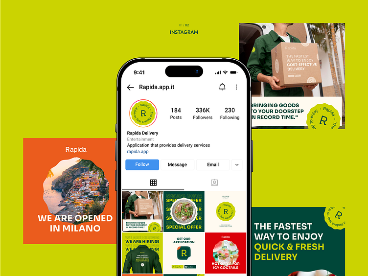
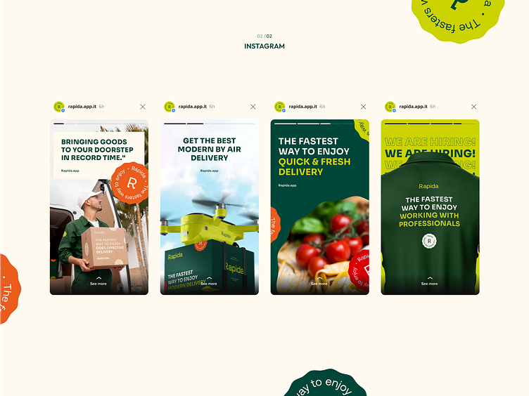
It is difficult for now to imagine effective digital branding without social media. We developed a consistent brand language, that made the brand recognizable and improved the memorability of the brand style.
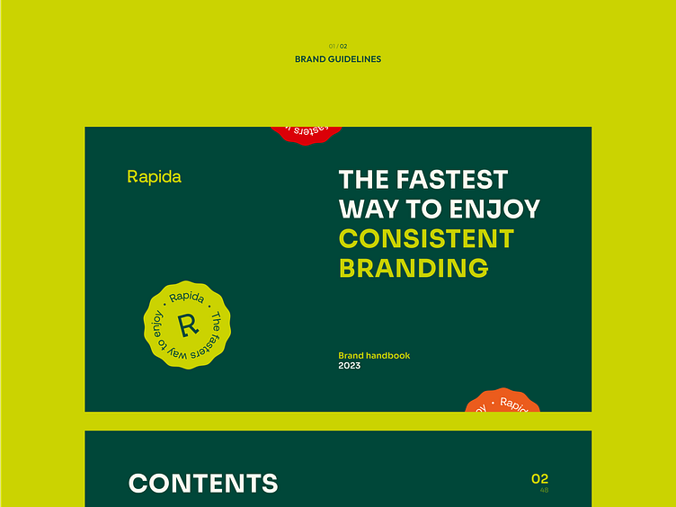
Definitive guide
To ensure that the brand identity will be used correctly, we created extended brand guidelines that clarify the appropriate usage of the logo, color palette, typography, and other graphic elements, and collected them in a complete folder of all brand assets for easy access.
Visit our website to see more!
📮Want to say hi?
Drop us a few lines at hello@phenomenon-studio.com
Stay tuned for our updates at