Wecab (Client's Work)

Wecab is a new taxi service that aims to be fairer and more reliable than its competitors like Uber and Lyft.
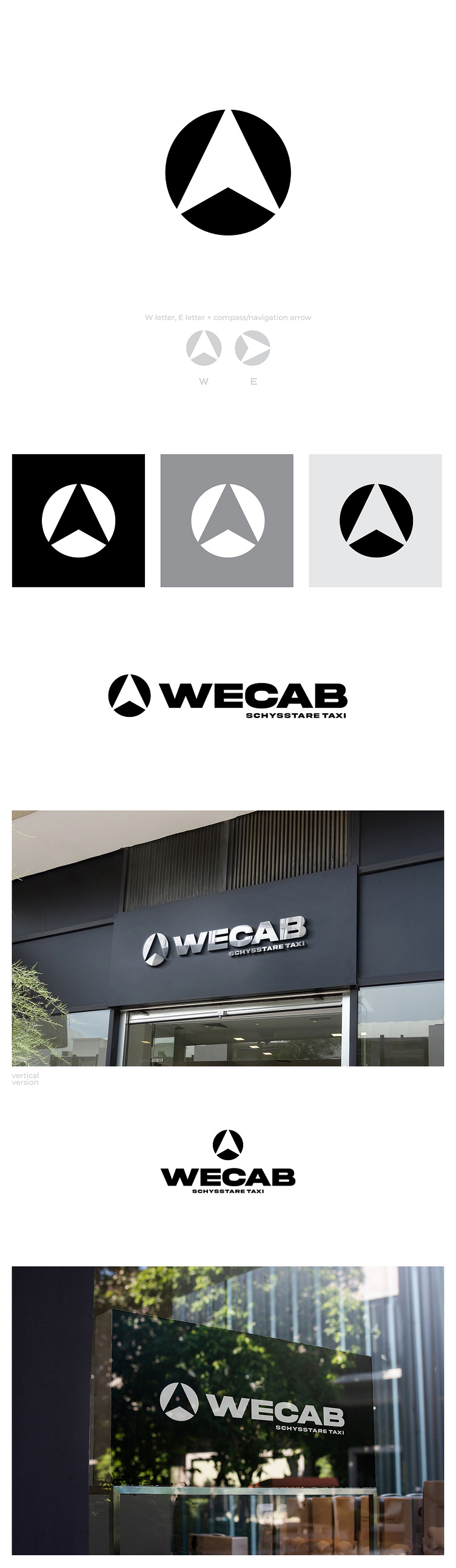
Since the company owners' initials are W and E, and they wanted some reference to a compass, I chose to edit the compass arrow in the negative space to look like the letter W. Rotating the compass arrow to the right, we get the second initial, the letter E.
You can also buy some of my pre-made logos: