


Data map

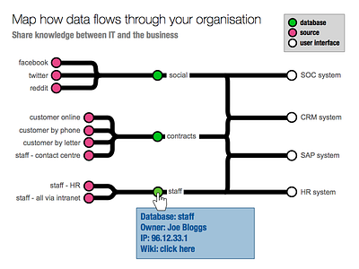
Mock up of how my tubemap webpage project could show data flowing through an organisation. In this example, nine (pink) data sources supply three (green) databases, which in turn power four (white) frontends/user interfaces. Staff can share this arcane data far more easily in a diagram. Techie terms can be stored in the diagram too.