Shuddle: One Design System, Endless Potential

Problem
IPTS: the Interplanetary Travel Syndicate, a bustling transportation network that shuttles people from world to world within our galaxy, has been launched without a digital presence.
My Role
Head of Digital for the newly launched IPTS: the Interplanetary Travel Syndicate, a bustling transportation network that shuttles people from world to world within our galaxy.
Solution
We will launch with three unique offerings:
ipts.org - an informational website with the latest news and happenings
IPTS Travel - a website to browse and book travel within our galaxy.
IPTS Rail is a real-time web app: lines, routes, and times for all commuter lines.
I have decided to make a design system to facilitate the creation and any maintenance or prospective rework.
It also makes sense to chronicle the journey for handoff and knowledge transfer. This includes notes and observations, such as Figma Cards and this Case Study.
Bringing in the UX-perts
I brought in my internal UX team to conduct interviews and perform the necessary research, competitive analysis, mood boarding, user flow work, and A/B testing to ensure we nail down the information architecture side.
At the same time, I double down on the design system, component library, and branding. That being said, we will work closely together.
UX Outcome The research was performed on an eclectic range of user groups and demographics. Group size ranged from a minimum of 10, and 132 groups were interviewed across all seven continents. Interviews took place within a one-month period.
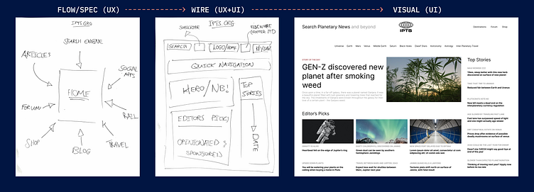
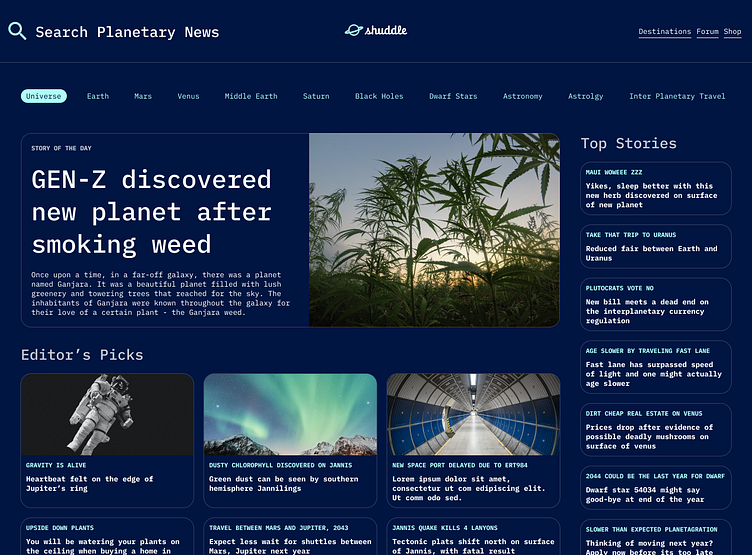
IPTS.ORG
Pain Point 1: 80% of candidates did not know of the IPTS
Pain Point 2: All candidates that marked “Interested in keeping up with news and happenings” with IPTS consumed information through direct competitor’s blogs & websites.
Pain Point 3: There is no dedicated source covering IPTS
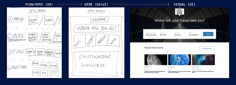
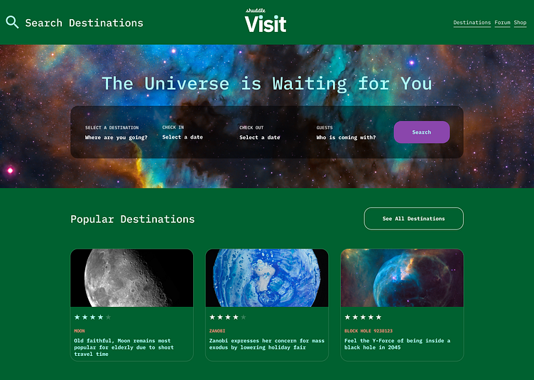
IPTS Travel
Pain Point 1: With too many booking sites, candidates found it hard to find the best value
Pain Point 2: Most travel services only serve single distinctions
Pain Point 3: No way to compare offerings
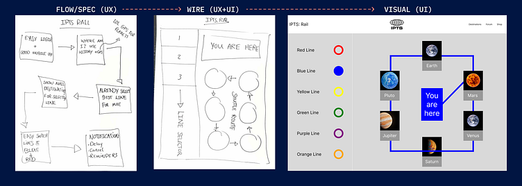
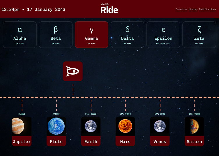
IPTS Rail
Pain Point 1: Every interplanetary traveler with more than three trips has missed a shuttle
Pain Point 2: No way to get cancellation and delay updates
Pain Point 3: Extensive research is required to identify the most efficient route for daily commuting
A collaboration
With usability, readability, accessibility, and hierarchy in mind, I collaborated with the UX team. The 3 sites were formed to satisfy the user's needs and pain points and get us as close to our inspirations sites, respectively.
IPTS.org
IPTS Travel
IPTS Ride
Design System
More than the products, the real value is in a design system that saves time and money by codifying decisions for replication, reference, and scalability. Over time the system will facilitate continuous improvement to the overall customer experience by ensuring consistency, familiarity, and accessibility at every interaction. It is made up of many parts.
Components
At every significant checkpoint and working session, our progress was analyzed for obvious similarities and intentions amongst elements. I have identified common UI elements that can be shared across our product range and interfaces.
Here, a visual inventory of all the design elements, grouping, and ranking in order of frequency was helpful.
Componentization was considered for the most common elements. This approach allowed me to establish a consistent set of design patterns that could be reused across multiple projects, improving efficiency and consistency.
Component Reference Site - ZeroHeight
Another envisioned benefit is facilitating the collaboration between designers and developers. I decided to invest further in a reference site with dos and don'ts, a version log to document and communicate changes to the development team, and a case study example usage.
Variants
I quickly found the need for components that are similar to each other, with only slight differences. Variants allow you to group and organize similar components into a single container. This simplifies your component library and makes it easier for everyone to find what they need. Example of components with variants:
Boolean Properties
Boolean properties set true/false values. This allowed me to toggle the visibility of an attribute on or off.
For example, I used a boolean property instead of creating a variant for Header with and without a search icon. This significantly reduced the size and effort to maintain the library.
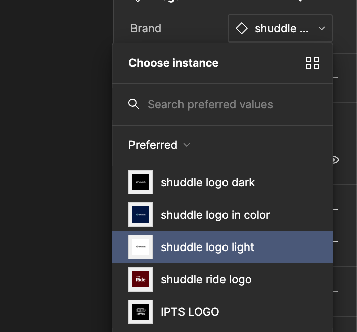
Instance Swaps + Prefered Values
An instance swap property indicates which main component or variant instances can be swapped, a perfect application to the Logo, which could switch out depending on the context.
Furthermore, I was able to set several preferred values.
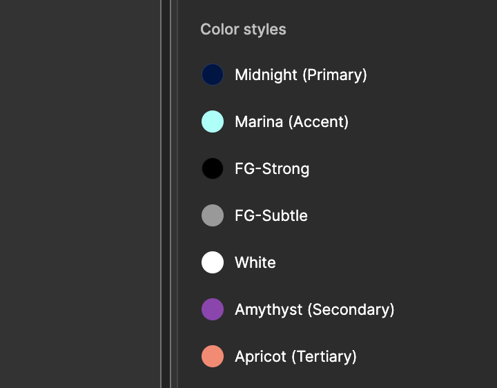
Color Styles
Color styles are another useful tool to add value to a design system. In building our original sites, I didn’t spend too much time matching colors during the building phase. This seemed pointless as the value of color depends on its context and the colors of surrounding elements.
Styles were created with a tiered approach. Firstly, foreground and background colors were established and responsible for each site’s legibility.
Secondly, Primary, Secondary, and Tertiary styles are assigned to elements to portray branding. These are primarily used in case of a rebrand or application of brand colors to an interface (and guess what, not in vain).
Thirdly, functional colors, if necessary. For IPTS Rail, I decided to color code various lines using colors.
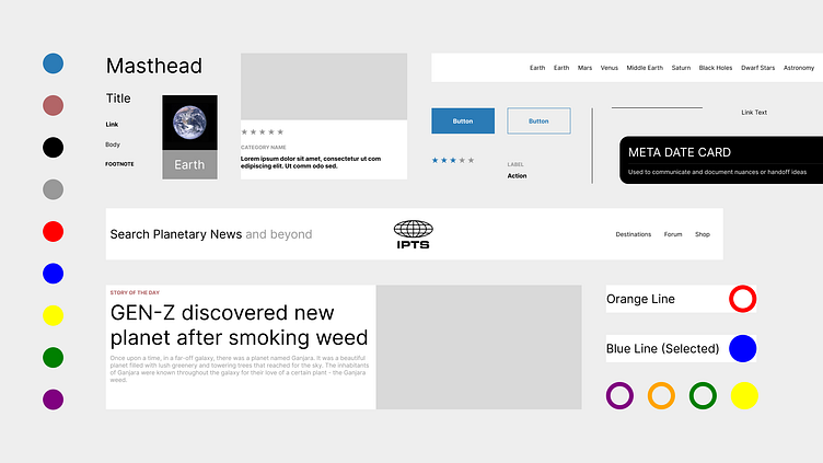
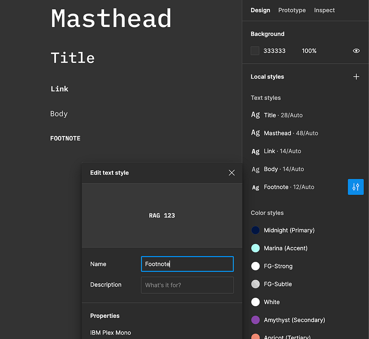
Text Styles
Hierarchy, hierarchy, hierarchy. After organizing our information on each site from most impactful to least, I established a type system that would remain the same regardless of a theme or brand change.
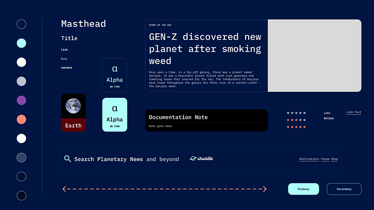
Masthead
Title
Link
Body
Footnote
Learnings
Timing is important
Creating components too soon is a very easy mistake, and I have repeatedly fallen into this trap. Components can save a lot of time when modifications are made on multiple instances or when multiple instances need to be created.
However, they also require time to set up and contextual awareness. Thus, the value of a component is not always apparent, and it can be beneficial to perform an analysis before creating a component out of everything.
One example is the Hero component, which is only used in one instance.
It’s a balance, not a contradiction.
At the same time, too many component instances can cause issues later on when finer control is desired.
Initially, NavigationItem and Link were the same components, when in reality, modifications would likely take place at a different cadence for component instances in Header than for Navigation. Thus, it makes no sense for these to be the same component.
Specificity in naming conventions
As our component library built up, I noticed that general names such as Card became problematic. Because Card was a common component in both IPTS.ORG & IPTS.Travel sites needed to become more customizable to suit both sites' needs and, as a result, became very complex.
This complexity made it difficult to document usage and guidelines, so instead, it needed to be broken down into separate domain functions, e.g., MediaCard, and ActionCard.
Incorrect naming
Furthermore, the Card was misleading as it is very commonly an elemental component used at an atomic level to portray a visual effect and grouping of content. Thus MediaCard and ActionCard were again renamed more aptly to ActionItem, MediaItem.
Rebranding IPTS
Problem
Under my leadership at the IPTS—the Interplanetary Travel Syndicate—just hired the prestigious branding firm MegaBrand to rebrand the entire organization. A few things will affect the three products we have been working on.
MegaBrand discovered through focus groups that the IPTS name and logo felt very ominous, like it was a cold, faceless corporation that was always watching. (“The eyeball-shaped logo doesn’t help,” said one candid participant.) In addition, the IPTS wants to appeal to a younger demographic. After weeks of research and exploration, they’ve settled on the new name, “Shuddle,” which feels like a cool startup.
The color palette is fresh and vibrant, and the identity relies much more heavily on the photography of younger people to feel more welcoming and inviting.
The typographic palette relies heavily on the IBM Plex superfamily to give a wide range and make everything feel familiar.
The three main products have also been renamed to feel more like a family of products instead of independent offerings:
“ipts.org” is now “shuddle.world.“
“IPTS Travel” is now “Shuddle Visit”
“IPTS Rail“ is now “Shuddle Ride. “
My Role
As Head of Digital, my role is to update our suite of products to this new branding. I will also update our reference site to reflect the new brand in design and content.
Typography Updates
As expected, this was one of the most effortless changes, thanks to a well-thought-out design system aspect. As MegaBrand provided the new fonts, it was as simple as downloading, installing, and switching out the font for each of the Type styles created. Minor adjustments to weight and size were made; however, the effect was astonishing.
Color styles updates
To make it easier for the team and engineers to keep track of the changes, original names were preserved by appending to the new names. Even though this is not strictly necessary, it could mollify the exertion necessary to roll out the changes.
Base colors such as FG (foreground and background stayed the same) as these foundational colors should remain within the contrast ratios for accessibility purposes.
Two additional colors were added: Amethyst and Apricot as secondary and tertiary. In contrast, all the original rail colors were completely removed from the system. These would be breaking changes, and the necessary communication was delivered to all teams involved with ample time.
Lastly, Ride and Visit logos were picked to create a color style for each of those two, facilitating the rebranding of those respective sites.
Component Updates
The logo becomes an Instance Swap property.
As each new sub-brand has a different logo, I expanded on the Logo component by creating a component from each logo, including the original IPTS. This allowed me to set preferred instances on the logo component to easily switch between sub-brands in context.
Colors to Greek Symbols
The original IPTS Rail used color-coded lines; however, to respect MegaBrand’s new color palette with only five colors total, I have decided to move away from colors as a system to organize lines in favor of Greek symbology.
Red Line will now be Alpha (α)
Blue Line will now be Beta (β)
Yellow Line will now be Gamma (γ)
Green Line will now be Delta (δ)
Purple Line will now be Epsilon (ϵ)
Orange Line will now be Zeta (ζ)
Learnings
Humans are particularly bad at predicting the future, and our decisions today can bite us in the bite tomorrow. Change is inevitable; however, as we learned throughout this rebranding, a design system can minimize negative impacts and facilitate change.
At the same time, this design system wasn’t without its flaws either. Many components required slight modifications and maintenance; some were deprecated, like the original LineItem.
Creating a design system was a successful approach to building our products.