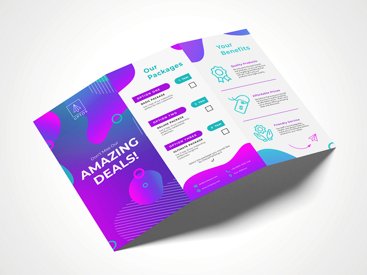
Brochure Design for Uptos
Hello! This is a Brochure Design for Uptos and their packages. The color palette I selected was carefully chosen to convey the message of the brochure while being visually pleasing. The use of icons in the brochure makes it easy for readers to understand the information presented at a glance. I selected icons that are simple, clear, and representative of the content.
What do you think about it? 👀
-----
If you like my post feel free to follow me and leave a like 😃
-----
I am available for new projects, so feel free to reach out.
-----
Let's work together! Contact me at f.krotzer@fabiandesign.de
bifold brochure
brochure
brochure design
brochure template
creative
creativity
design
designer
flyer
flyer design
flyers
graphic design
layout
modern
multipage brochure
print
print design
trifold
trifold brochure
typography
View all tags
Posted on
May 1, 2023
More by Fabian Krotzer View profile
Like

