INA - Isfahan Neuroscience Association

Hello there!
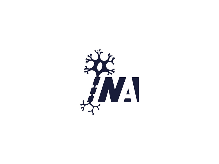
I'm excited to share with you about the logo I created for INA, the Isfahan Neuroscience Association.
I wanted to design a logo that would effectively represent the association's focus on neuroscience and its location in Isfahan.
To achieve this, I combined the letter "I" with a neuron shape, creating a unique and visually interesting design.
The "I" represents Isfahan while the neuron shape symbolizes the brain and nervous system, which are central to the study of neuroscience.
I'm particularly pleased with how the combination of these two elements creates a strong visual connection between the association and its research focus. Furthermore, the use of a neuron shape adds a sense of complexity and sophistication to the logo, emphasizing the advanced nature of the research being conducted by the association.
Overall, I think that the logo I created for INA is both simple and memorable, effectively communicating the mission and purpose of the organization. It should help establish a strong visual identity for the association and make it easily recognizable within the field of neuroscience.
if you like the design press 👍🏻 like.