Visual Identity Design for a Space-Tech Startup

Vishwa is my personal Visual Identity project. It is similar to the one I did for a company that works towards improving Space Technology. In these slides, I will go through my Design approach.
Search for Keywords
Since Vishwa is a start-up and the Team consists of brilliant young minds, the challenge was to keep the Visual Identity to be Fresh, Energetic, Professional, and Technical yet Friendly enough to attract youngsters to join the Team.
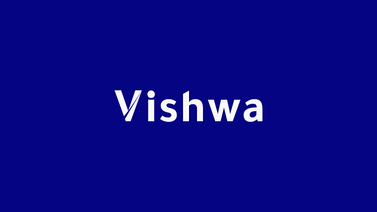
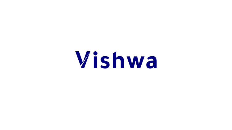
The Logo
First, I reviewed the relative keywords for Vishwa and then sketched a few Type-based Logos. I made sure that the logo fits well with the company's values. It had to be simple, memorable and relevant. The edges had to be clean and sharp signifying Seriousness/Professionalism. It's a san-serif-based text logo and goes well with modern typefaces.
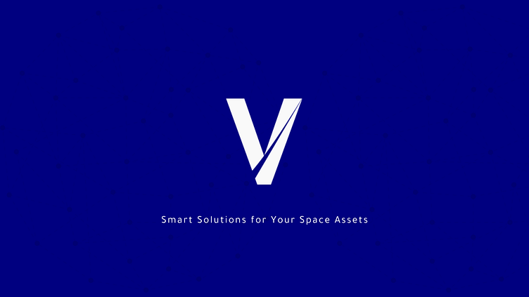
I also took note of the logo dimensions. It had to be legible on a small scale as well the large one. Whether be an app icon, a profile picture or a large billboard, it had to be functional. The V from the logo here comes to the rescue. It is simple, elegant and memorable. It can be made use of on smaller scales.
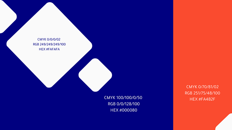
The Colour Palette
Blue was the colour choice of the client, and I had to pair it with colours that would suit the visual identity of the company. Since blue is used for its calmness, trust, security, and order, I paired the deep blue with a somewhat scarlet red that would signify energy, passion, and action. Here, the blue colour also relates to space, and the scarlet colour is similar to the colour generally used for lasers. I try to maintain the 60:30:10 rule for colour harmony, so I included white in the colour palette. While blue and white can be used interchangeably depending on the requirement and applicability, the scarlet red colour would be kept at a minimum, i.e., 10 percent.
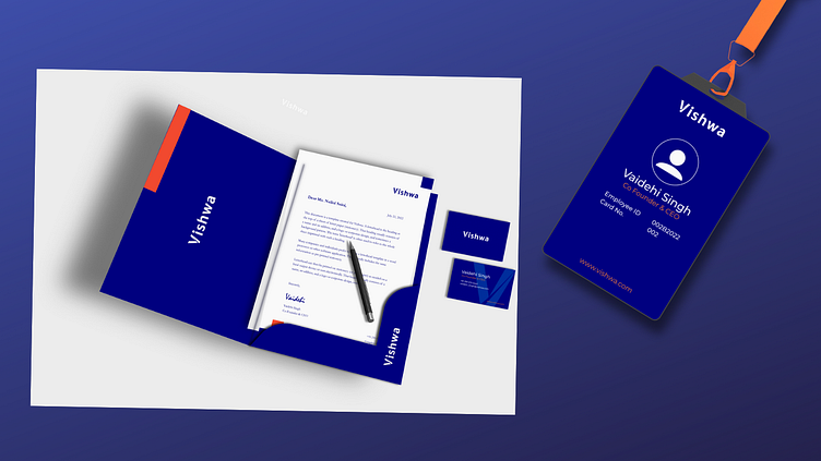
Designing the Stationery
After selecting the colour palette, I applied it to the stationery to test its functionality. The overall impact had to be as per the company's value. For the more formal text, I preferred a serif typeface like Garamond. And for the general ones, I used a sans-serif typeface.
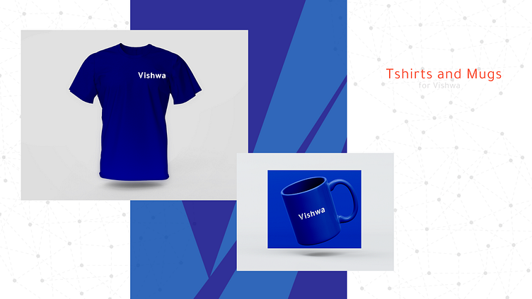
Accessories
I also designed accessories for them, including T-shirts and mugs. These would be used by the team members and also for corporate gifting.
Conclusion
It was a great experience designing for a space-tech-based start-up. With this project, I learned more about designing for businesses in various fields. And I continue to learn.
If you need a Stunning Visual Identity made just for you, Drop a Hi on:
Email: Artist.LipiSingh@gmail.com
Also, Connect with me on my Instagram Handle:
https://www.instagram.com/aksharcalligraphyandlettering/channel/