Case Study: IPTS Rebranding to Shuddle

Project Brief
The Interplanetary Travel Syndicate (IPTS) has contacted a marketing agency to help them rebrand and modernise their entire image. Since there are a significant amount of changes to the foundational core of the brand, this means all associated products will also need to undergo a hefty update to match the new branding.
Goals:
Articulate the main accessibility issues and use pain points caused by the previous iteration of the design system
Utilise the rebranding assets within the new version of the design system to complete the company’s image transformation
Problems:
Several components didn’t follow modern best practice guidelines, including:
Typography is all caps which lowers legibility
Low contrast in text overlayed on images which decreases text accessibility
Many components relied on design trends that are no longer considered modern approaches to interfaces with good visual hierarchy for current screen resolutions
The new colour palette & typography significantly alter the look of existing components and will require redesign for the UI to fit together cohesively
Approach
Since I was the one who created the original IPTS design system and knowingly added several usability issues for myself to fix during this part of the case study, I knew exactly what areas I wanted to hone in on while reseraching various best practices and accessbility guidelines.
During this phase of the case study, I did much more extensive research and comparisons against other well known design systems to pull together the next iteration of this design system while taking into account the substantial change in branding.
Discovery, Research & Iterating
The 3 main components I chose to tackle for this case study were the buttons, cards and search inputs. There was also considerably more analysis placed on making the foundational colour palette accessible and creating additional adjustments for the typography in the Shuddle Visit product.
Colour Palette & Typography Considerations
The biggest change from the first version of the design system was the drastic shift in tone for the colour palette. Previously it was mainly black & white but now there are several highly saturated colours used in the branding.
Another big change was the typography. The new fonts that are used in the marketing material have a very stylised width for the body font and noticable serif points for the title font. I decided to use another font within the same super font family that would be used specifically for Shuddle Ride as the route results would be much more information heavy. I opted to use IBM Plex Sans to make the font more uniform instead of IBM Plex Serif & IBM Plex Mono.
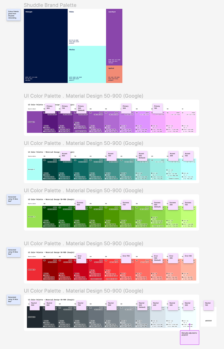
Here I'm experimenting with which colours on the swatches could be used as various lighter or darker shades of particular colours. Each colour is derived from the rebrand assets with a special shout out to A Nice Red & the Figma plugin UI Colour Palette
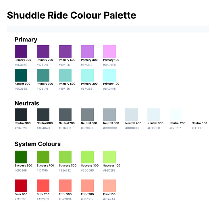
Based on the colour swatches produced earlier and after running an accessibility check on them, this is the final colour palette.
Very importantly, I specifically chose a light blue and purple that were similar enough to the new branding's "Marina" & "Amythest" colours but purposely made them less saturated to have better legibility with text.
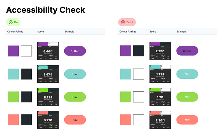
An accessibility check for the most favourable colour combinations from the colour palette.
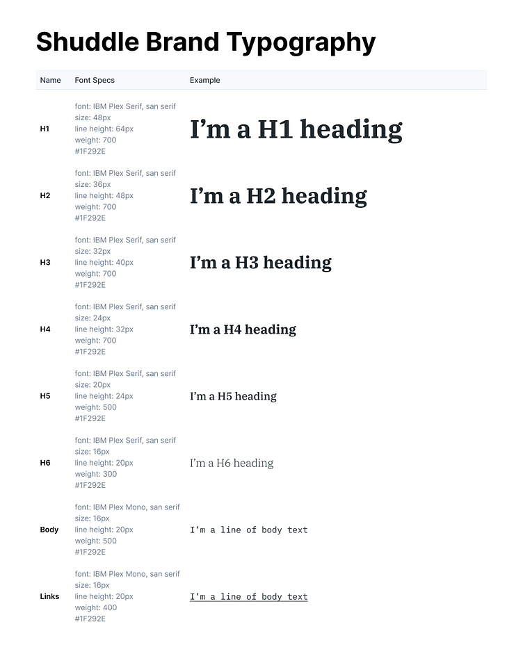
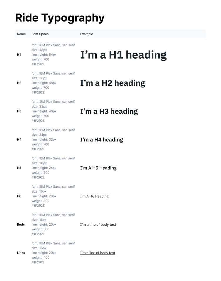
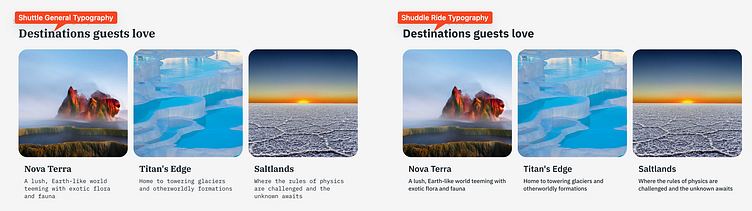
Cards with the general Shuddle branding (left) can be used on more marketing focused applications like Shuddle Visit. The more even lettering of the Shuddle Ride typography (right) lends itself better to being used when the information density has increased. This would make it more legible for use in Shuddle Ride.
In-depth Research for Component Best Practices
Here I start digging into the buttons by understanding the common places they are being used right now, analysing button patterns in similar applications and then creating new button design based on my findings.
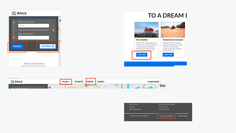
An audit of the buttons that are currently used from the initial design system that was made for IPTS.
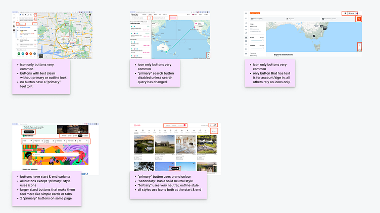
An analysis and comparison of the anatomy for other buttons used in similar websites and applications.
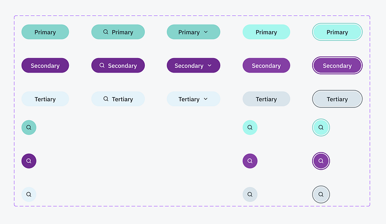
An overview of all the different button types, states (default, on hover, on click) and with icon variations that can be used immediately in the current UI.
In the future, more states such as a "focus" state for keyboard accessibility can be added when this component is revisited after initial testing of these button designs.
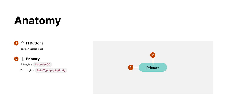
A diagram showing the anatomy of the primary button type.
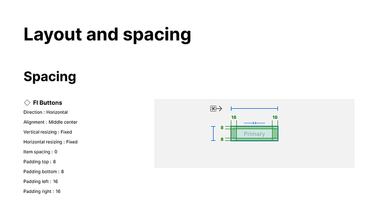
A break down of the layout, spacing and CSS needed to make this button component.
An example of the primary button design being used in Shuttle Visit.
An example of the tertiary button design being used in the UI for Shuddle Ride.
Final Designs
I've included a comparison screenshot of the original route planner and travel destination exploration websites compared to their updated counterparts with the rebranding applied.
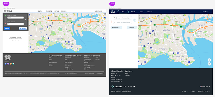
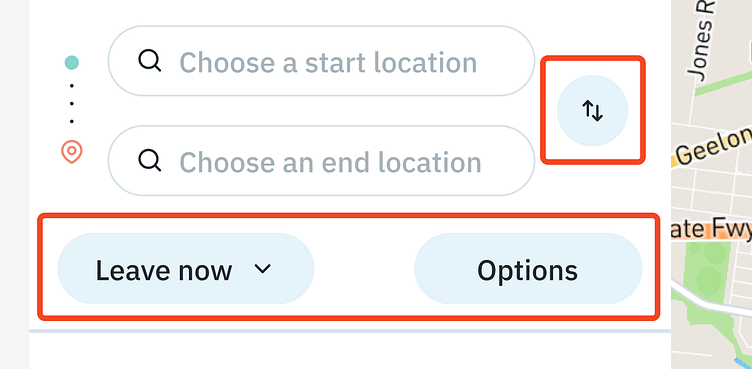
Above is the original (left) with the rebrand (right). While the layout stayed very similar, the buttons and search input now feel less cluttered compared to the initial design system components.
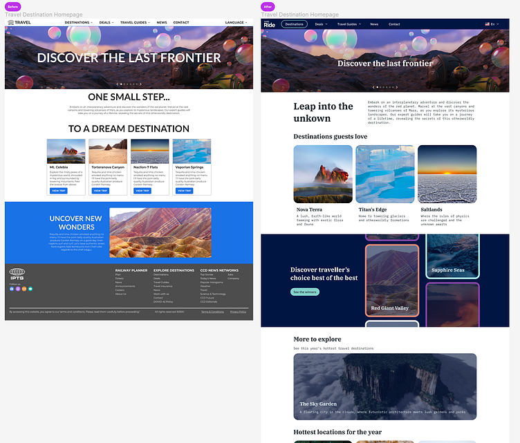
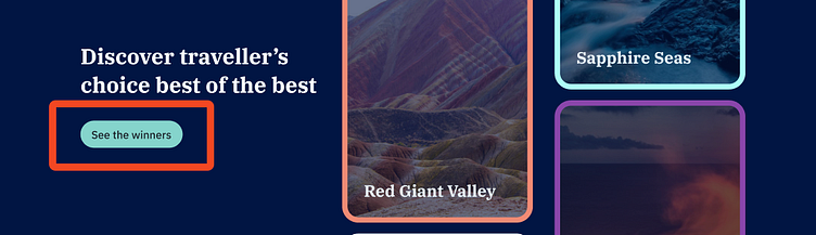
The card design on the rebranded travel website (right) has a greater emphasis on the image and has a cleaner look in comparison with the initial design system (left). With modern best practices applied and UI patterns taken from Adobe, Shopify, AirBnB, and more, the destination images can be the focus instead of being bogged down by text while matching the rebrand.