Reavis | Brand Identity

https://www.behance.net/gallery/166886577/Reavis-Brand-Identity
Reavis is a real estate firm that offers innovative and customized solutions to clients looking to buy, sell or invest in properties. With a team of highly skilled and experienced real estate agents, brokers, and advisors, Reavis offers comprehensive services, including residential and commercial property sales, property management, property development, and real estate investment advisory.
To establish itself as a leading global real estate brokerage with a unique culture and approach to projects, the company underwent a brand identity development process. The approach was modern, dynamic, and future-focused, adopting a simple yet impactful design that conveyed the brand's core values and unique selling propositions.
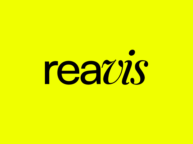
The brand's visual identity was crafted with two typefaces, Satoshi, a modernist sans-serif typeface, and Playfair Display, a traditional serif typeface set in italic. The combination of these two typefaces created a compelling alliance of contemporary and modern typographic tones, capturing the essence of the brand's values and aspirations. The brand's color palette featured black and yellow, with black representing stability, sophistication, and professionalism, while yellow symbolized optimism, energy, and innovation.
Reavis' brand identity is not only visually appealing but also perfectly aligned with the brand's values and aspirations, creating a consistent and cohesive visual language across all touchpoints. The brand identity reflects the brand's focus on investment and business advisory services, with a perfect balance between tradition and modernity.