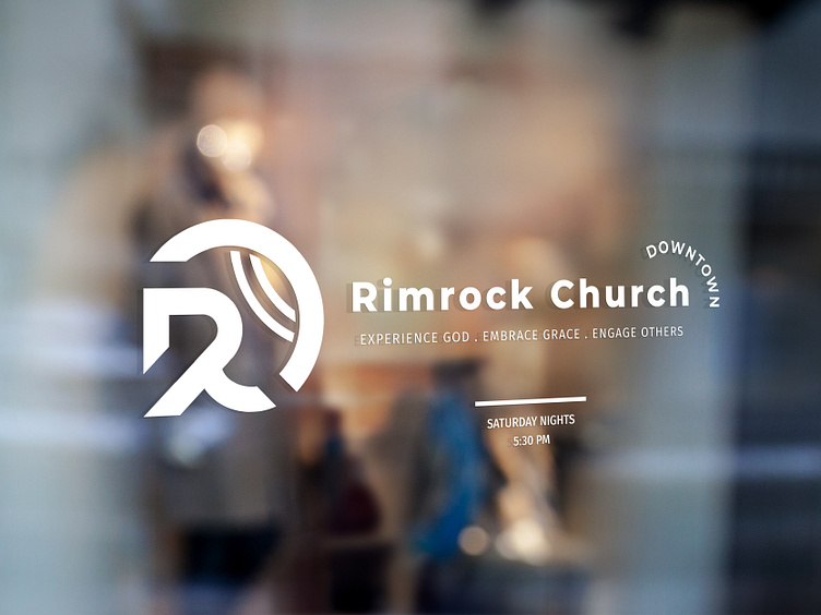
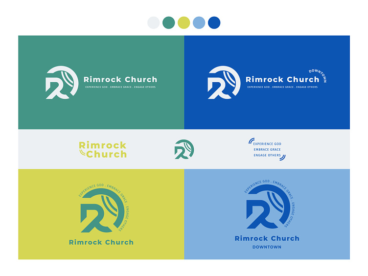
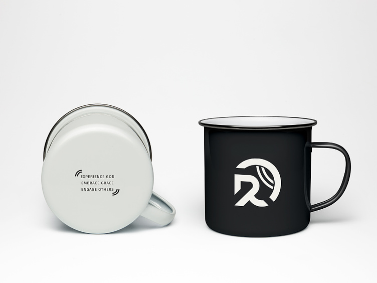
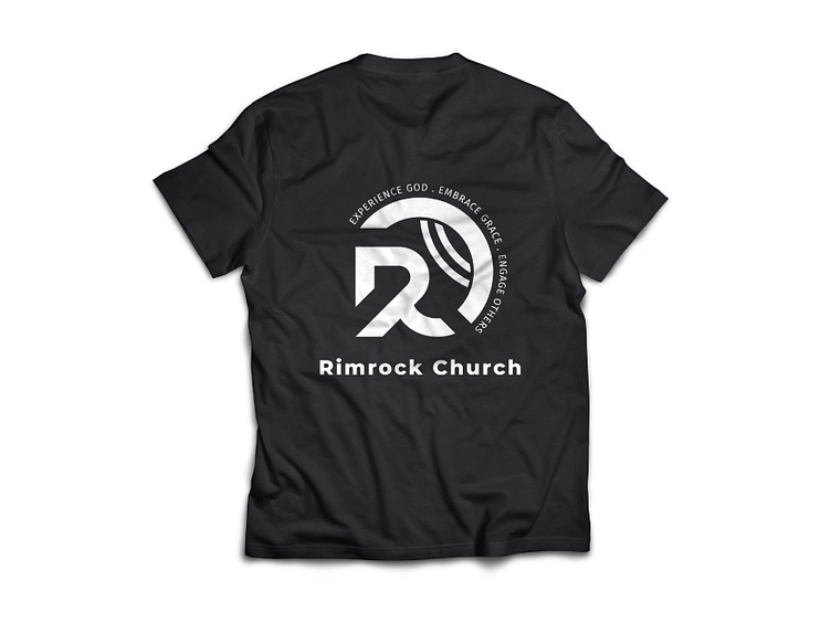
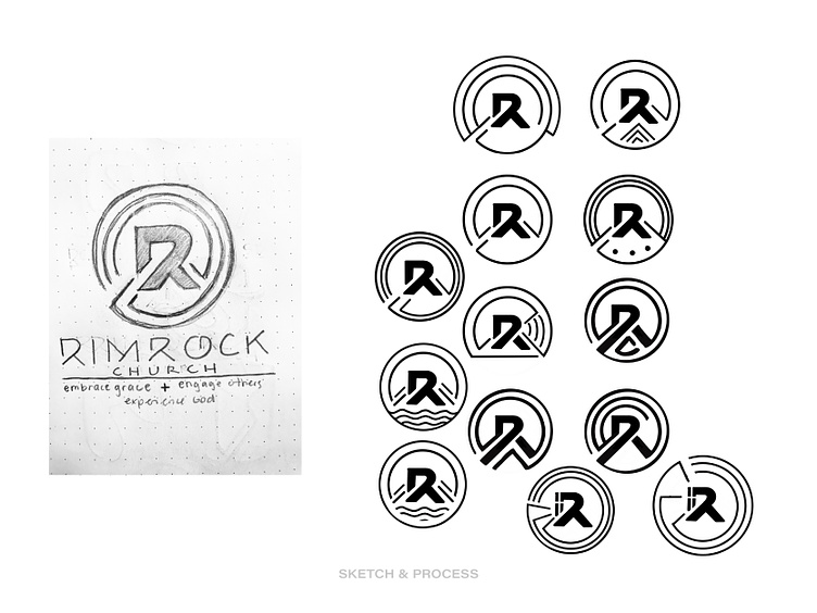
Rimrock Church - Brand Identity Design - Concept 2

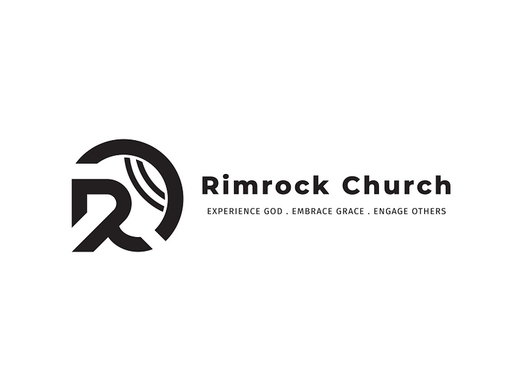
Inspired by the ‘ripple effect’, this logo represents Rimrock’s church community being transformed by Christ. As a community, we engage others as we share the joy and light of God, and it spreads like a droplet of water in a lake, causing a ‘ripple effect’. The bold “R” symbolizes Rimrock not only as the rock itself, but the church as a whole. The solid and strong foundation where we get to experience God is married with the soft curves representing the grace of God.