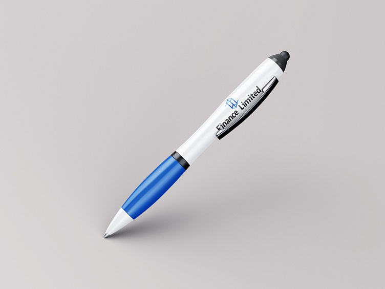
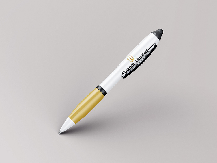
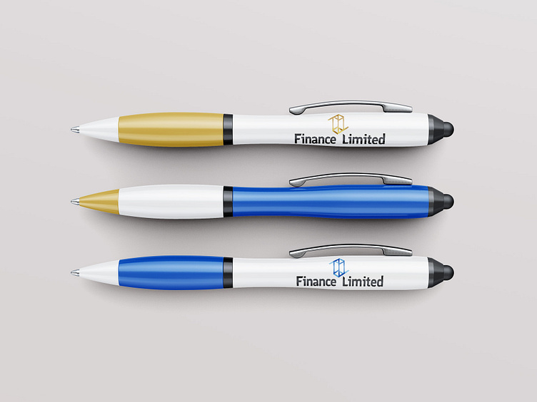
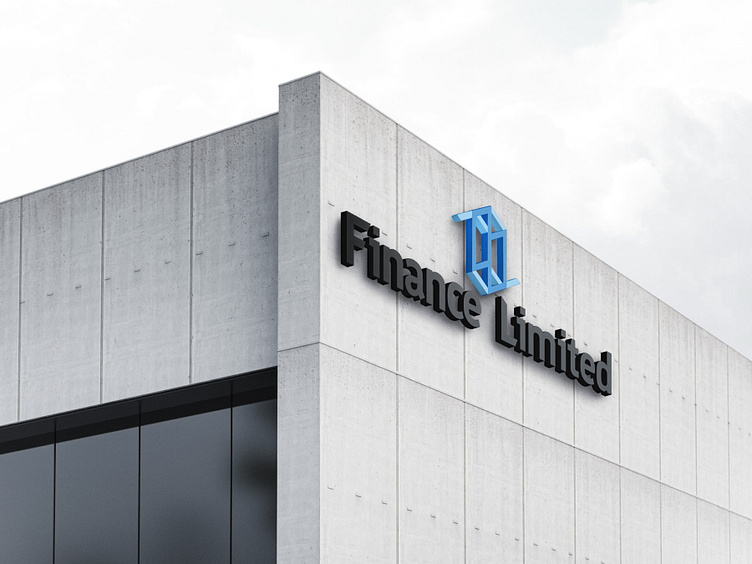
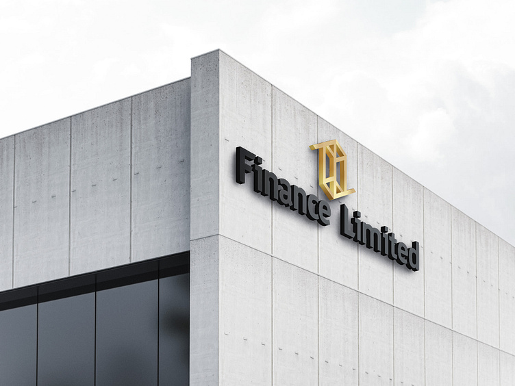
Business Logo

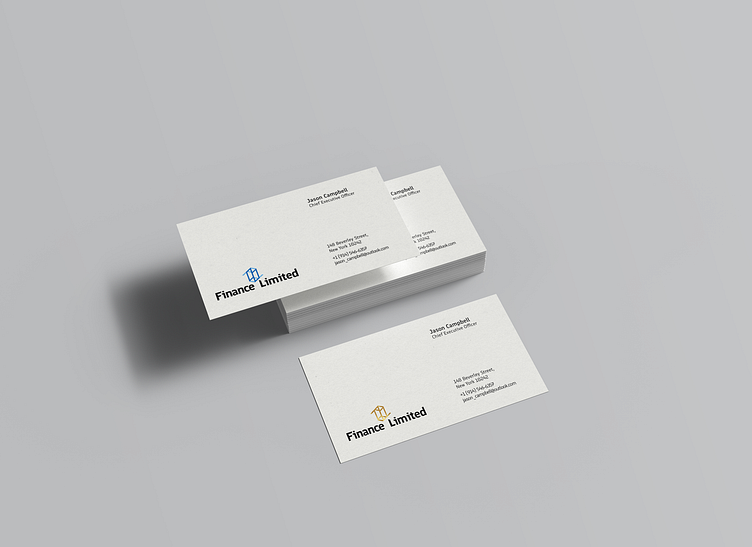
The logo is constructed according to the principle of a cube in isometric projection: the letter F represents the top face of the cube, which is mirror reflected at the bottom. The letter L represents the right face of the cube which is reflected upside down, and two Ls form the shape of a rectangle. The font was slightly modified to match the slant of the logo. It is available in two color variations. The effectively communicates the idea of a modern and professional financial company with a focus on stability and growth.