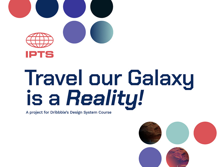
IPTS Design System project

Brief:
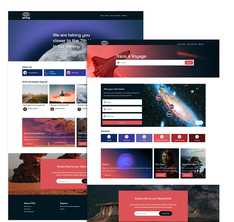
The IPTS: The Interplanetary Travel Syndicate, is about to launch three unique offers.
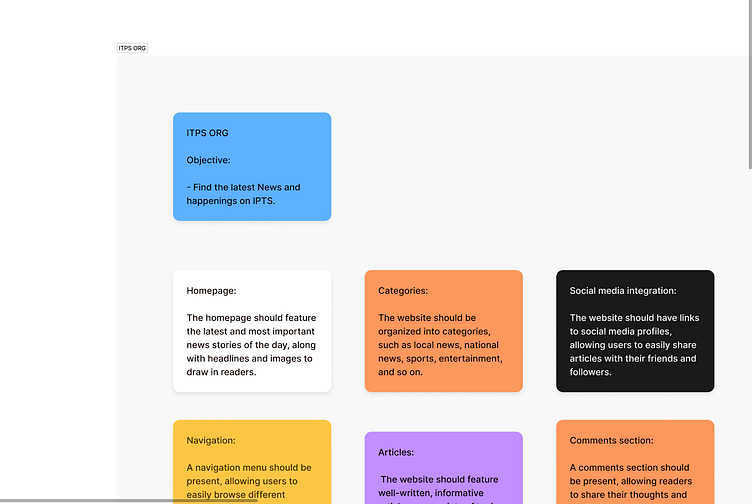
An Informational Website for IPTS Org on which users can find the latest news and happenings with the IPTS project.
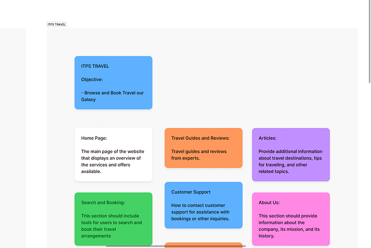
A IPTS Travel website where users can browse and book travels to and from multiple destinations within our galaxy.
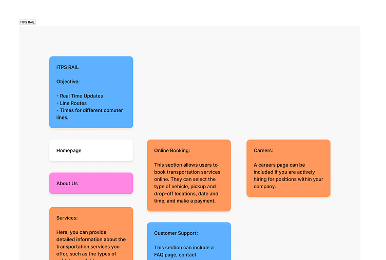
A IPTS Rail website, a real-time web app where you can view lines, routes, and times for all the different commuter lines.
Investigation and definition
Following the initial requirements, i started to define the content for each of the websites, what to include and prioritize was key before starting any proposal. This was helpful to identify at the beginning common patterns, and what was unique to each of the sites.
What are the competitors doing and works well?
While defining the information required for each of the sites, it was key to know what competitors are doing and working well. For this i have perform a Competitive Analysis.
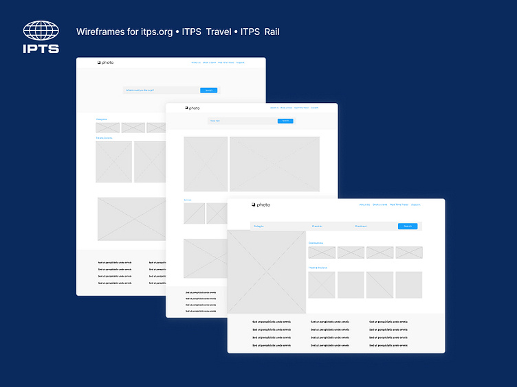
Wireframing
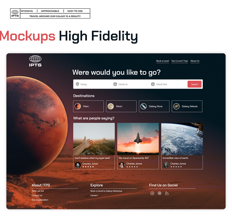
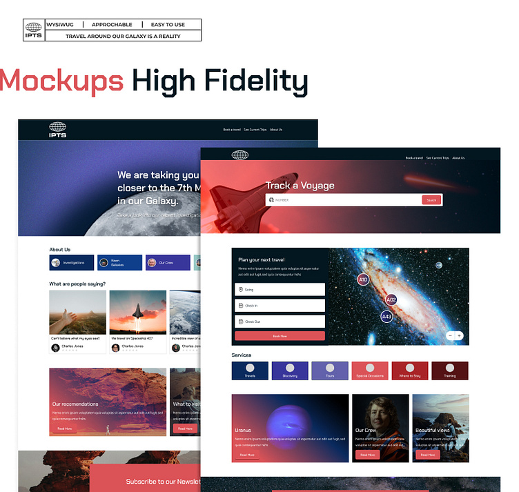
Once the architeture and prioritization of content was made, i proceed to create wireframes of ideas for each of the site. While ITPS Org and ITP Rail are informative, ITPS Travel main goal was more actionable were user are already taking the decision to book a travel.
There for i went to this initial approach an give; ITPS Org and ITPS Ride a more structured layout while ITPS Travel more visually impactful.
Visual Design
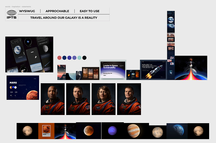
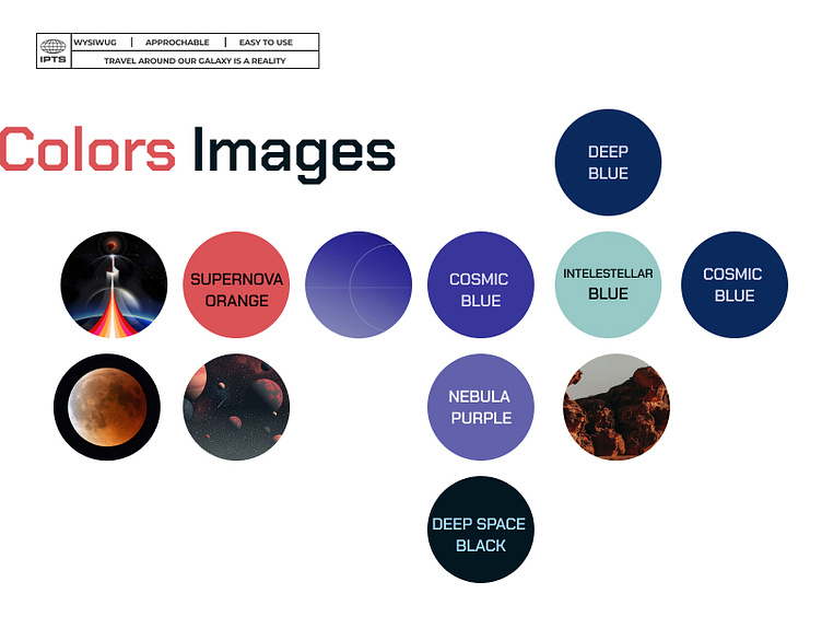
Creating a cohesive identity for IPTS project was important to allow an unified identity on each of the sites. I base this on three key principles:
WYSIWUG:
(What you see is what you get)
Travel to any galaxy is a reality there for photos must be real, avoiding illustration and prioritizing photos of planets, galaxies and current views.
Approchable:
In order to allow users to imaging in those places, people have to be shown on those places (photos of the current view or taking by them).
Easy to use:
Any element of the page should be following common patterns, and be easy to book, view and check for any update, the language used should be familiar and common.
Investigations and information should be displayed in the site as artcile or news to allow users to feel confort on this new reality.
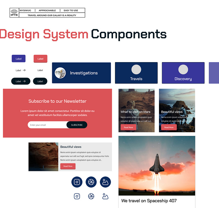
Deep Nova Design System
I begun by creating the initial site for ITPS Org, once this site was created and defined. The common patterns idetified when creating the wireframes were translate to a Design System called "Deepnova". This was crucial to speed up the process of desigining "ITPS Travel" and "ITPS Ride".
https://zeroheight.com/312866239
The Design System follow the structure of:
Styles:
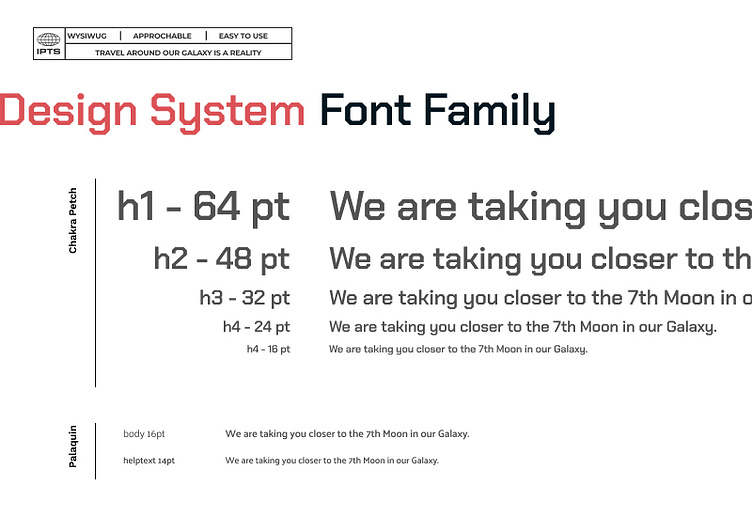
Colors
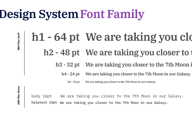
Fonts
Components:
Banner
Buttons
Cards
Footer
Hero
Input
Icons
Navigation
Documenting the Design System
In order to bring value and have a source of truth for Designers, Engineers and the ITPS Team. "Deepnova" (Design System) has now its own site were any update on the Design System can be followed through.
This documentation allows teams working for ITPS Org, ITPS Travel or ITPS Ride syncronize and effective.
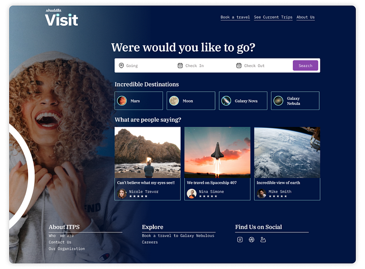
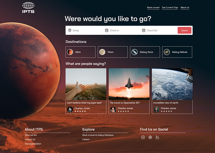
A Change of Direction - Rebranding
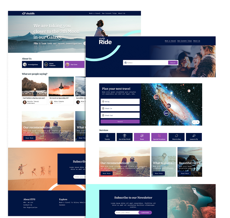
ITPS is now Shuddle!
As part of the ITPS Project a redesign requirement was made from the leadership. A full rebranding was made for ITPS organization.
The main objective for this requirement is to identify how easy or not is to update an existing Design System, and how efectively this speed up the process of making an update across mulptiple projects.
Below you can see the upgrade of the Design System
according to the Brief and Rebrand:

My key Findings when updating a Design System:
1. Keep the styles naming convention generic to any property given.
For example, on my initial Design System I named the styles for colors: primary, secondary, tertiary, accent etc ... if any of those were name according to the color name it had made the proces to update it more difficult, as orange would not match the new color purple.
2. Images updating process
During the process i found that updating photos, was really difficult, I needed to make some updates on existing components in order to keep my initial layout to the new fresh and vibrant design.
3. Make sure to style all texts to avoid issues!
The process of updating fonts was easy, the only issue was that i forgot on the initial design for ITPS Project to apply the styles for some texts so, when updating the sites for the new look and feel i need to take a look to each element.
4. Create Separate Design Systems
While updating "Deepnova" Design System, i found out is more straight forward to duplicate the existing Design System and then swap the library throught your projects, this way you will be sure that the old Design System stills available for the team in case of needed.
It is more complex to review the version history to see the old version.
When Swapping for a new library, make sure you have the same number of components and styles for the new project.
Make sure style naming convention are generic, for example it can be managed with Design Tokens.
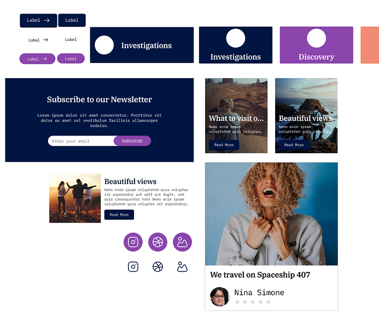
IPTS Travel now is Shuddle Visit
After - Before
ITPS Org now is Shuddle / ITPS Ride now is Shuddle Ride