Chonk Cookies


Give them what they want
Chonk is a start-up cookie brand on a mission to break the dull sector of frozen baked goods in the UK. Aiming to bring properly delicious, warm cookies to people in their own homes. With a fresh different view to healthy and sustainable living. Chonk are made different.
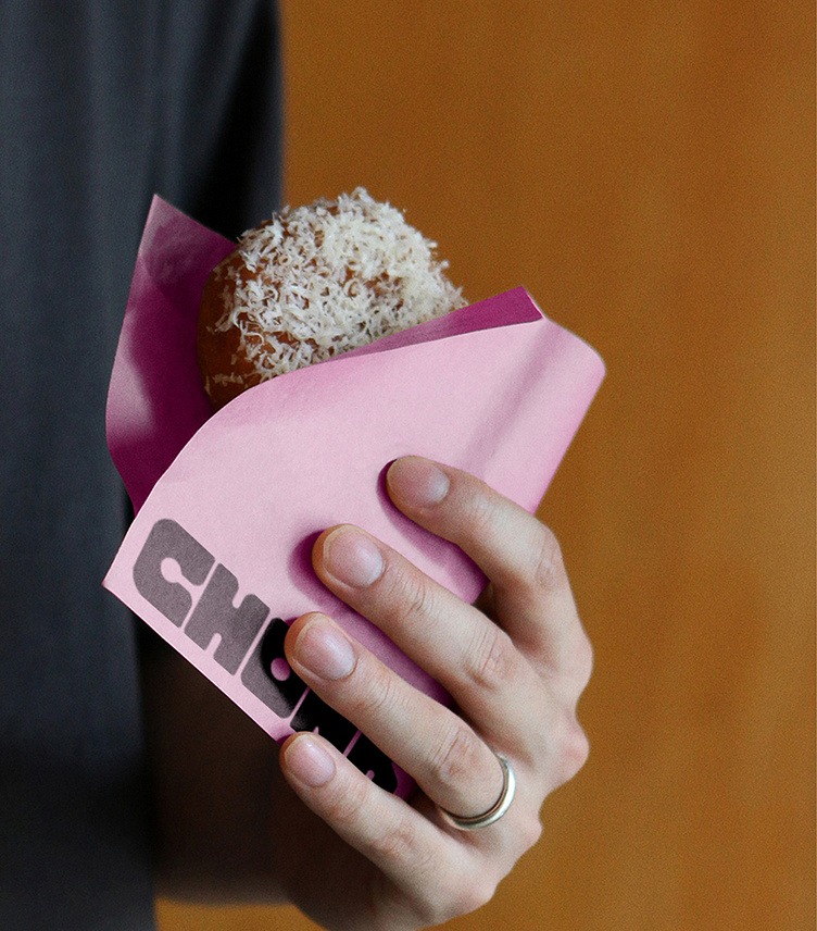
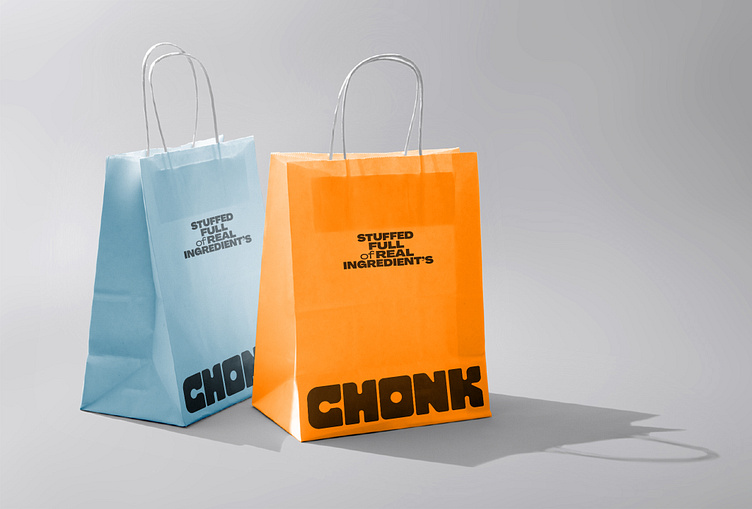
We worked with Chonk to define their proposition. ‘Stuffed full of real ingredients’, It’s simple, if you’ve chosen to have a cookie - it’s a treat. They don’t play in the diet or low sugar sector; they focus on cookies that are worth every bite. Generous and inclusive because it’s healthy to enjoy.
The visual identity was founded on a playful and exaggerated vision of the joy a proper cookie can bring; visual vibrancy and frank expression. We crafted a stocky and absolute wordmark; a wordmark able to pierce through the noise of a cluttered display. Inspired by the abstract beauty of melted-down ingredients we developed a system of tactile patterns that feel superfluous, a radiant visual expression giving Chonk a powerful signature aesthetic. We developed a colour palette to establish definitive stand-out. And a system of use to categorize flavours. One of the leading elements of this identity is its tone of voice. A roaring voice requires an equally potent typeface to carry it, ‘Pangram Pangram’s’ ‘Agrandir’ supplied the perfect balance of imperfection.