Salixan | packaging


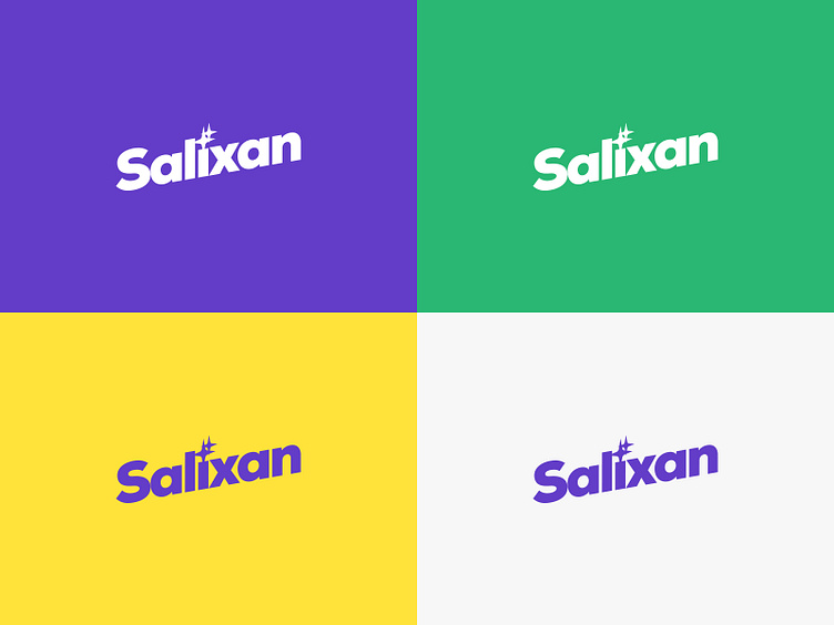
In the font logo of the brand Salixan the image of purity is encoded in the form of a surface gloss inscribed in the letter I, which perfectly conveys the idea of purity.
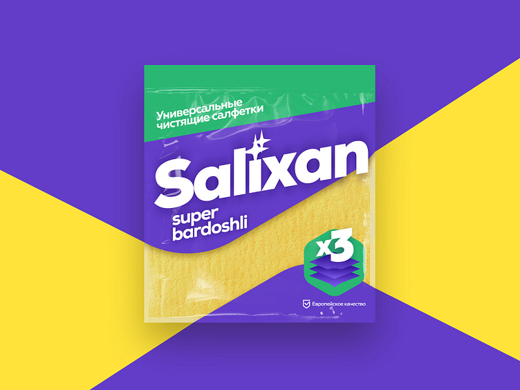
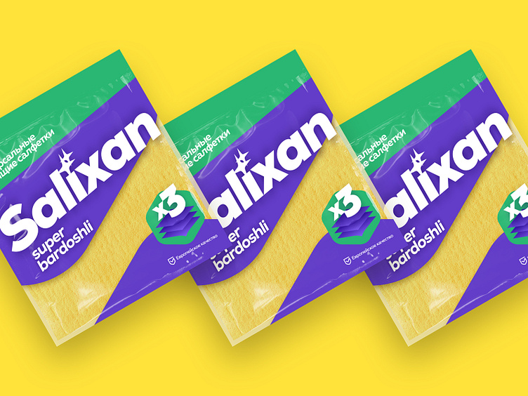
The packaging is made in an original combination of colors, and the window on it, which became a part of the color composition, clearly shows the cleaning cloth, which is especially important for buyers. The original branded lines play well with the composition and correctly place accents. This makes it possible to differentiate products well on the shelves in the store.
Fedor Beltugov multidisciplinary designer & art director focused on branding & interactive design
find me online: behance | instagram | linkedin | telegram | website