ríjuice brand design + direction


the basics
i was hired as brand + design director for ríjuice––a cold-pressed juice company in southeast pennsylvania. i was brought on to elevate the brand from it’s dis-jointed, cold look and feel.
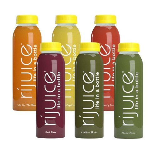
how it started
when i joined the team, the brand vibe was cold and lacking personality (pictured above).
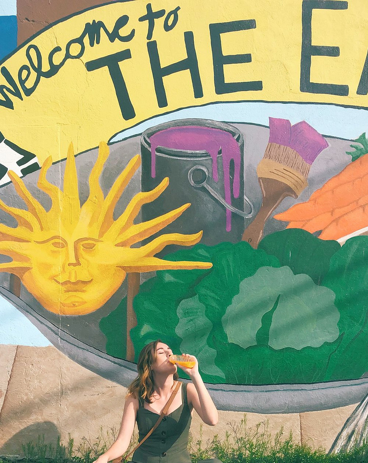
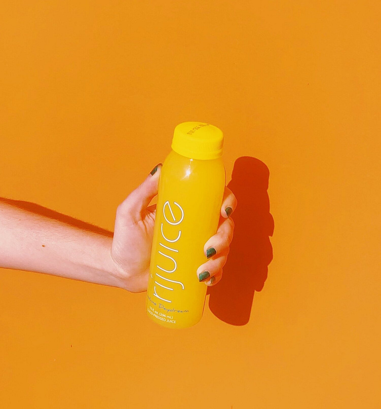
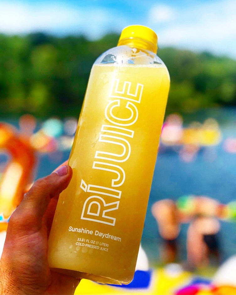
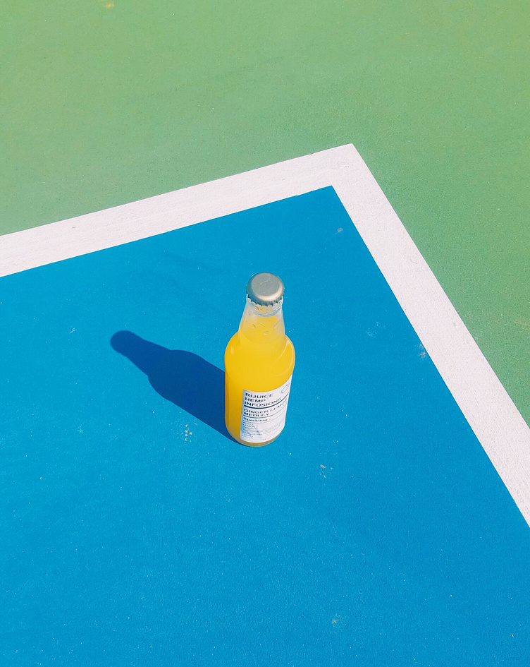
alongside starting our rebranding efforts, i developed several campaigns to showcase the existing product in a new and fresh light.
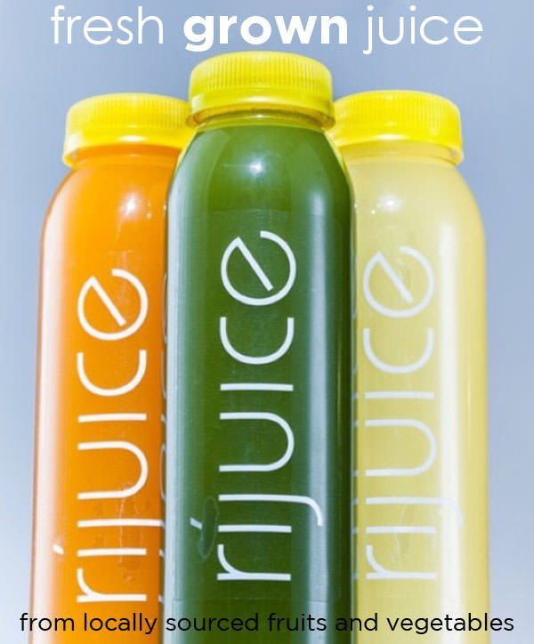
how it's going
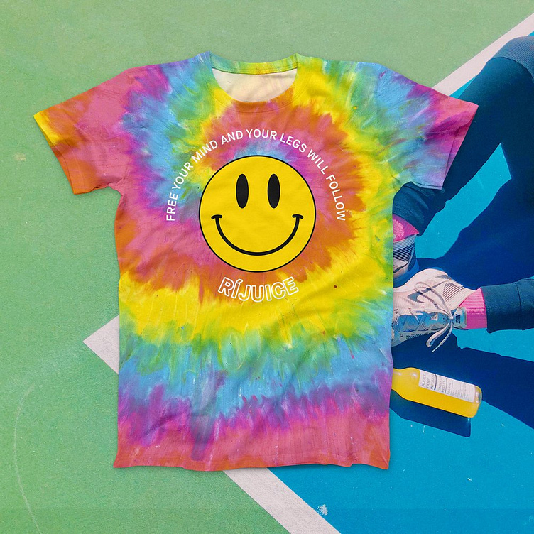
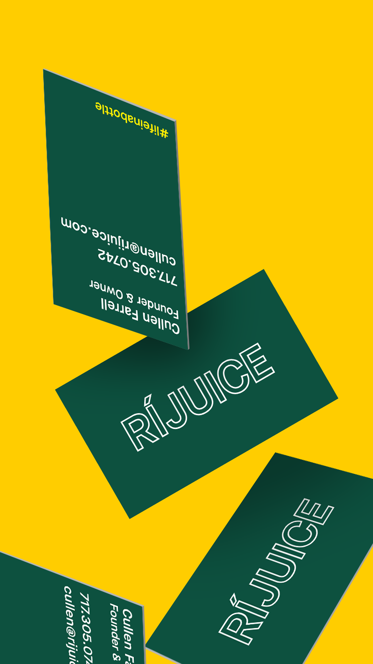
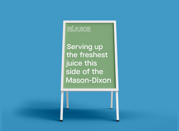
after a year of collaboration with the leadership team, sales team, employees who make the juice daily, market research and real conversations with our customers, we landed on a new identity that brought warmth, fun, and healthy vibes.
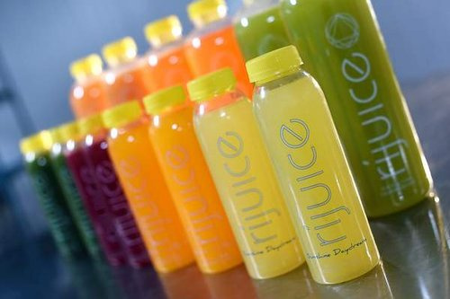
during our market research we found people wanted more transparency. (big surprise, right?)
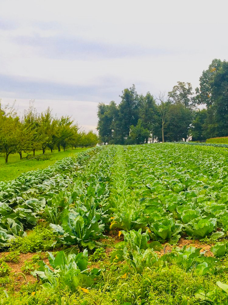
so one of our core values became showing the process of where everything came from. we brought cameras along to the local farms we purchased from, and began educating our customers on the process of making cold-pressed juice.
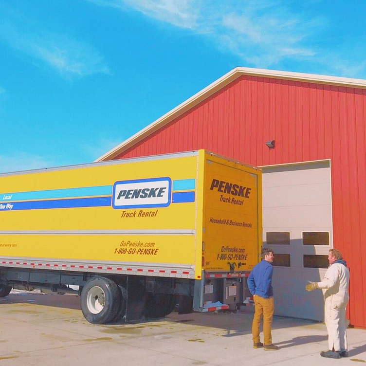
i strived for more than just beautiful design. that meant traveling to some of our wholesale accounts and asking how i could make their jobs easier.
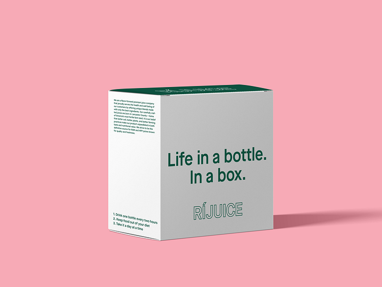
i learned the old shipping box made it impossible to know what was inside, so i redesigned the box with the flavors on the side to make inventory counting a breeze. (our juice cleanse box also got a makeover, pictured next.)
the outcome
in the following year:
we doubled our retail presence across the state.
we captured our intended 18-24 year old demographic for the first time, and grew that demographic by about 200%.
we doubled our revenue and completed a successful round of fundraising, which allowed the company to expand the product line and increase production.