Wemove logo concept ( for sale )


Experimenting with a different color scheme for wemove, a fitness app that is all about helping people achieve their fitness goals.
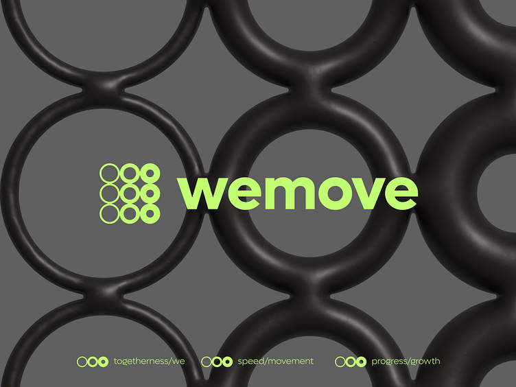
The concept behind the Wemove logo is speed and progress. The logo features a series of circles that increase in thickness from left to right, creating a sense of movement and momentum. This design element is intended to represent the idea of progress and growth, as well as the speed and agility that are necessary to achieve fitness goals.
In addition to representing progress and speed, the Wemove logo is also intended to evoke the idea of strength and power. The circles in the logo become bolder and more solid as they move from left to right, suggesting a sense of increasing strength and resilience. This design element is intended to inspire and motivate Wemove's customers, reminding them that with dedication and hard work, they too can become stronger and more powerful.
Any feedback is welcome as always! :)