Oppo - Logo Design

Oppo
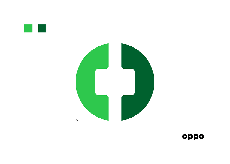
Logo for a Telecommunications called Oppo. The logo is made with two telephone receivers laid out in a way that creates an O, the initial of the company.
One of the colour shade chosen is the colour that is currently being used to imply the stability, and the new shade of green was chosen to represent the fresh changes and innovation within the organisation.