Rebrand for Tropical Boutique Resort

OBJECTIVES
We helped TUK owners Merel and Louise rebrand their beautiful Caribbean resort to create a more playful, tropical and laidback identity. The goals from the project were to increase the resort status to raise suite prices, increase the occupancy rate and to gain a larger following on social media.
STRATEGY
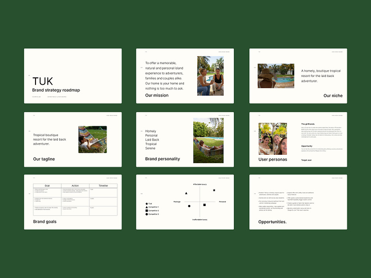
During our strategy workshop, we defined the TUK mission statement as "To offer a memorable, natural and personal island experience to adventurers, families and couples alike. Our home is your home and nothing is too much to ask." This warm and welcoming sentiment was a cornerstone for our rebrand and informed our design decisions.
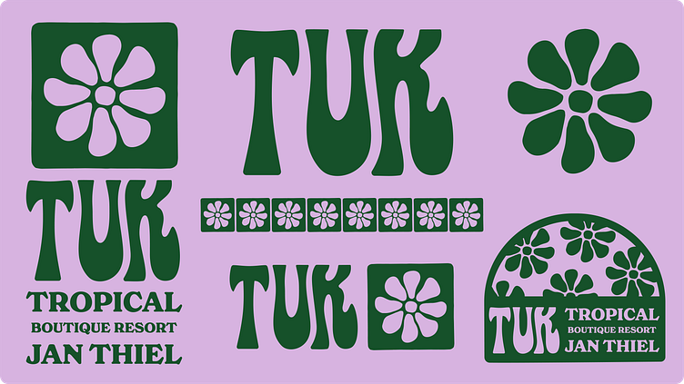
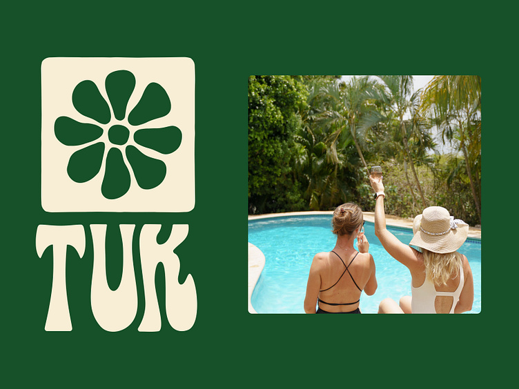
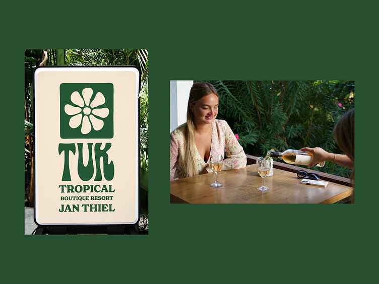
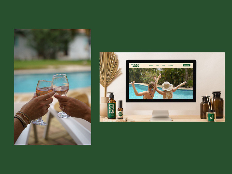
RESPONSIVE LOGO FAMILY
The resort is a tropical paradise filled with beautiful plants, flowers and sunshine. We wanted to represent this in the visual language of the identity. We hand drew the logotype to feel like the lazy leaves of a palm tree gently blowing in the summer breeze. We complimented this with a naive and irregular flower brandmark. To add to the logo family, we created a colour palette to represent the vibrancy of the island of Jan Thiel. We complimented this with New Spirit, an elegant yet playful typeface.

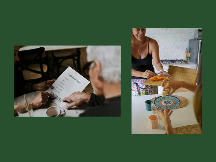
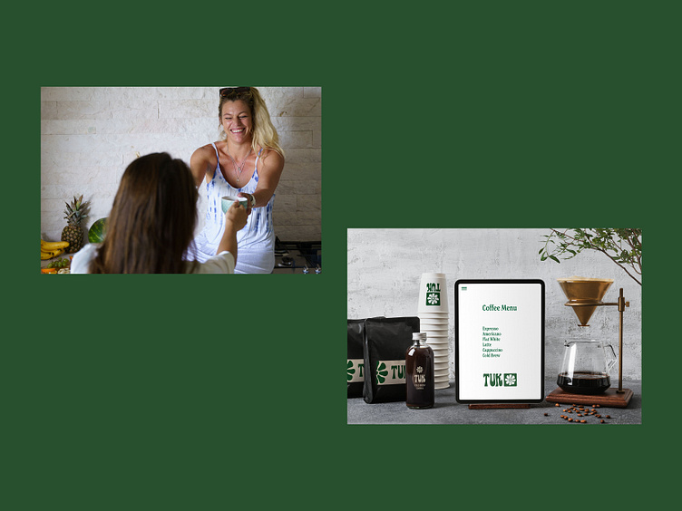
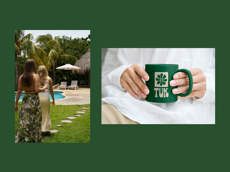
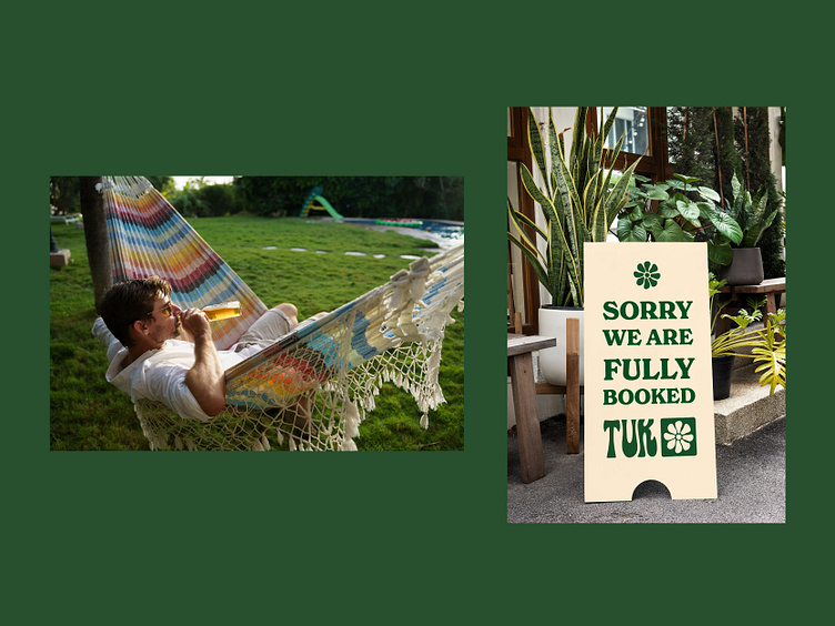
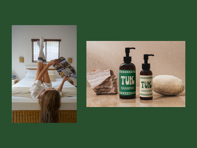
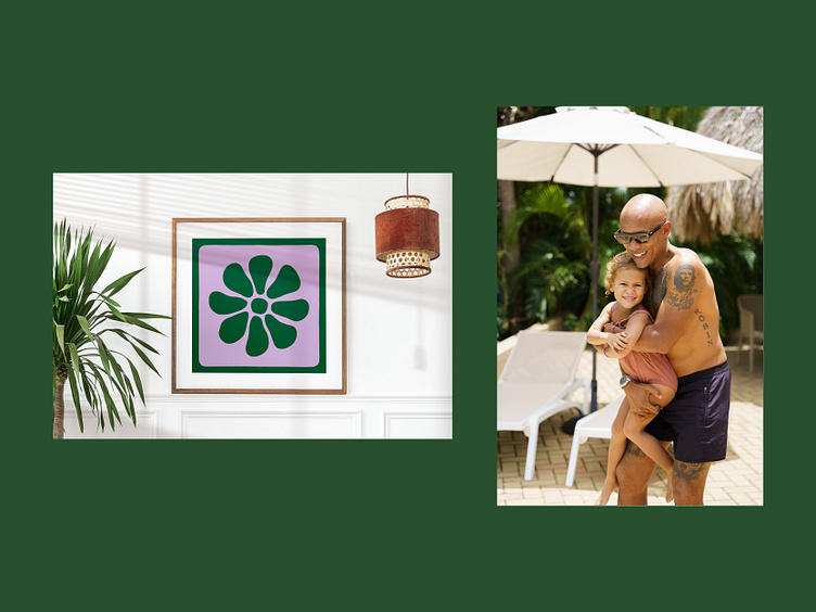
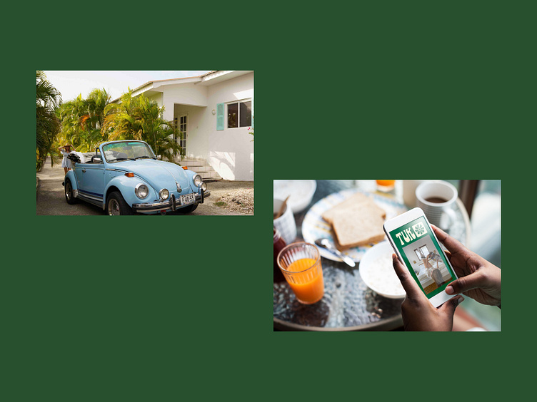
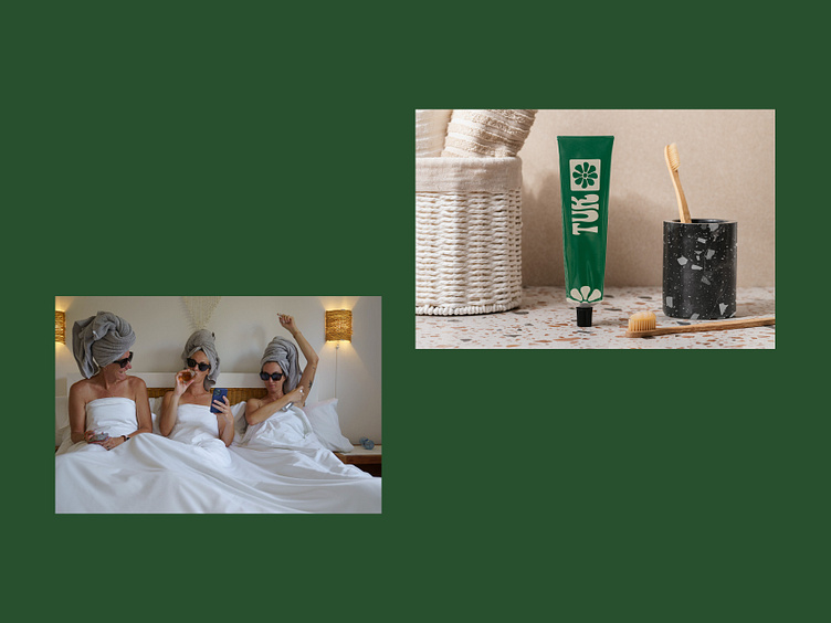
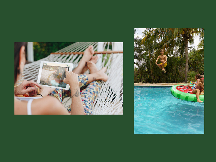
BRAND IN ACTION
Now the fun part. We used the brand identity to create marketing collateral for the team to use in their campaign and throughout the resort. This included social media, signage, packaging and menus.

OUTCOME
The result of the TUK resort rebrand was a much more fun, approachable and inviting identity. The team were able to achieve their main goal of raising brand status which allowed them to increase suite price and occupancy at the same time. We provided a clear style guide so they can manage their brand in house to our high standards. Merel and Louise were overjoyed as their brand now more accurately represents their warm personalities and hosting style.
