Climes - Brand renovation

The kind folks at Climes came to us with an aim to create a graphical system that would bring in a consistent visual synergy throughout their existing products and services.
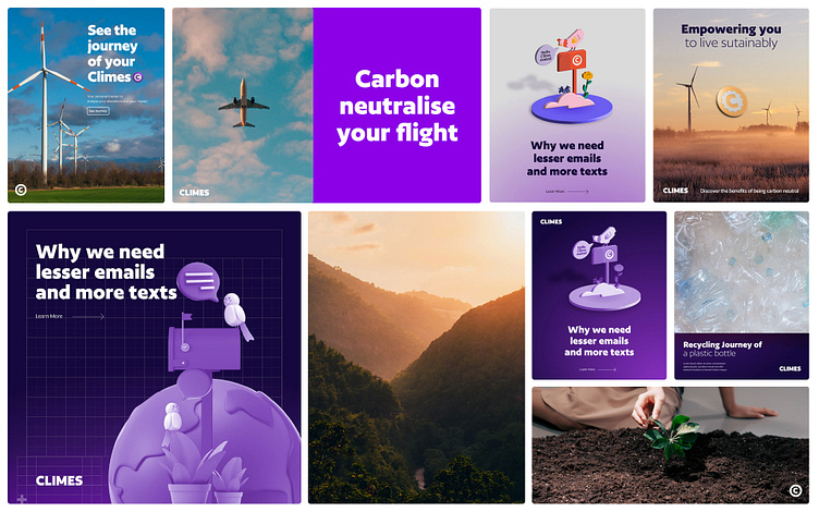
Climes helps people take climate action in one click with tools that offset carbon footprint, thereby making climate action as normal as your morning cup of coffee. We played a part in their efforts by stepping into their world, exploring it, and then making their virtual footprint fresher and more appealing.

The project started as a brand kit design project but eventually it was realigned to be a minor upgrade, a step up in branding. Keeping this in mind, we stuck to the original logo design and simplified it for more legibility and a sharper look.
The overall look and feel of the brand was reimagined from ground-up and the result speaks to the fresh, bold new generation of climate conscious consumers.

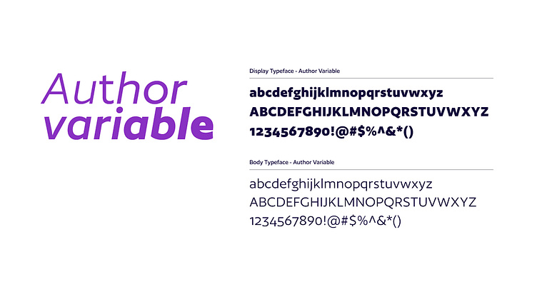
Power Purple remained as their primary colour along with a few secondary colours to keep the branding flexible for future products/services. Author was used as the primary typeface due to it's powerful presence and legibility.


We created a system of icons and a library of assets and also a step by step guide on how to create and or use the pre existing assets from Stock websites.
The goal was to keep the design process simple so that the design team at Climes can take it ahead and create various extensions using the guideline we established.

The team took ahead the groundwork we layed out and applied the system to all of the existing web pages and communication channels. The brand transformation was a result a fun, collaborative and cohesiv efforts and we hope you like the results.

