


Citrus Brand Identity Design

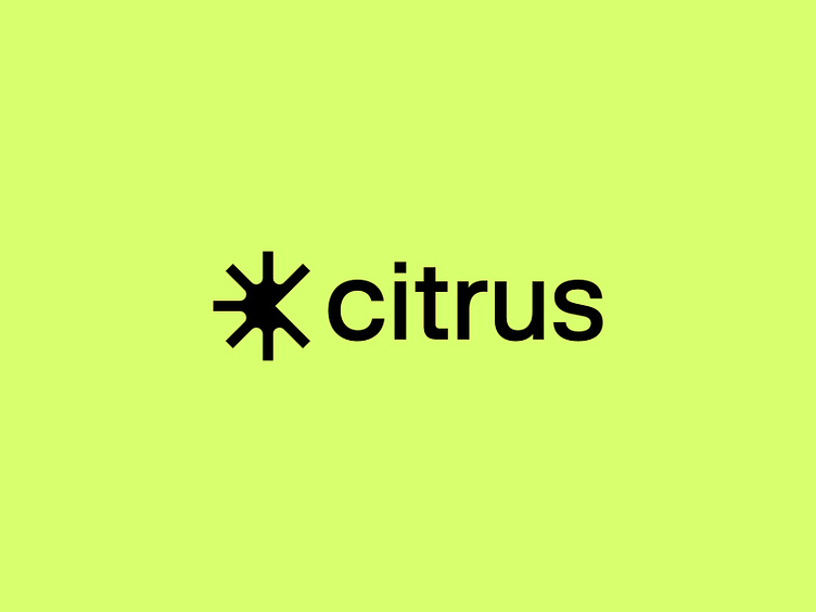
The name Citrus is derived from the "Howey case". For the brand symbol, we created an abstract C shape from an inversion of a citrus fruit. The repeated nature of the mark is indicative of inclusivity and wealth-building.

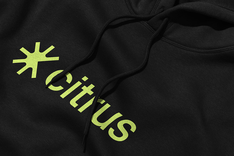
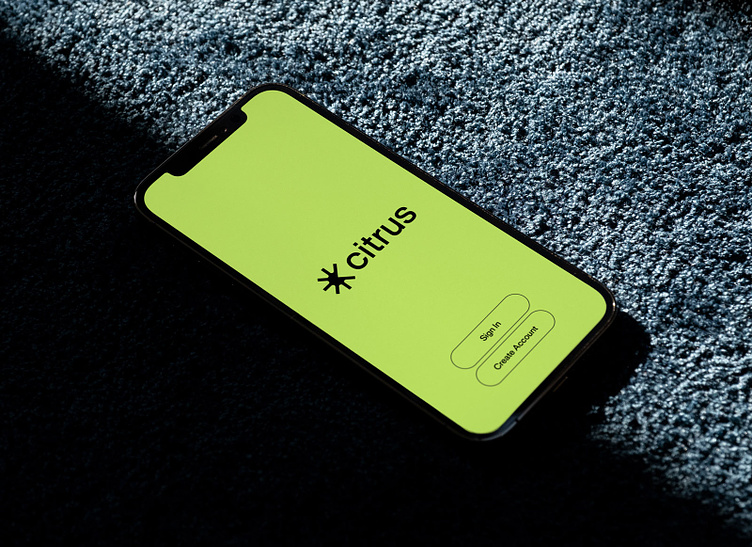
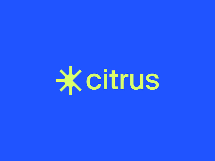
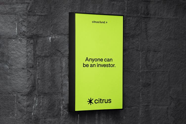
Because Citrus is for everyone, we wanted simplicity and usability to be hallmarks for the identity. We created a standard for the use of single, flat color layouts that place an emphasis on content and directing the user. This also signals to the simplicity of the platform.
Looking for help with your brand?
Let's work together! → hello@andrewwiseman.co