SpaceCard Mobile UX

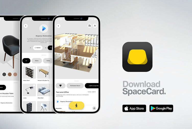
The SpaceCard user is required to download the mobile app as part of the purchase of a VR visor which begins in the mobile or ‘vertical’ state. The mobile UX had within it user stories that started with device calibration and once completed, would begin the vertical version of the app designed around space selection.
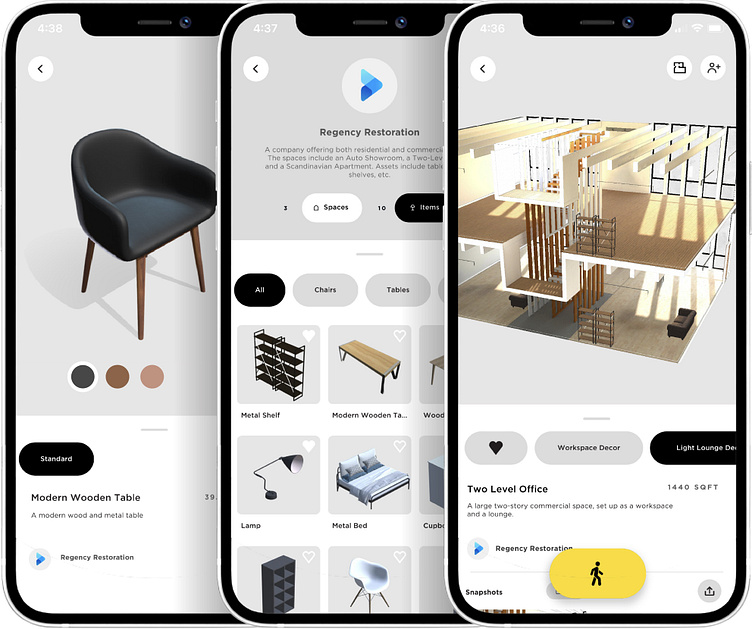
From a UI design perspective, we wanted to mimic an instagram-like experience where various spaces would be shown in an infinite scroll manner. Once selected, each space would be shown in a 3D preview that rendered the space in a dollhouse perspective allowing the user to ‘jump in’ with a yellow walking symbol. This would begin the transition into VR mode.
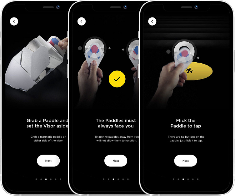
Once the user has selected to begin a VR session, they need to be onboarded with SpaceCard’s controller or ‘paddle’ system. This is an onboarding process that gets the user comfortable and familiar with using controllers in VR. Because the controllers were magnetically latched onto the sides of the visor, they were more a part of the visor design as opposed to standalone controllers like in most VR systems.
We decided to first familiarize the user with the location of the controllers by grabbing them and familiarizing themselves with their shape and function before they had the headset on. This experience would be guided by an animated tutorial with voice overs while the smartphone was still in vertical mode.