Salt

How we gave the Salt brand an edge - literally.
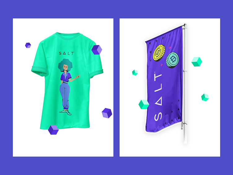
As an early-stage company with a small in-house marketing team, Salt saw the benefit of scalable, high-quality design and decided to partner with Superside to develop a brand guideline, a library of icons, character designs, and a collection of images for all their future marketing needs.
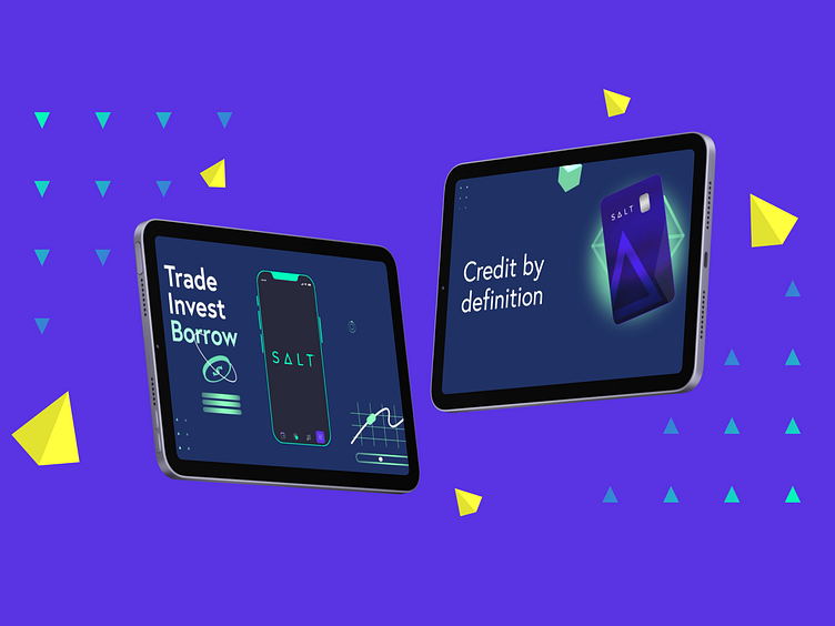
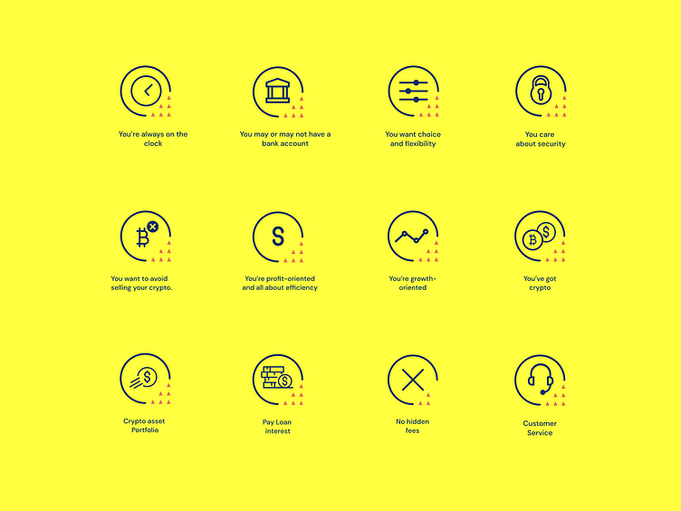
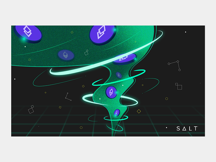
Being a lending and borrowing platform for crypto assets, Salt needed its brand to represent a sense of security. We translated the triangle in the brand logo into icons which were used across all their marketing materials to ensure consistency.
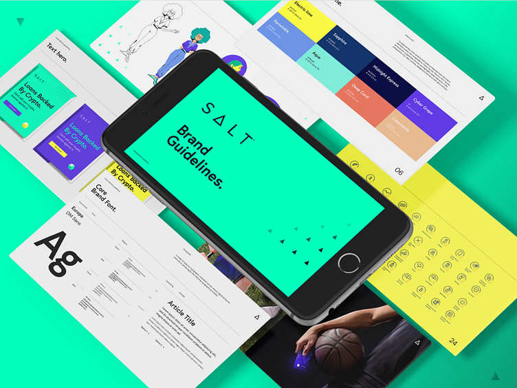

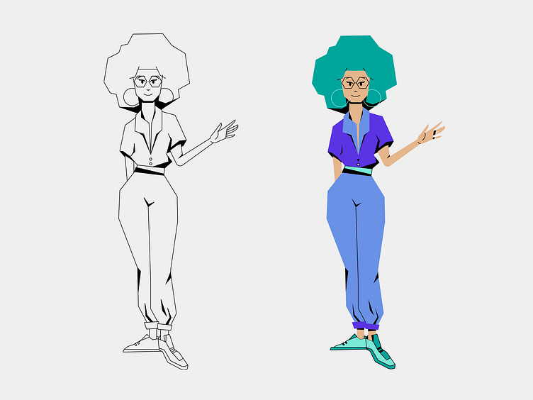
Wanting to stand out from its competition who favored more stock illustrations, Salt showed a preference for 60s-style comic book illustrations. We used black lines and dark strokes to represent shadows and ultimately achieve a brutal, angular feel.

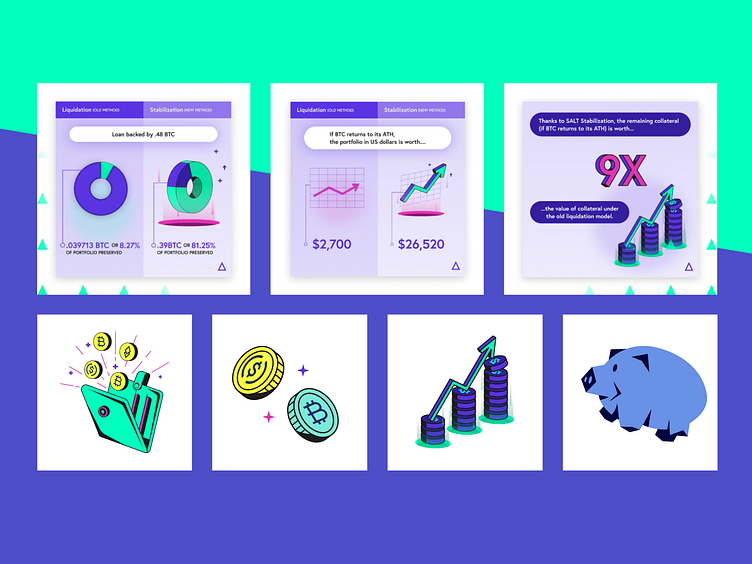
Using these illustrations, icons, and brand guides, we created templates for the primary website pages. The retro illustration style was reflected in charts, numbers, and objects making the usual boring financial data appear more cartoonish, minimalistic, and easy to digest.
Creative Lead: Vlad Hrynchuk, Esteban Guillen
Design: Natalia Destefano, Mercedes Caamanio
Illustration: Catalina Canizales, Miguel Ledesma
Animation: Miguel Silgado
Creative Project Management: Camila Garzon, Fabio Chaves, Laura Cervantes
Please visit: saltlending.com