Multiverse Comics / Dashboard design

About the Project
I created this project as a part of Hype4 Academy's SaaS product web design course. This is an admin dashboard design for a fictional New York comic book/geek store chain, Multiverse Comics. (Think of Forbidden Planet in London.)
The whole process took a few weeks, and after that, I got some feedback from Michal, the tutor of the course. I've implemented most of his recommendations into the finished product here.
The Logo
I've designed the logo of Multiverse Comics. It's relatively simple, and represents three planets, the immense variety of comic books, and the multiverse.
Dashboard
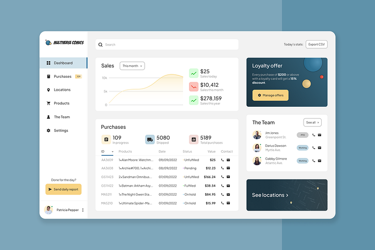
This is the first screen I've designed. It's basically a high-level overview of what the whole web app would be capable of, and it's also the first page you see after signing in.
This page informed the color scheme, layout and typography of the later screens. I wanted something clean, that's not too flashy, but still thematically accurate: since this design is for a comic book store, I wanted comic books to inform the colors. And since it's for a New York chain, Spider-Man was the obvious choice. 😇

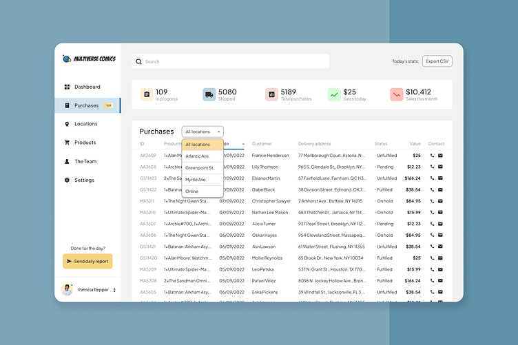
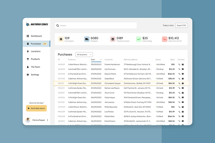
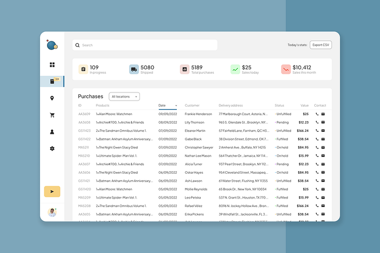
Purchases
Designing tables is always a bit of a struggle. They have to represent data in a usable way. I believe I have succeeded in designing something that achieves this requirement.
You can order the table by the labels, like ID, Products, Date, Customer etc. While you can also filter the data entries by locations. Hovering activates a yellow highlight over the rows, while collapsing the menu on the left gives you more screen real-estate.

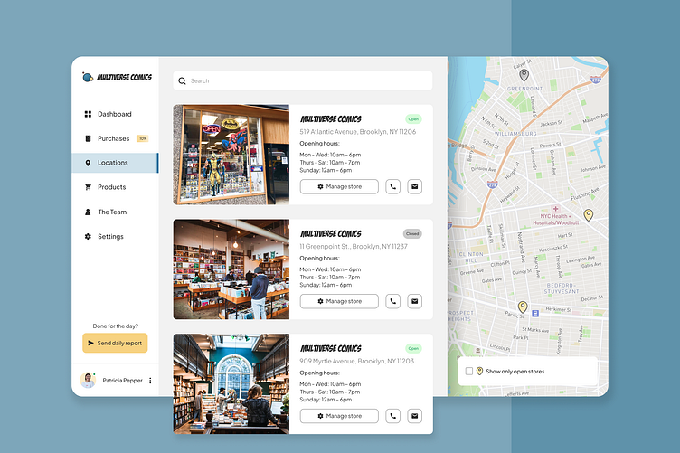
Shop Locations
This store chain has 3 locations in London, so it's important that a manager can, well, manage these from the admin site. I would imagine these card would be on the Contact page of the chain's website, minus the "Manage store" buttons.
The map would be available in light or dark colors as well.

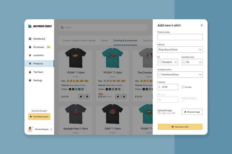
Products
Handling and filtering many types of products could be a challenge, but I believe I've found a suitable solution. On these screens, you can see some product cards with some T-shirt designs. Adding a new product would be quite easy: clicking on the bottom right card would open a modal with a simple form where you can set the name of the product, the colors, and even the percent of discount you want to apply to it.
An alternative to the menu on top would be to use a dropdown next to the search bar. This would provide more space for the cards.


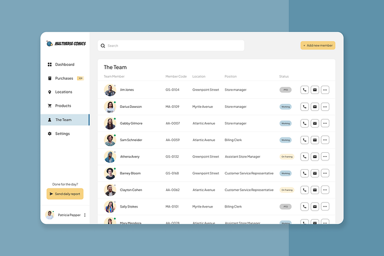
Employee Management
Multiverse Comics doesn't have employees, it has team members like many good superheroes do. And supervisors/HR people need some way to manage The Team. This page allows them to do just that. They can see which store they're working in, what's their position and their status, and can call or e-mail them. They can even add new members, using a relatively short and easy form.
I admit I had a lot of fun coming up with the names of the Team Members, making them sound as comic-book-y as I could. 🫠

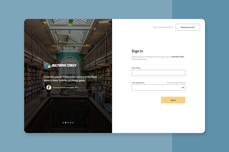
Finishing Touches
After I was done with the majority of the design, I created the login screen. I wanted it to feel friendly, showing some nice reviews on the left. Positive feedback is always important. 💛

Conclusion
Overall, this project was great, I did a lot of things I haven't done before, so I feel like it was definitely worth it to try my hand at a SaaS product. ☺️
If you have any questions or feedback, feel free to send them my way, or contact me at hello@adamsarpatki.com. 😊