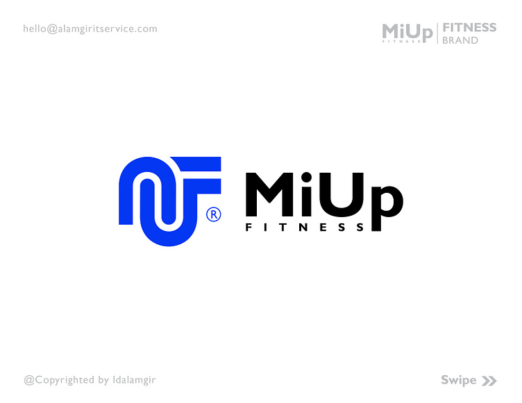
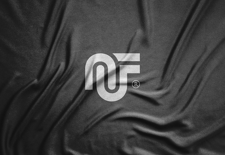
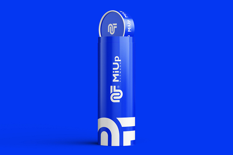
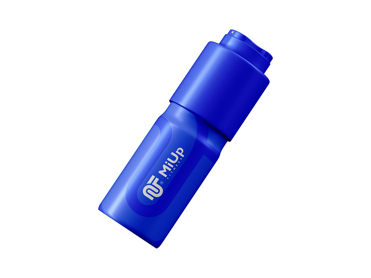
MiUp FITNESS Logo | Fitness Branding

Get fit with MiUp Fitness! Our logo features the letters M, U, and F, for a strong and stylish brand

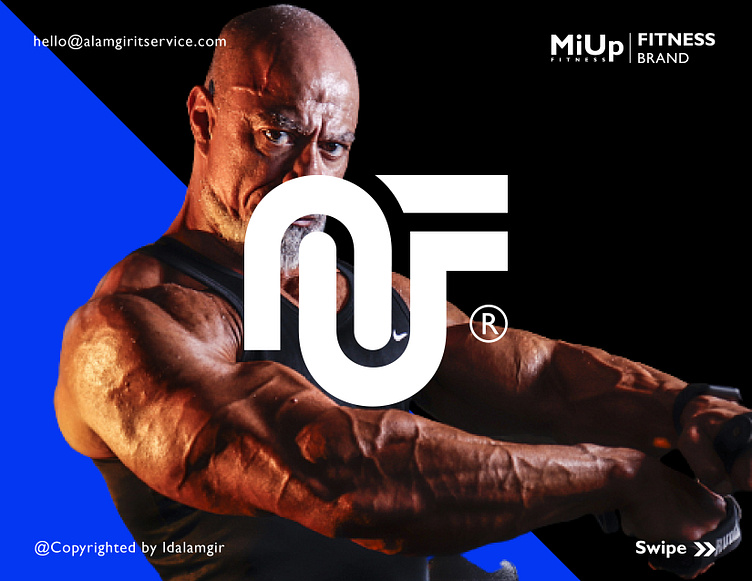
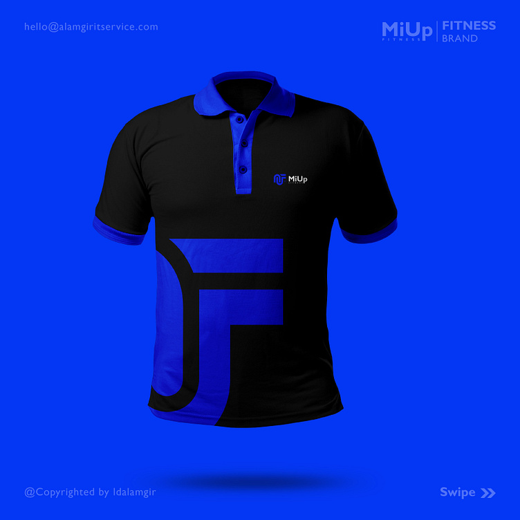
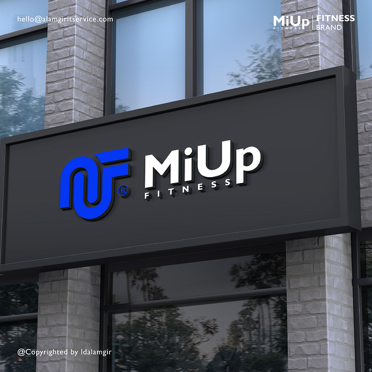
The design is sleek, bold, and minimal, which are my preferred characteristics in a logo.

I trust everyone is having a productive week filled with energy and momentum! What do you think?

Introducing our new fitness logo! It incorporates the letters M, U, and F, to represent our commitme
Looking for a fitness brand that's both stylish and effective? Look no further than MiUp Fitness!
Featuring the letters M, U, and F, it's a stylish and meaningful design. 💪🏋️‍♂️👍
That's why our logo incorporates the letters M, U, and F, for a strong and inspiring brand mark.
Our fitness logo is a bold and stylish symbol of our commitment to helping you achieve your goals.
With our new fitness logo, we're ready to take on any challenge! Featuring the letters M, U, and F
Our logo features the letters M, U, and F, for a sleek and memorable design.
Our fitness logo is the perfect symbol of our dedication to helping you achieve your goals.
"At MiUp Fitness, we believe that fitness should be both challenging and rewarding.

What do you think about this Concept?

Leave a comment and press (💖) if you like it.

🤑 Available For Sale 🤑

👇 Contact me if you need similar Logo, Contact Me 👇

Email Whatsapp

👇 Follow Me On 👇

Website Instagram Linkedin Twitter 

More by ✅Alamgir H. | Logo Designer

View profile