Case Study: Moon - NFT Marketplace App

The Brief
Client
MOON is a new up and coming startup with the goal of revolutionising the NFT marketplace business with a design-first approach and a deeply curated experience for its users.
Objective
Establish the visual language of this new NFT marketplace app ready to revolutionize the digital art scene. First, lock a visual aesthetic and then scale the design on multiple screens based on the wireframes and the flow provided by the client. Finally, build a UI Library of the final UI and create a functional prototype.
Audience
The audience of this project is all those people embracing and following, in one way or another, the world of NFT and digital art. So we’re talking mainly about tech-savvy people that know their way online and in the world of crypto, and NFTs, with also a strong sense for visual aesthetics and art; they value curated and beautiful experiences as much as they do with the digital art that they create, buy and/or sell.
Deliverables
New visual language.
Fully designed flow in High Fidelity.
UI library.
Functional Figma Prototype.
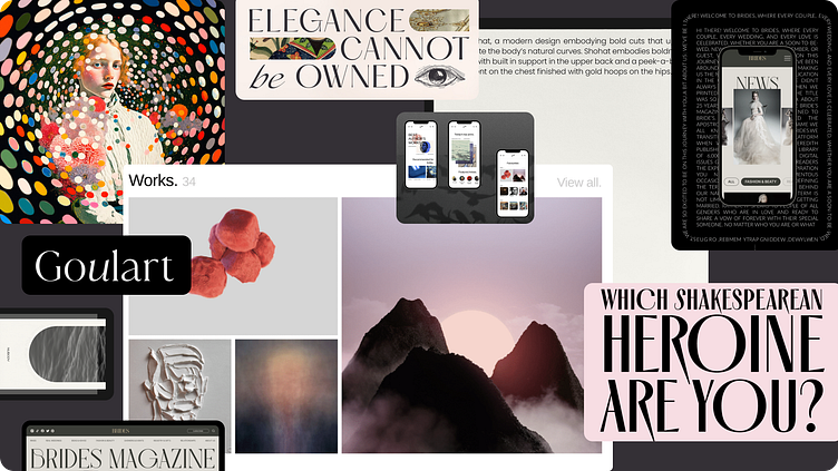
Moodboard
Inspired by the symbolism in the word MOON, I wanted to explore the ethereal lightness, desires, and the many things not shown below the surface that may not be apparent even to ourselves. Something that is almost too delicate and tangible, yet seems too perfect for this world.
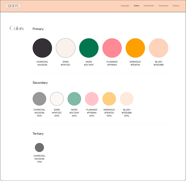
From this moodboard I explored a modern elegance theme with clean lines, soft expressive typography, and a focus on legibility and usability. I was inspired by the pastel dots from a painting for the color palette. Using "windows" as an ode to see "within" as designs for the NFT artwork cards. As well as curating the use of typographic styles to a modern take on editorial design, but for the NFT market.
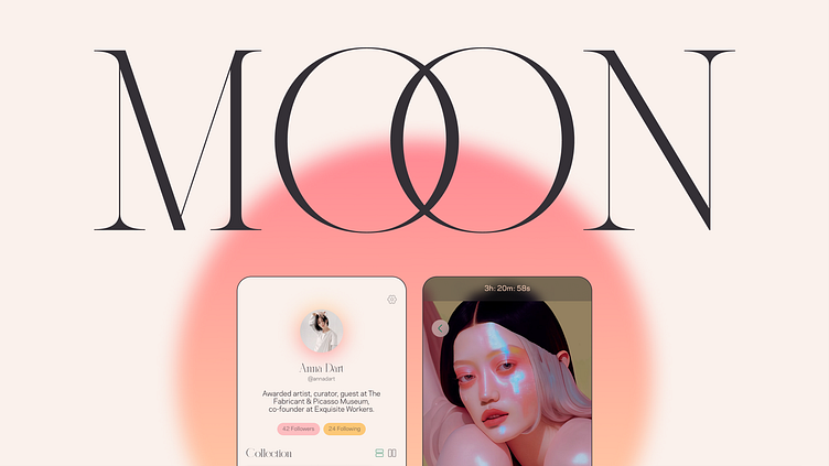
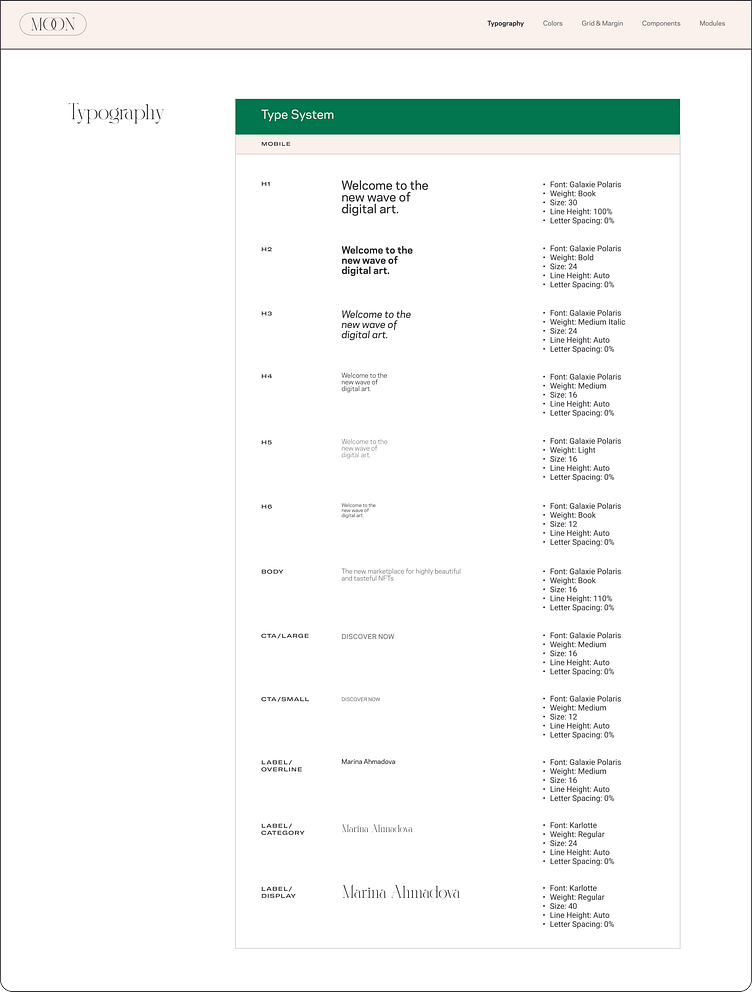
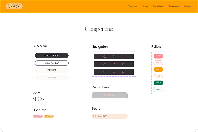
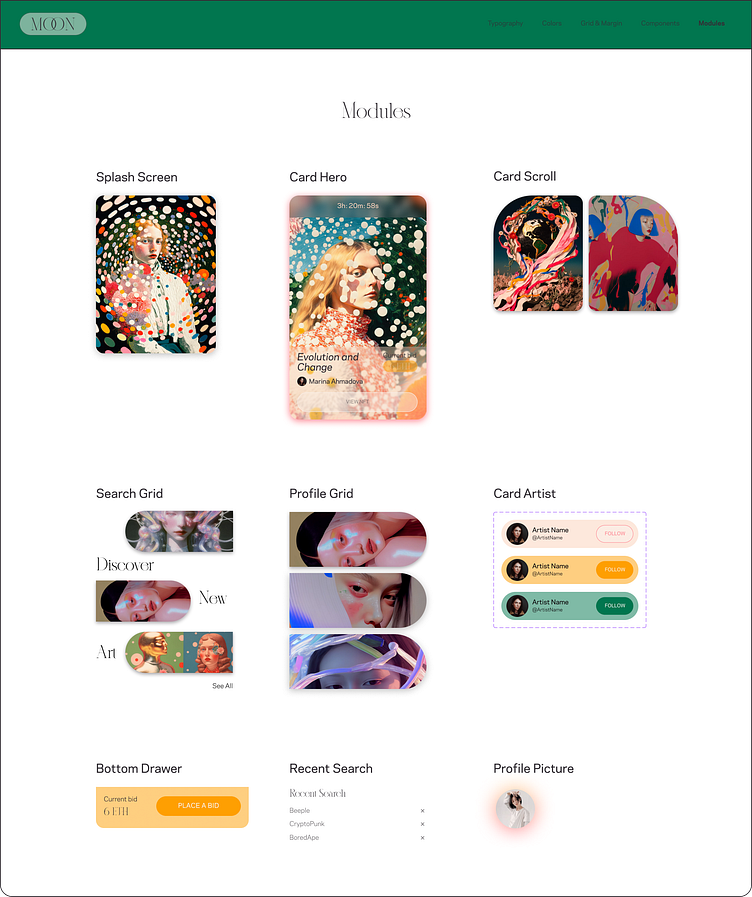
Styles & Visual Langage
A visual language was created to develop a branded look and feel that could be scaled on all wireframes.
Design Approach
NFTs come in a wide range of categories, styles and colors, so instead of focusing on a platform that caters to all. I felt that MOON should be an exclusive app with the focus on its symbolism and curate an ethereal space for NFT creators that fall under the gaze of elegance, soft, delicate and beautiful.
The UI design should revolve around softness, highlighting the content of the marketplace with a halo-likeness effect. The interface design is legible and clean so it does not detract from the NFT artwork.
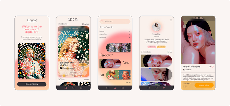
Lock & Scale Design
Takeaways
Through this Case Study, I've learned the value of establishing a visual language and scaling it consistently across multiple screens. It is essential for creating a seamless user experience. All the while, creating the design system and prototype for this NFT marketplace app. I've enjoyed every bit of the process despite meticulously contemplating wireframes and user flows back and forth. It's all part of the process... isn't it?
Credits
The beautiful artwork seen in this Case Study can be found below.
@marin_ahmadova
https://foundation.app/@Marina_Ahmadova
@annadart
https://foundation.app/@annadart
@moonchildtamoo
Contact
If you'd like to talk more about this Case Study, collaborate, or just wanting to make a new friend :)
I am available for hire.
More about myself can be found here