Neo Brutalism Tinder

Neo-brutalism is a new design trend that has been gaining popularity in recent times. As a designer, I was intrigued by this trend and decided to experiment with it by redesigning the popular dating app Tinder.
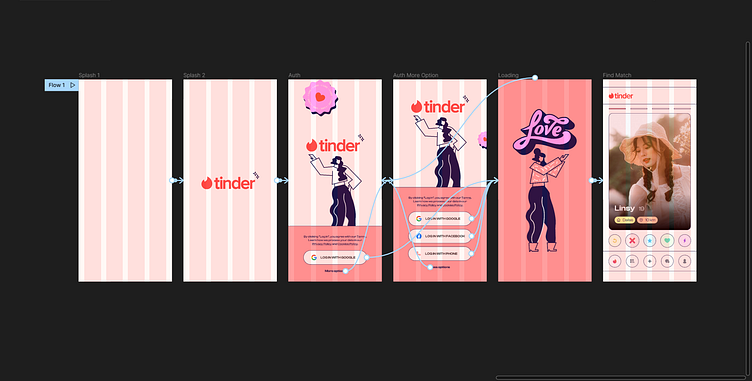
The first step was to create a splash screen that would set the tone for the entire app. I used pastel colors, which is a departure from the typical bright and bold colors often associated with Tinder. The pastel colors create a sense of calmness and tranquility that is often missing in dating apps.
The next step was to create the rest of the screens for the iOS version of the app. I continued to use pastel colors throughout the app, and I also incorporated brutalist design elements such as large, bold text, simple geometric shapes, and asymmetrical layouts.
One of the key features of the app is its simplicity. I wanted to create an app that was easy to use and understand, even for someone who has never used a dating app before. The minimalistic design, combined with the pastel colors, creates a user-friendly and approachable interface that encourages users to explore and engage with the app.
Another important feature of the app is its emphasis on user privacy. With so many concerns about data privacy and security these days, I wanted to create an app that prioritized the safety and security of its users. I achieved this by using a simple and straightforward interface that clearly communicates the app's privacy policies and encourages users to take steps to protect their information.
Overall, the neo-brutalist design of the app creates a unique and engaging user experience that is unlike anything else on the market. By combining the simplicity and approachability of pastel colors with the bold and striking elements of brutalist design, I have created an app that is both aesthetically pleasing and highly functional. Whether you're a seasoned Tinder user or someone who is just dipping their toes into the world of online dating, my neo-brutalist redesign of the app is sure to impress.
Overall, the neo-brutalist design of the app creates a unique and engaging user experience that is unlike anything else on the market. By combining the simplicity and approachability of pastel colors with the bold and striking elements of brutalist design, I have created an app that is both aesthetically pleasing and highly functional. Whether you're a seasoned Tinder user or someone who is just dipping their toes into the world of online dating, my neo-brutalist redesign of the app is sure to impress.