Nspace: Case Study


The Brief
The client for this project is Nspace, an up-and-coming startup with the goal of revolutionising the NFT marketplace business with a design-first approach and a deeply curated experience for their users. The objective was to establish a visual language for the NFT marketplace app, create a visual aesthetic, and scale the design - all based on the wireframes and the flow provided by the client.
The challenge for this work was creating a design for an audience who are tech-savvy and value good design - they possess a strong sense for visual and art, and Nspace wants to provide them with a beautiful app experience which also presents the digital artwork as the central focus.
Moodboarding
Throughout my research, I observed that other NFT marketplaces were often applying a futuristic, sleek, and dark UI design look and feel.
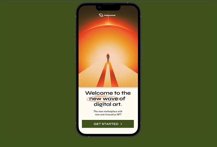
My goal was to differentiate Nspace from the rest, so I explored a contemporary modern, clean and light design. I wanted this to be a place where you can discover and explore high quality NFT's, while also providing a easy to use, approachable, and beautiful feel. These visuals include square edges on elements, as well as a light background colour and dark type.
Visual Exploration
My initial design explorations had a similar look and feel that I wanted to get across, now it was time to hone one of them further. I went with Concept 01 in the end and began to explore all of the design systems required to turn this into a more final concept.
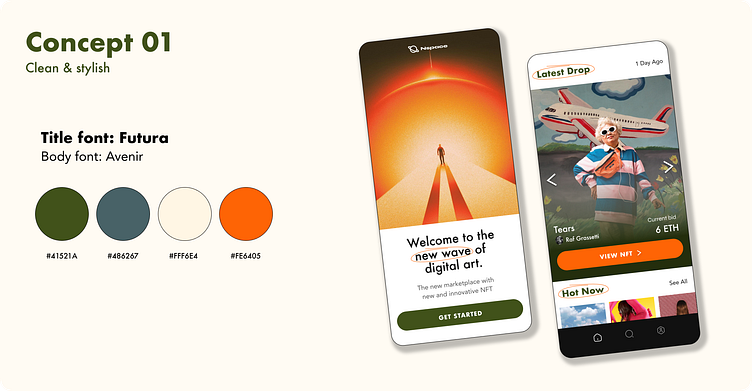
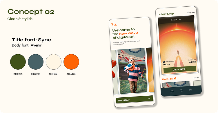
Colours, fonts and style
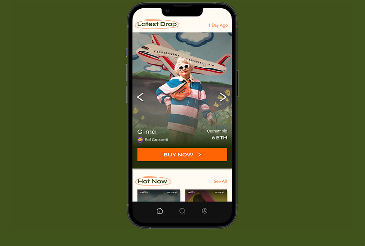
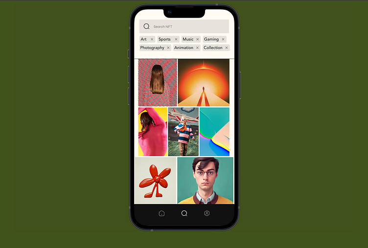
A bright and simple colour palette was selected in order to allow the digital artwork be the central focus for users. Syne was used for headers and the CTA's and Avenir was used for body copy and overlines.
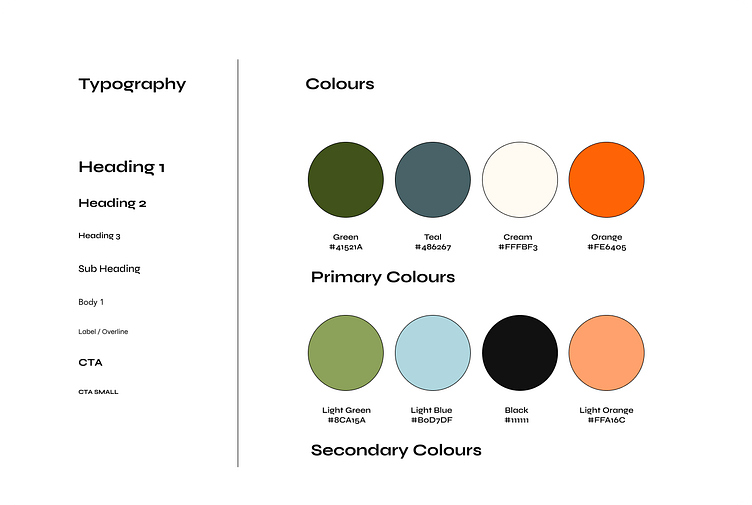
Scaling the visual language
Once my design exploration was selected and cleaned up, the type and visual styles were applied to a design library in Figma and applied to other components and screens.
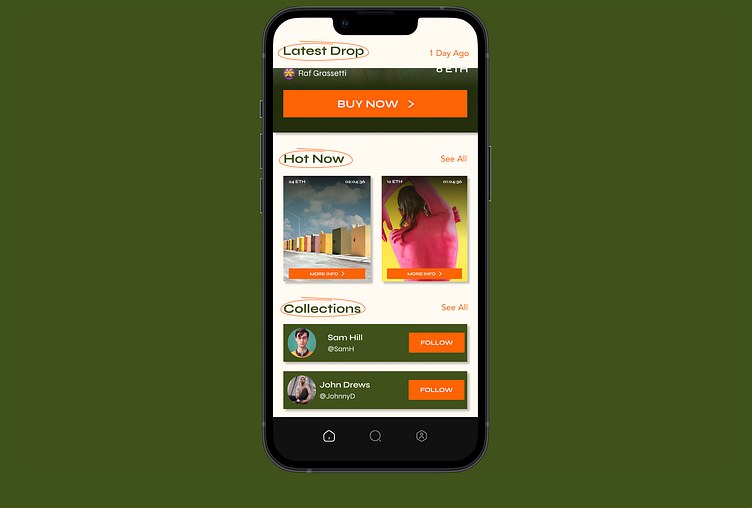
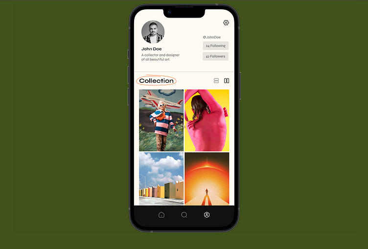
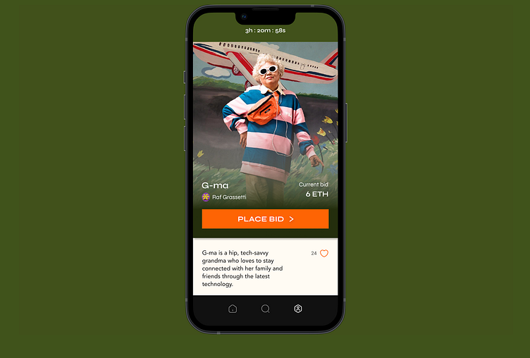
Each variation of the screens aimed to bring the brand identify to life while maintaining a consistent visual language, with each NFT card displaying the art in a large full width format and squared edges, this really did the job of showing off the NFT's and allows the viewer to really see them.
Each main card was also given a lightly elevated feel with a drop shadow with deep blur and low opacity, which gave each piece of artwork a bit more interaction affordance and creates a contemporary feel when interacting with the app.
A bit more colour and texture was added to the overall layout by applying a some pops of colour to the CTA buttons.

Final Design
I introduce to you Nspace, a new NFT marketplace with a clean and clear UI design that provides users a place to explore and discover new and innovative NFTs.
This work is the result of a Dribble UI Design course in 2023. Thanks for the great instruction from Daniele Buffa and excellent mentorship and feedback from Taya yamenko throughout the course. I learned so much about UI Design process and many new tips and tricks about using Figma along the way.