Solaris Energy Branding


Hola Folks 🙋♂️
Solaris Synergy's brand identity portfolio combines sun elements with geometric concepts to showcase innovation and sustainability in renewable solar energy. The design features clean lines, shapes, and bold colors, with a stylized sun logo and modern visual language that reflects the company's commitment to a cleaner future.
Contact us to get your logo design or branding project done
Email: rukurustudio@gmail.com

Ideation → The logo concept for Solaris Energy was developed by collecting ideas and researching the brand's values. Using brainstorming sessions and digital tools, designers created a modern logo with a stylized sun and bold typography that reflects the company's commitment to sustainability and innovation.

The Logo → Solaris Energy's logo variations were designed to be versatile and adaptable to different contexts.
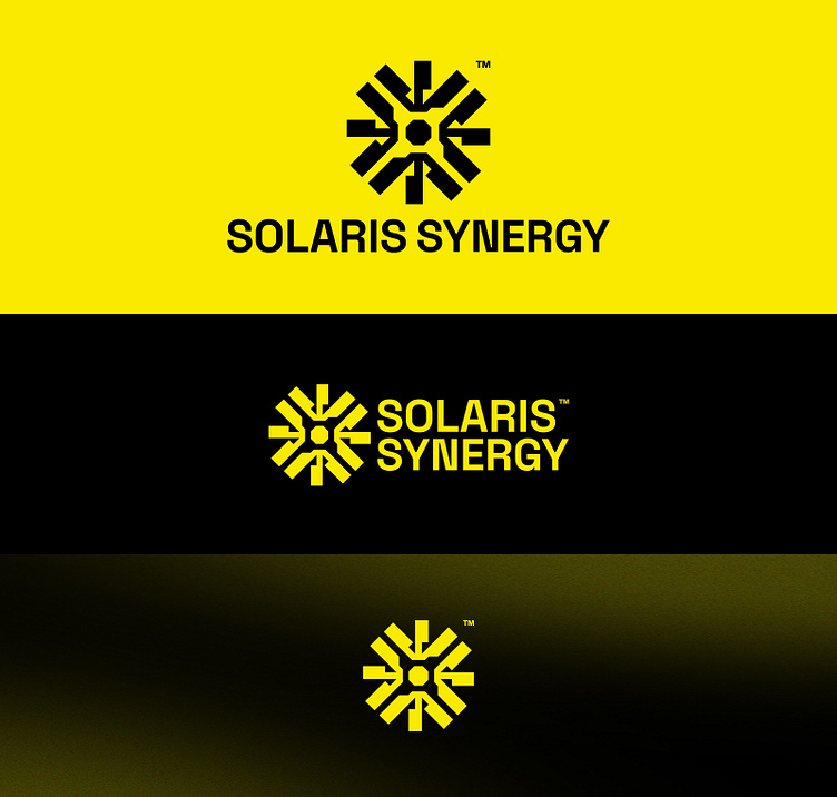
Typography & Color → The Space Grotesk font and yellow as the primary color were chosen for Solaris Energy's branding to convey a modern, clean, and optimistic image that aligns with the brand's commitment to sustainability and solar energy.

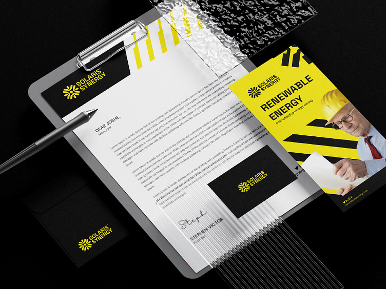
Implementations → Solaris Energy's logo has been used consistently across their website, social media, marketing materials, and product packaging to create a memorable and recognizable brand identity. The logo's adaptable design ensures that it maintains its visual impact in different media contexts.


Please share your thoughts!
Contact us to get your logo design or branding project done
Email: rukurustudio@gmail.com
Find us on:
Behance | Instagram | Freelancing Platform 99Designs
© 2023 Rukurustudio | All Rights Reserved.