RedShelf Inclusive Access

Insights and communication for inclusive access programs in higher ed.
Project Goal
The Inclusive Access Dashboard delivers actionable data and communication tools about student participation in an institution's distribution program. The goal is to drive higher sell-through for publishers, and allows institutions to negotiate lower course material prices for students.
Team
I was responsible for experience and interface design, working in collaboration with our product manager, engineering team, and accessibility director.
Timeline
Initially designed in fall 2020; beta launched in spring 2021.
Before
The existing iteration was slow and buggy, and suffered from a number of experience flaws. Users didn't know how to access the most important information, and RedShelf employees ended up managing the process for their clients. Additionally, bookstore managers requested easy access to critical data that would enable them to aid their students in getting cheaper textbooks.
Interviews
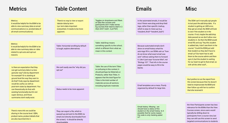
Because our account managers were tasked with helping their clients through the process when things go wrong, we went to them first to discuss pain points. This was a huge business concern for RedShelf; fixing the dashboard's functionality would free up literally hundreds of hours per week all told during critical times in a university's term schedule.
"Term data is so important everywhere. It needs to be more apparent. Otherwise we have a terrible mixture of courses across all time. That’s not how we work."
-RedShelf Account Manager
"If I send a message to 500 students, I get 500 rows. I have tens of thousands of pages of email history to navigate through."
-RedShelf Content Manager
"I hate horizontal scrolling on tables! It’s impossible in the current experience to keep track of what I’m trying to scan for."
-RedShelf Sales Team Manager
Site Map
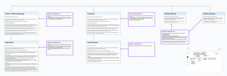
We came out of those meetings with a lot of actionable feedback. After organizing them into "items to consider" (above), we started to figure out how we could update the site hierarchy to provide a more predictable experience.
I started by creating a site map of the existing product, and I found that the hierarchy was extremely flat, which created a fair amount of confusion on the user side.
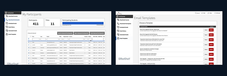
Instead, I took a page from MailChimp and bucketed what we were now referring to as "Campus Insights" into 1. Participants/Sections; 2. Emails; 3. Insights. In addition to a hierarchy, of vital importance for planning was deciding what each page's distinct purpose was, as well as an entire list of items and actions that could be taken on the page. This is also where we noted question marks for stakeholders and challenged some of our own assumptions.
Medium-Fi Wireframes
Wireframes are a really important part of the process. This helps us to start illustrating functionality to engineers and getting on the same internal page with how a pattern should function with stakeholders, and we can iterate quickly from there.
Because we were on a speedy deadline, we used wireframes to quickly validate assumptions with stakeholders and a few close clients and then moved right along. We'd spent a good deal of time putting our design system Talon together, so we were able to spin these up relatively quickly.
High-Res Mockups & Specs
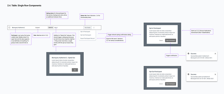
We quickly applied color and exact type and started breaking the project back down for engineers. This is sort of a strange process, to complete a story by breaking it apart, but we pride ourselves on our strong communication of design needs with our engineering team. This was especially necessary given that we were working with contractors in Belarus, who would be doing a good deal of their work while we were asleep, and vice versa.
We were adding components into the design system, as well, so part of this work required spec'ing out generic components that could be used across multiple verticals at RedShelf.
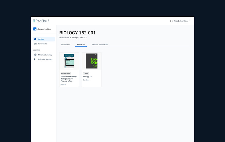
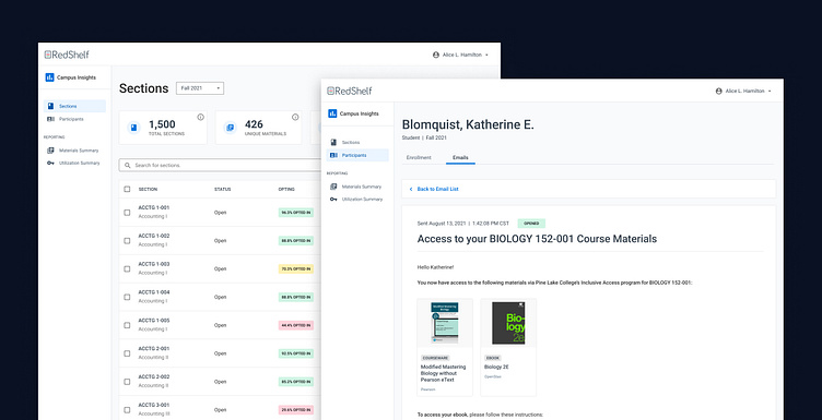
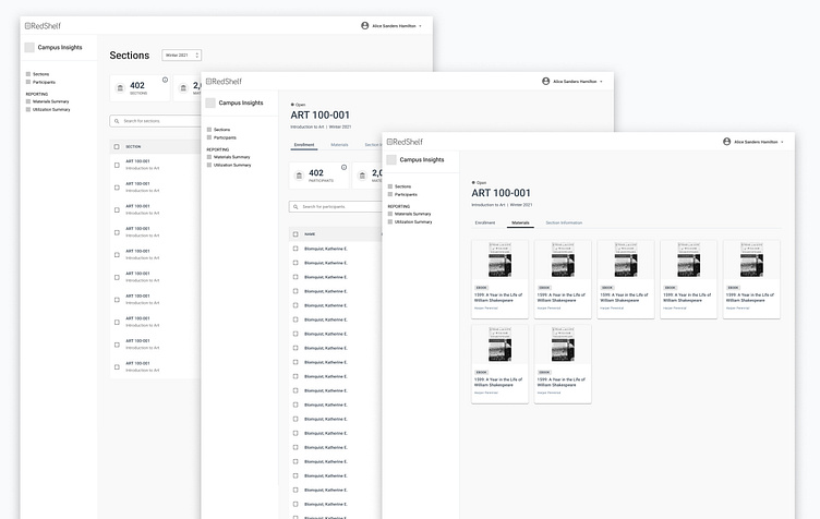
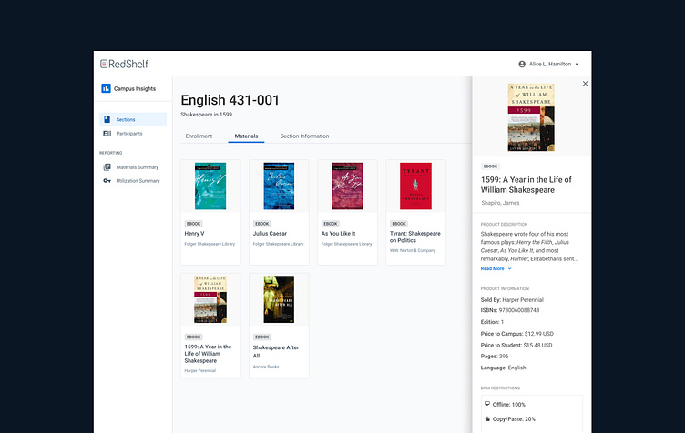
Each section has its own tabbed interface, which allows bookstore managers to drill into tons of precise data on the section and its Inclusive Access status.

We spoke to users and found that their workflows were more complicated and data-dependent than had been assumed. Instead of a happy path, there are so many potential use cases for Inclusive Access, that it’s necessary to have a flexible system that clearly spells out large hunks of data. Instead of separating adoption data from pricing data from enrollment data, as separate verticals at RedShelf had done, we’re bringing it all together to give account managers that insight.
Materials have been added to Inclusive Access Dashboard, giving bookstore managers immediate access to vital data.
Materials are at the heart of the Inclusive Access program, and previously, this information had been siloed into a completely separate vertical. This created a lot of headaches for account managers, as they had to continually navigate between Inclusive Access and Course Manager to help their clients resolve their concerns.
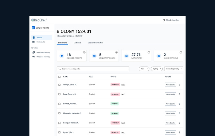
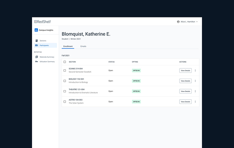
One of the biggest wins has been the addition of a metrics panel to lists.
Again, there’s an absolute ton of data that a bookstore manager could potentially sift through. In order to help answer the question, “What do I need to do today?” we’re giving bookstore managers a high-level overview of the most useful daily data for a list, a section, or a student. Future improvements for the database-to-design connection include being able to compare data on the fly. Right now it just spits out raw numbers; it would be far more useful for a bookstore manager to immediately see, for example, that IA enrollments in a section are down 30% from what they were in the last term. That way they could immediately investigate and resolve any concerns about the program, thereby continuing to help students save money on books.
Here, I’m breaking down the interface for our engineers in Europe, so they can make progress on it while I’m asleep.

At the time of my departure in spring 2021, Inclusive Access Dashboard was getting a test run with a few pilot schools before rolling the changes out to our entire customer base. Our business model was structured in such a way that we have limited opportunities to do user research, so we kept contact with our customer-facing support teams and analyzed data to find customer pain points. After each release, the team had check-ins with those colleagues to view MVP data and prioritize for the next iteration.