Hantarasa - Retail Accessory Company - Visual Identity Design

Hantarasa is an accessory retail company that provides various accessory needs. Hantarasa has its own guiding values within the scope of its brand, which it wants to implement and convey to the audience through a visual identity. Hantarasa believes that visual identity is one of many factors to build a strong brand identity.
Logo Concept

There are certain values that want to be conveyed in a logo. These values are also related to the brand name "Hantarasa". Hantarasa is a combination of three words, namely "hantar" which in English means to send, "rasa" which means feelings, and "asa" which means hope. Hantarasa is a brand that provides various accessory items. With the name Hantarasa, the hope is that through simple things such as accessories, everyone can convey their feelings, communicate what they want to say, and also give hope or aspirations even through small things.
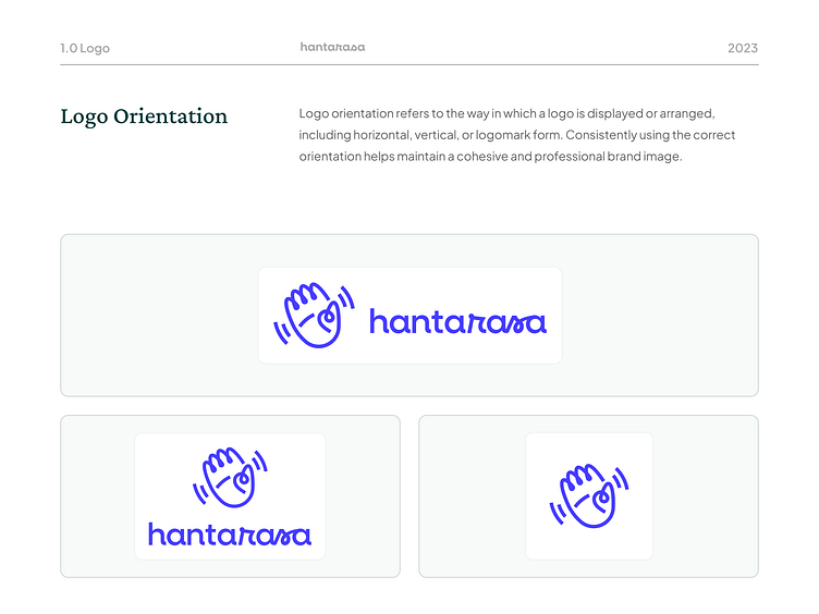
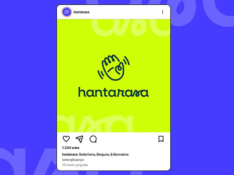
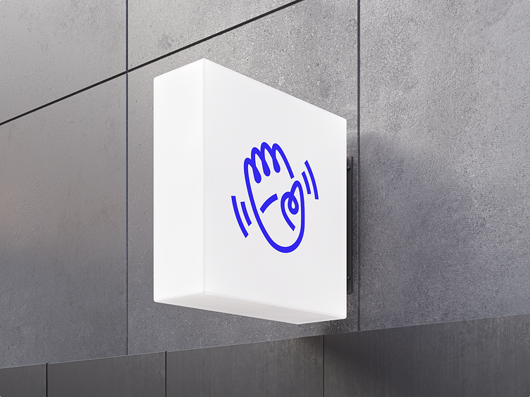
Drawing inspiration from the name and its meaning, the logo is designed to convey the same values or meanings. The logo shape is a combination of a "hand" and a "heart". The hand is a representation of "hantar", while the heart is a representation of "rasa and asa". The logo shape is also made with dynamic connected lines. In addition, the logo is slightly tilted with curved lines on both sides. The style used in this logo is expected to create a pleasant, flexible, and friendly impression.
The slightly tilted logo, with two lines on the right and left sides, is expected to give the effect of a waving hand. As if giving a friendly greeting, or a warm farewell. From this, Hantarasa wants to be a brand that can greet and welcome anyone warmly, and give a good impression, until finally giving a warm farewell with hope for the next meeting.
Logomark Construction
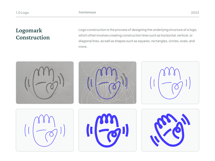
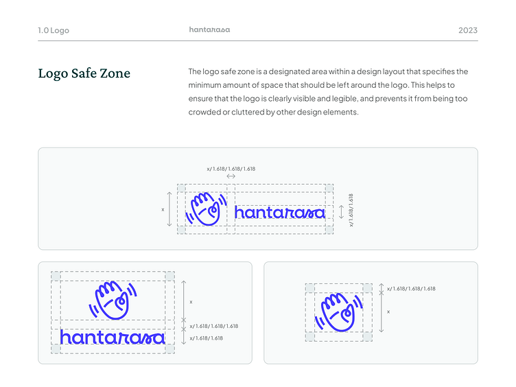
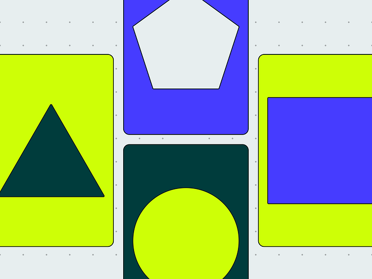
The logo construction process began with sketching on a piece of paper. The digitalization of the logo used construction lines as a guide to create the complete logo mark. In this process, circular and oval shapes were selected as the construction elements to adjust the logo's shape.
I found it interesting that most of the circular and oval shapes in the construction were divided by the golden ratio of 1.618, from the largest to the smallest shapes. This ratio helped me to determine the size of the circles and ovals to be used, and also provided a consistent rule for the construction of each element. The use of this ratio also created a sense of visual harmony in the logo, as each shape adhered to a particular proportion.
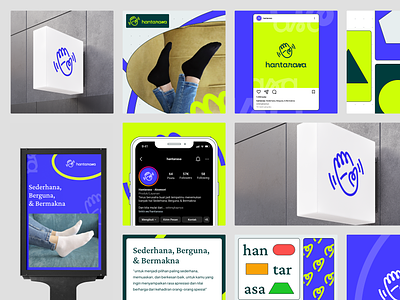
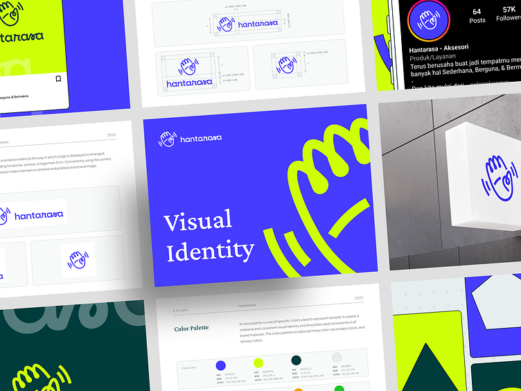
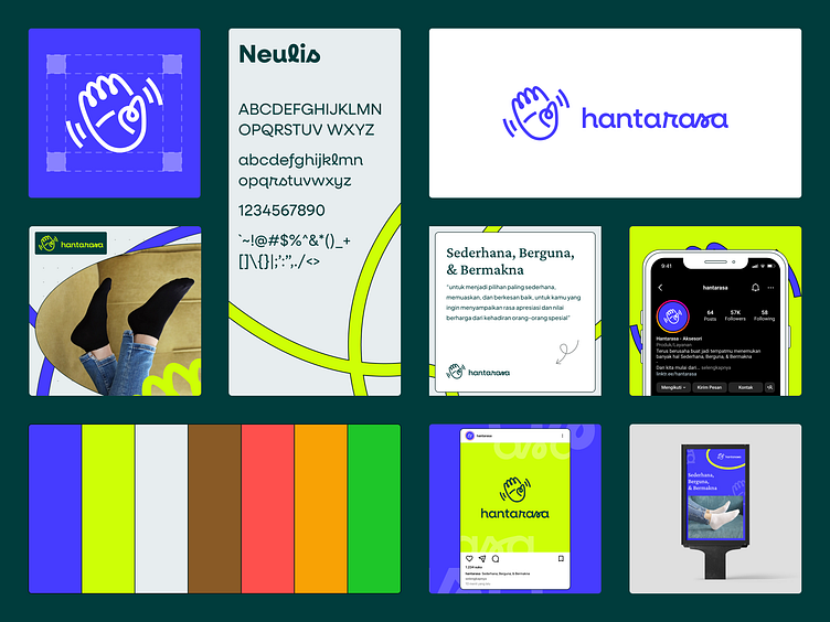
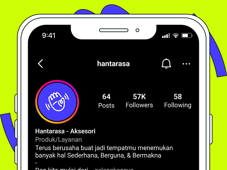
Design Preview


What do you think about my design? I hope you enjoy it.
Feel free to leave comments and feedback. And if you find my work useful and you like it, please don't forget to leave a love and save it. Last but not least, don't forget to follow me to get more updates in the future.
_______
I am also available for new projects. Let's start collaborate!