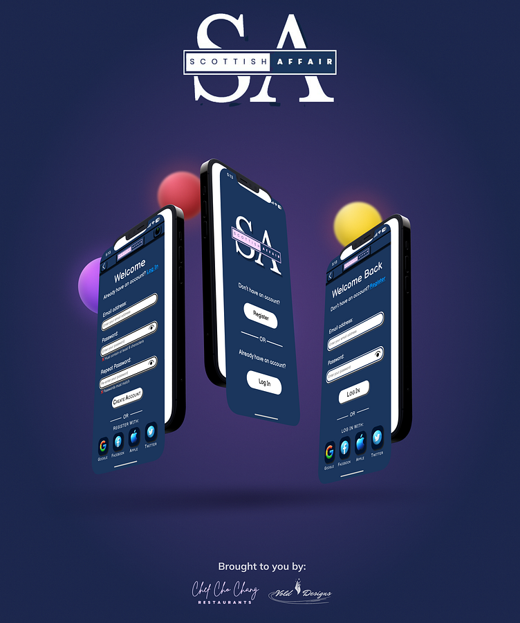
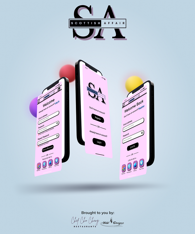
Restaurant App (Scottish Affair)

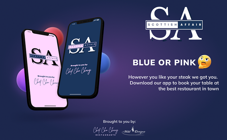
Design for the initial screens you would encounter on a restaurant app (i.e. loading, registration, log in and app access method screens which you can also find on my Instagram page or Behance). Used blue and pink to represent my dark and light theme respectively because:
1. The Navy blue according color theory should help convey a sense of trust and dependability whilst the pink should convey a sense of comfort and elegance. This I believed was best since a restaurant would ideally have all these qualities.
2. Blue and pink are also some the colors used to refer to the extent of which your meat is cooked. So I figured it would nice to factor that age old debate of how you like your steak into my design.
Leave a Like if you enjoy and please use the comment section to offer any feedback/suggestions you have in mind.
Credit: Amirali in Figma community for mockup frames