Opkey logo process


🚨 Available for new projects 👀
Last year, Forge helped the Opkey team rethink and simplify its no-code test automation platform with a new design system and platform redesign. We also worked closely with the Opkey team to update the Opkey brand to represent the quickly scaling company’s vision and world-class no-code test automation platform.
About Opkey
Opkey’s test discovery platform is like no other on the market and it demands a brand to match. Our goal was simple, have Opkey’s brand reflect the company’s speed to innovate on its best-in-class platform with optimism for what’s to come from the team of imaginative industry experts.
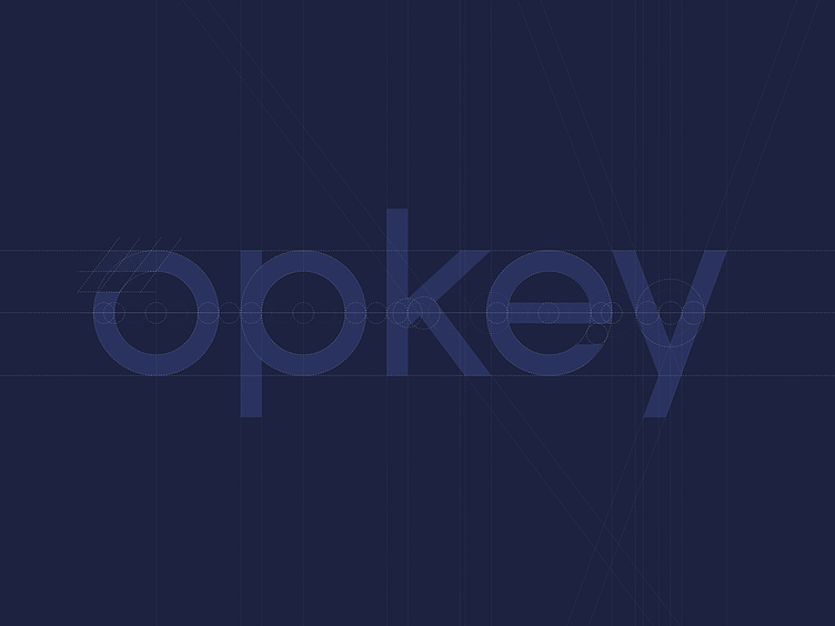
Process
We introduced a round character set that is both friendly and approachable. The circular base represents the endless cycles to create and innovate and is applied to the “O, P, and E” characters.
We broke the closed continuity of the “O” to introduce an open-ended trail of fading colors to represent the speed of innovation—giving us an icon that could stand all on its own.
Looking for research and product design?
👋 Let us know with a DM or at forge.is
👍 More cool Forge projects in our Dribbble profile