Palate Coffee Rebrand

Palate Coffee - Sanford, FL Rebrand
I've been a supporter of Palate for years since I found out that each cup of coffee sold, a portion of the revenue goes towards supporting non-profit organizations that help fight against Human Trafficking.
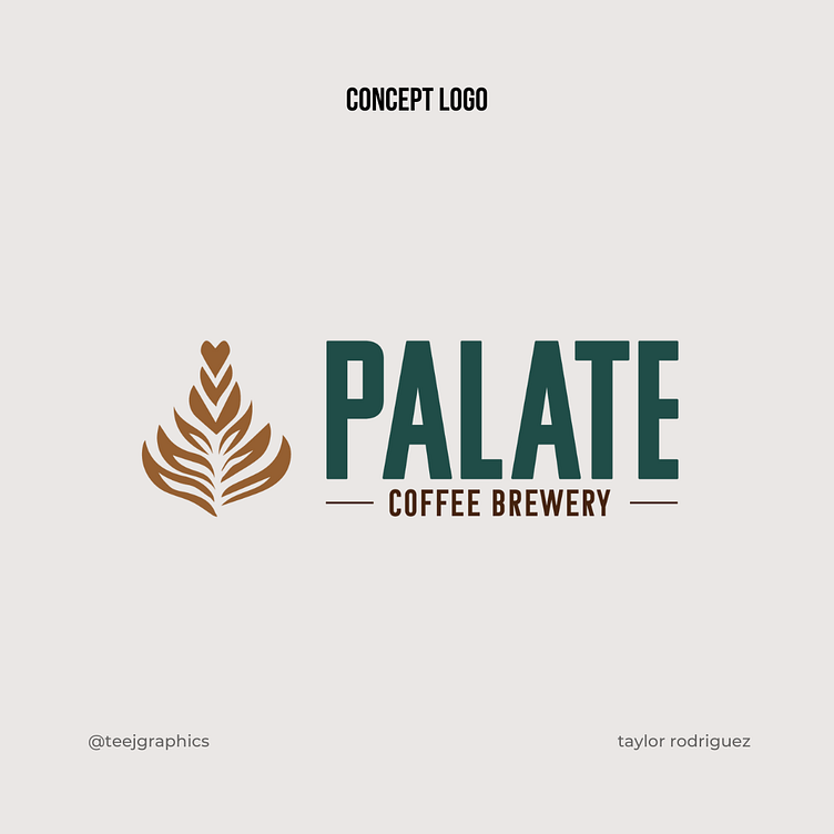
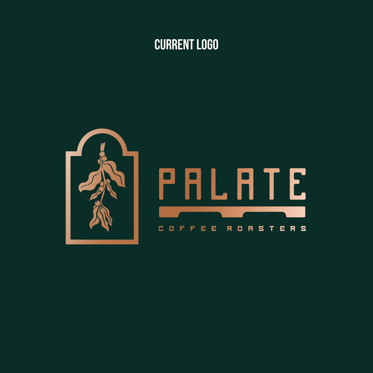
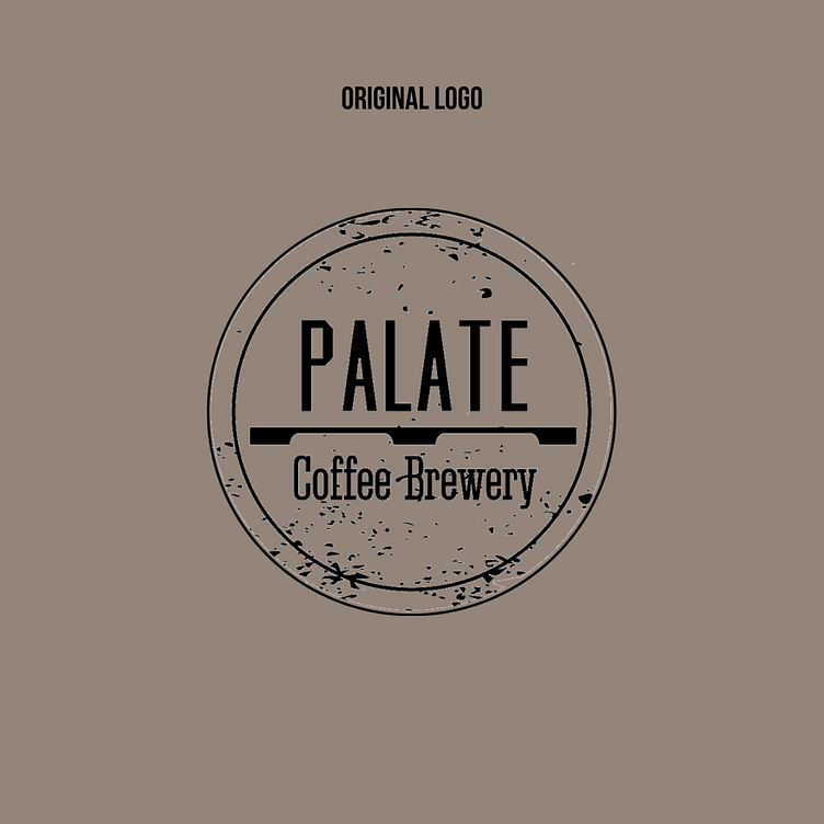
As you can see from the original branding, Palate has done two versions of their logo in the past. For this rebrand, it was important to me to keep a similar typeface that the community would recognize (especially since it's been an established business for many years), but be something that stood out and didn't cause any legibility concerns. Whenever doing a rebrand, it's crucial to understand that regular consumer's of a brand have a perception of what that brand should appear as, so doing a completely different idea is typically not recommended since it might confuse your target audience.
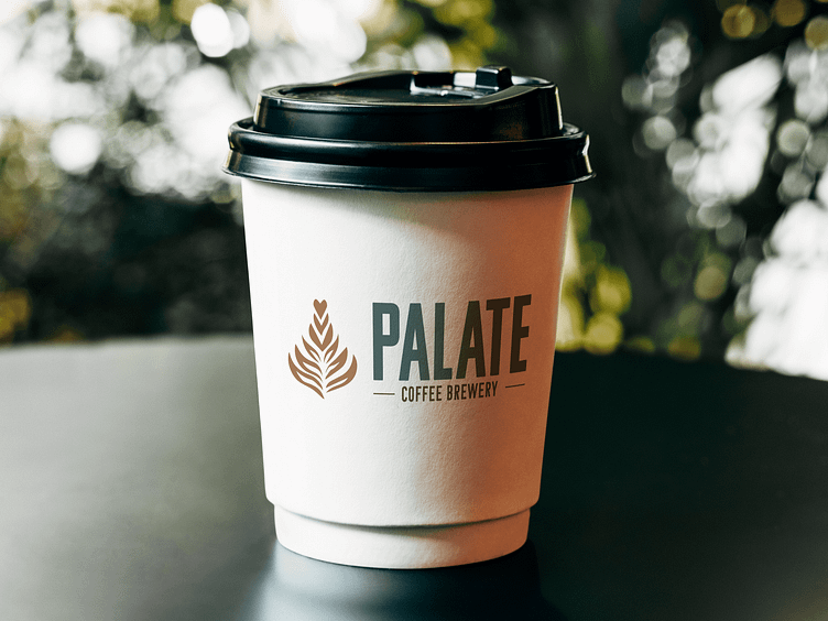
For the icon or logo mark, we transitioned from the previous brand's leaf/branch idea to a more recognizable icon that could be used on marketing materials and communicate with consumer's what the product or messaging immediately was without hesitation.
To be a little more creative than most coffee shops, instead of doing a traditional coffee mug, bean or similar idea, we went with a tulip/latte art icon. This was important for us to choose since latte art has taken off in popularity in recent years with coffee enthusiasts looking to attend latte art classes - something Palate might benefit from if they choose to include that in their service options by encouraging their consumers to keep coming back to learn how to make different pieces of latte art.
If you are ever near Sanford, FL, I highly encourage you to visit Palate! #logo #coffee #dailylogochallenge #sanford