Hang Tag Design

SMUG is an online & in-person shop that sells unique vintage pieces. Carefully sourcing and selecting each piece, they offer a wide range of different clothing items, all of super high quality. The personality of the brand is quirky, cool & oh-so-smug. They do not compromise on fashion or quality, all while being truly sustainable.
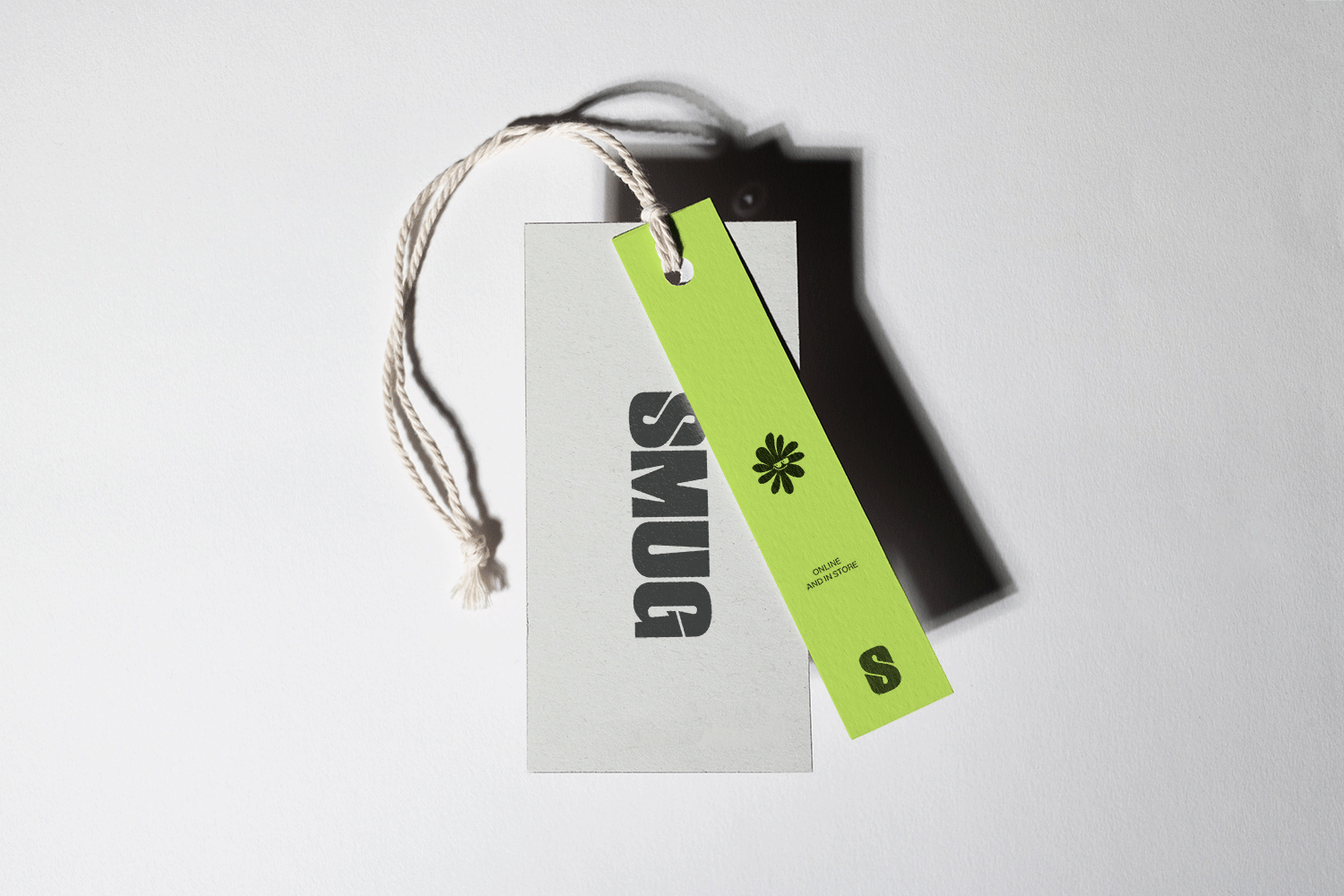
The brand identity is a visual expression of those qualities: the typographic logo, based on Druk Super, has widened stroke endings with sharp diagonal cuts that are somewhat reminiscent of a smug facial expression. In it’s full lock-up version the logo is accompanied with a timeline and a symbol of a flower with, again, a smug emoji face in the middle. The symbol is used in small sizes as a mark, as the main element of a custom pattern, or in large sizes as a graphic element. Color palette consists of black olive & off white with accents in perrywinkle and neon yellow-green. Both accent colors are strategically used on off white or black olive, but never together or on top of one another. This ensures that SMUG has a clean and sleek look, while being instantly recognisable.
See the full project on Behance
Follow me on Instagram
_______
Project inquiries: hello@studiomodra.com