Accessibility First

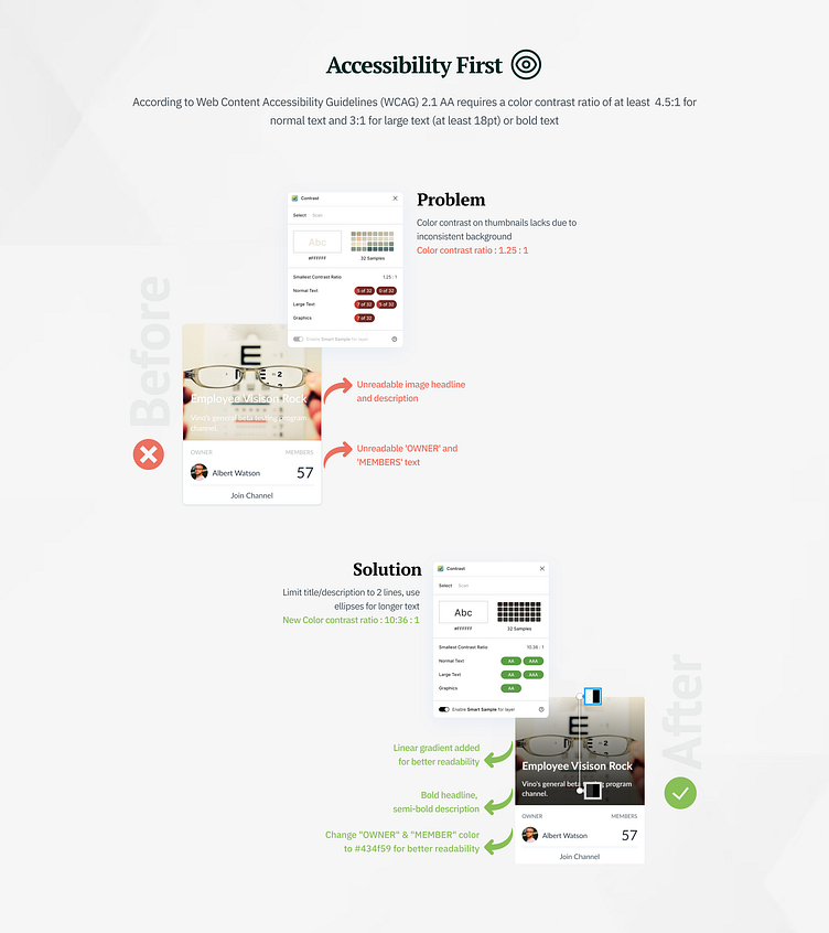
The importance of accessible color contrast in design cannot be overstated. It makes the design more inclusive and accommodating for all users. Unfortunately, in the card component, the color contrast on thumbnails is lacking due to inconsistent backgrounds.
To improve this, we have added linear-gradient, bold headlines, and semibold descriptions, and set some restrictions to enhance the design. We limited the title and description to only two lines and used ellipses for longer text to maintain the visual balance. With these changes, the new color contrast ratio is 10:36:1, ensuring a more accessible and inclusive design.
We hope you found this information helpful. Don't forget to like and share your feedback.
Thank you for scrolling!