Banking App Concept


Taking this design out of the vault! A few years ago, I decided to make a quick revamp of an app that many Canadians use on a daily basis.
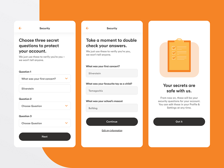
The new approach to colour see’s the brand’s signature Tangerine orange to reinforce the brand through iconography and illustration. With this approach, I was able to avoid having to darken or muddy the brand colour to pass accessibility compliance, if it were used for primary CTAs.
Overall, the goal with the redesign was to show that the brand has strong legs to stand on, and that it is possible to leverage the existing library of colours/illustrations to create a new banking experience and modern digital expression of the brand.
Illustrations by Tangerine