Ministry of Crab - Logo Redesign

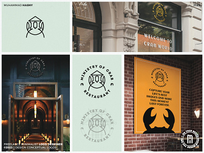
Here's what I'd do if I got the chance to redo the Ministry of Crab logo. I kept the crab, the name, and the color palette. However, the crab was combined with the Dutch building. What's left is a more significant mark. It's easier to recognize, and it's thicker to improve legibility at smaller sizes, making it more accessible and welcoming to everybody. What are your thoughts?