Koda: The Dog Everything Mobile App


Dog is no longer limited to “man’s best friend”. Over the past half decade dogs have evolved into “fur babies”, work from home comrades, therapy companions and so much more (I’m looking at you, fellow millennials). Lockdown was a crazy time and brought out in us a desire for unmasked companions whose fluff could possibly ease our world anxieties.
According to this Washington Post article and others, America adopted millions of dogs during the pandemic. It was the perfect setup. Puppies could be potty trained between Zoom meetings- heck, some of us took our zoom meetings on our phones as we walked our best friends. But, now that people are returning to work and kids are returning to school, our furry companions are left sitting at home, alone and confused. It’s time for a service based app that delivers peace of mind not just busy humans, but also to their canine counterparts.
Enter Koda - the dog everything app.
The Problem
The U.S. pet daycare market size was valued at USD 1.12 billion in 2021 and is expected to expand at a compound annual growth rate (CAGR) of 6.8% from 2022 to 2030. Increasing pet population, pet humanization, expenditure, the number of pet service providers, and initiatives by market players are some of the key growth drivers. The current pet care apps lack the holistic approach that provides users with not only a multitude of services, but also peace of mind by granting the user access to their pet caretaker in real time. Koda features perks like tracking your dogs live walk, video and voice call, and even potty pin drops so you can keep tabs on your furry friend throughout the day. With Koda, your pup gets to live their best life- a life beyond staring at the front door, waiting for you to get home.
Product Branding
Koda was a project I worked on for a freelance client. They came to me with their great idea of enhancing the dog care world with enthusiasm and vision. I was tasked with taking this vision and molding it out of pixels and hex codes into a product that would delight users at every click. My client defined their ideal user to me through words.
Think: millennials, house plants, hiking, earthy vibes and clean lines
From there, I began to lay out some initial styling for the app.
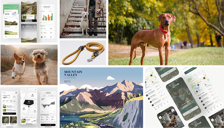
Below is the mood board I created to help define the product prior to any UX/UI design. This helped both myself and my client make sure we were on the same page for where the app’s “look” was headed.
The Process
My client desired a completed, dev ready product that they could take to a development team for implementation and present to potential stakeholders. They had a vision of what the app felt like to use, but lacked the design process knowledge and skills to bring this vision to life. I helped to brand and create the entire product.
I worked closely with my client, ideating and iterating in an agile fashion in order to correctly capture their vision and create the most intuitive and delightful product possible. It was a challenge to take others’ spoken and text written ideas and translate them into defined features, wireframes and high fidelity designs, but, I'm always up for a challenge! Problem solving is my jam.
My role in this project was as the Lead Product Designer.
The scope for this project was 20 weeks.
The design process I practiced included product branding, competitive analysis, user research, user personas, user flows, wire framing, mockup creation, and prototyping.
I primarily used Figma to craft this product, although I leaned on user research tools like Google forms, as well.
Competitive Analyses & User Research
I performed a few competitive analyses of other dog walking services. As I was to design a mobile app I choose to audit the most popular mobile apps in the app store at that time. Those were WAG and Rover. Usually, when conducting competitive analyses, I will download the app to my own phone and screenshot the ux flows involved in signing up, onboarding, and engaging with different features. From there, I take “sticky’ note sin figma and comment my likes, dislikes and ideas to later refer to when defining my products features and functions.
Drawing off of my recent experience with the competitors apps and my knowledge as a dog owner myself, I created a list of highly relevant questions that I felt would help to define Koda.
I created a simple survey using Google Forms that I then sent out to my network of friends, families, and social connections who own dogs. There are may user research tools, but I find Google Surveys incredibly easy to use for both myself, but more importantly users. Many people have google accounts and I have found that conducting user surveys this way yields the highest rate of responses.
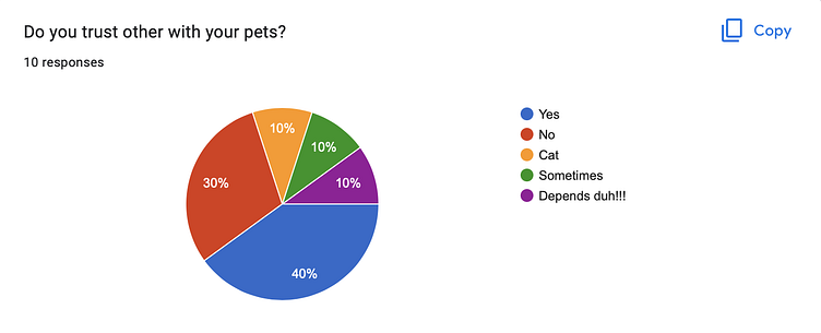
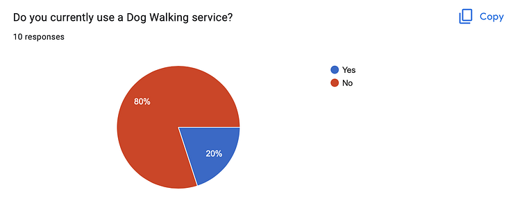
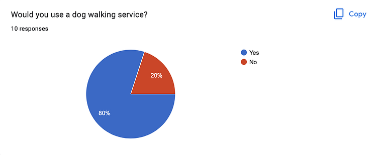
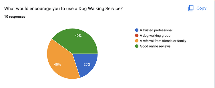
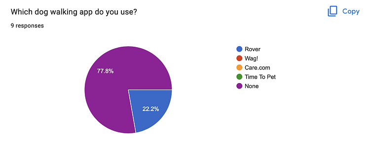
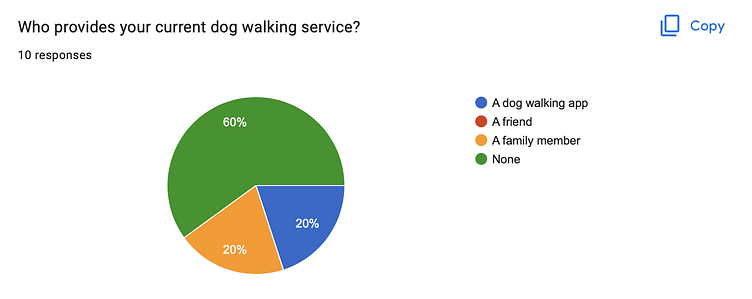
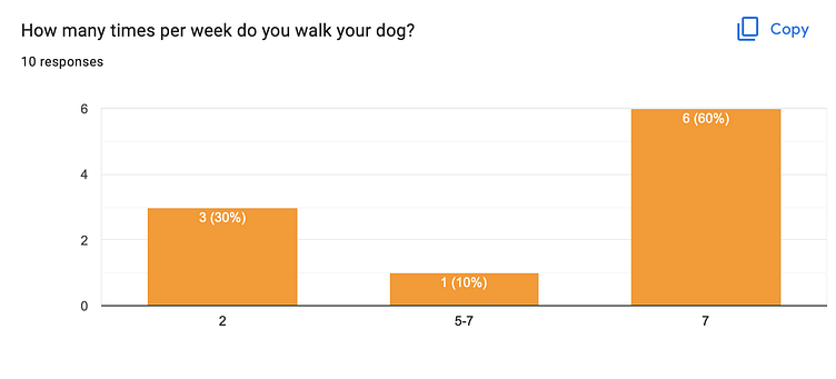
A picture speaks a thousand words- as does a pie chart!
Below are data visuals of my research findings. You can also see that 10 people engaged in my survey, which pleased me as I tend to agree with the Nielson Norman group’s UX interview guidelines. A small amount of ideal users (in this case, pet owners) is better than a vast amount of random people.
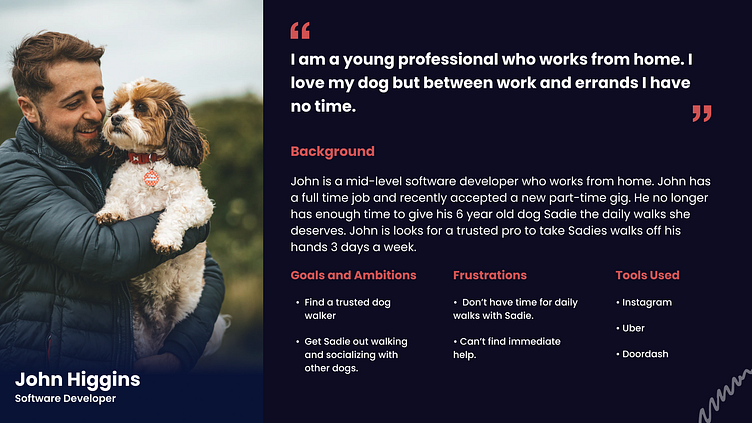
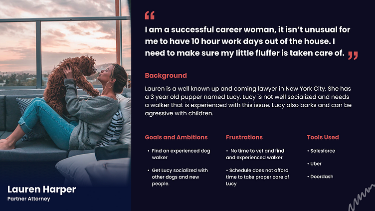
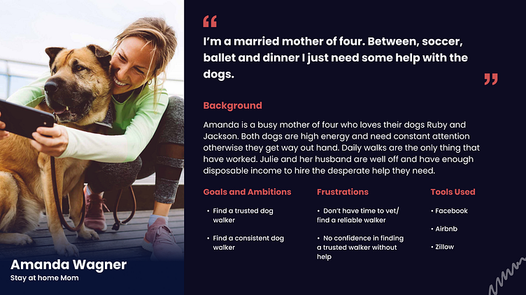
Personas
From these user surveys and market research, including my competitive analysis, I crafted personas for Koda's ideal users. Meet them below:
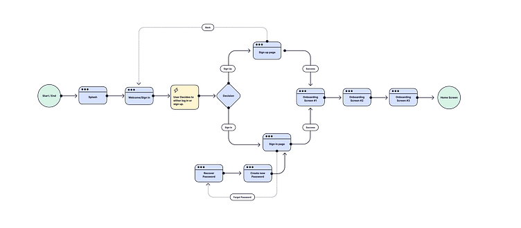
User Flows
Drawing upon these personas and user-centric designs practices, I defined key user flows that a Koda customer would encounter within the app.
Koda would beat the competition with a low barrier to entry and high interactivity with special features like viewing your dog’s live walk on a map. This would be done via the caregiver’s/walkers phone GPS connecting to Koda (caregiver facing product designs not shown in this case study).
This way, Koda users can truly trust that their dog is getting the walk they paid for and on the route they feel safe with.
Below is an example of one of the multiple user flows I created for Koda.
Wireframing
My client wanted a very aesthetically pleasing app that would appeal to millennials and gen-zers. They loved the look and feel of apps like Airbnb and Liketoknowit. When designing wireframes, I focused on using screen real estate for well sized cards, calming white space and clear visuals so that Koda would feel easy to engage with and modern. The examples of low fidelity wireframes shown below were used primarily to define key features and communicate them accurately to my client.
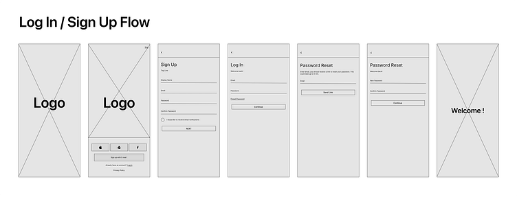
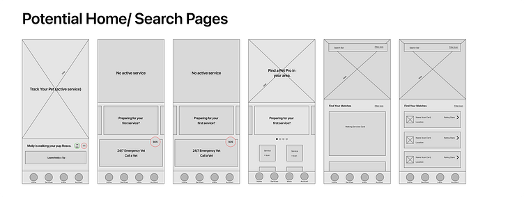
From low fidelity wireframes, I was able to confidently move into creating mid and high-fi designs. I like to use lower fidelity wireframes to define features and basic layout without investing too much time and energy into the user interface, as the exact UI will usually be determined later on in the design process.
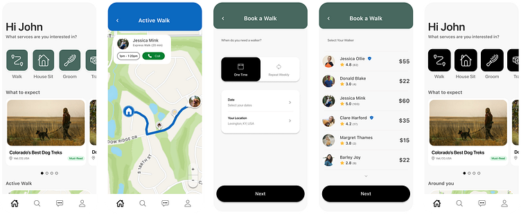
Mid-fidelity Wireframes
I considered these designs the "V1" UI for Koda, as I began to integrate some styling with colors, buttons and imagery.
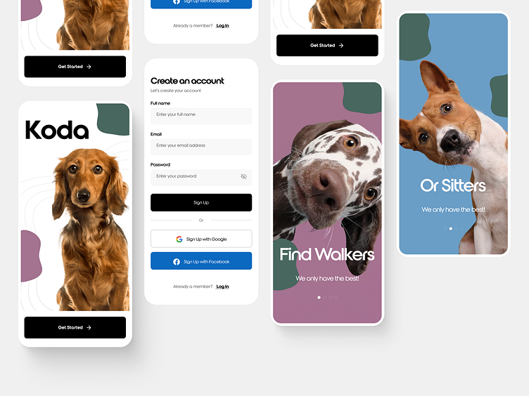
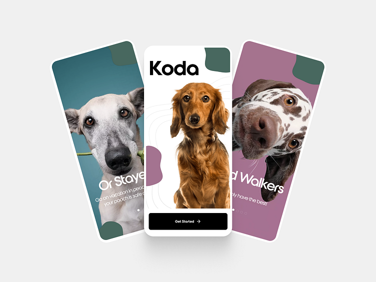
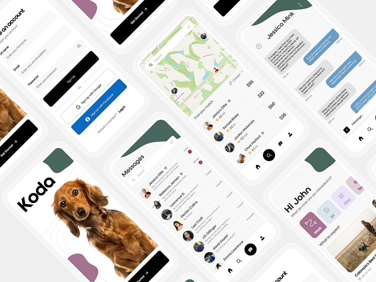
High Fidelity Mockups
I considered these designs the "V1" UI for Koda, as I began to integrate some styling with colors, buttons and imagery.
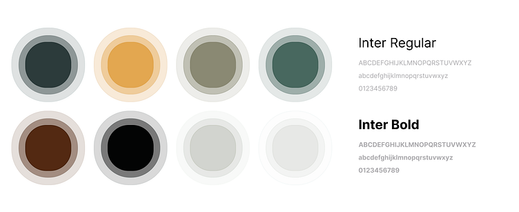
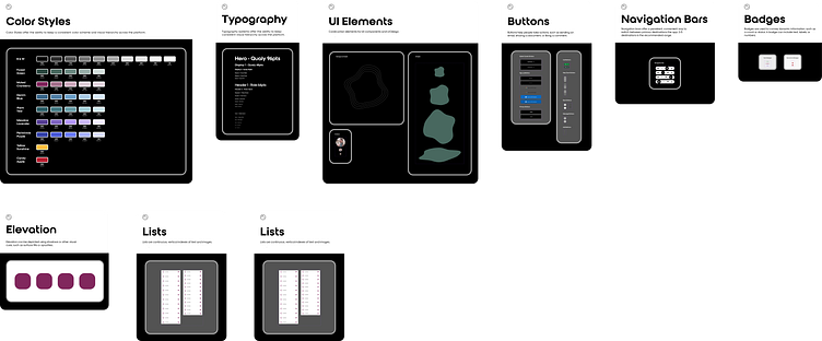
UI Design System
I always leave my freelance clients with design systems in place. I normally create:
Color styles library
Text styles library
Component library of the commonly used and custom components for the product I’ve designed. Through this design system, I aim to ensure ease of implementation for developers and ease of iteration if a future designer were to come along within the company.
Here is a little sneak peek of Koda's Design System!
Reflecting & Next Steps
In designing Koda, I learned a lot about the importance of utilizing user research and different fidelity levels of wireframes to define features and communicate clearly with clients. My client's had some ideas going into this about what the product should contain that my user-centric design instinct didn't necessarily agree with. When I conducted user research, I was able to explain to them
through solid data findings why these features were not as helpful as they had assumed. This saved my client time and financial investment in the design of the product and ultimately created a more enjoyable and relevant product that will boost Koda's success against it's competitiors.
My designs had a major impact on this budding company as I was able to involve my client in the entire design process, allowing Koda to stay true to the clients original vision while also evolving to delight the ideal user base across every feature. As my contract came to an end, I was both pleased to have provided to my client a development ready high fidelity design as well as excited to (one day soon) see Koda live in the app store.