Dog Walking App Design

Design Brief
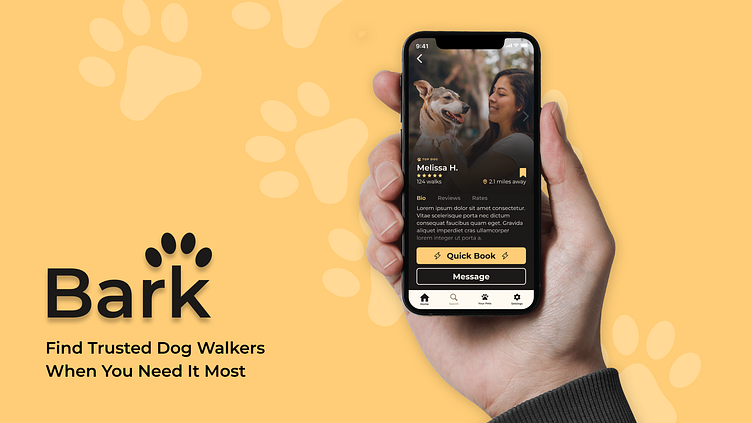
I created Bark as a dog walking app for the Dribbble Product Design Course to offer a user-friendly approach to find trusted dog-walkers quickly and easily. The project involved user and market research, user flows, wire framing, digital designs, user testing and prototyping to come up with an effective UI and UX.
Problem Statement
Dogs are a part of the family, which is why dog owners care about finding trusted individuals to take care of their dogs when they are away. The main problem is finding trusted dog walkers in a timely manner, and sometimes even last-minute. It can be challenging to find the right personality and scheduling to fit the dog-owners needs. My goal was to create a design that would alleviate these pain points and make the booking process smooth and intuitive.

User Research
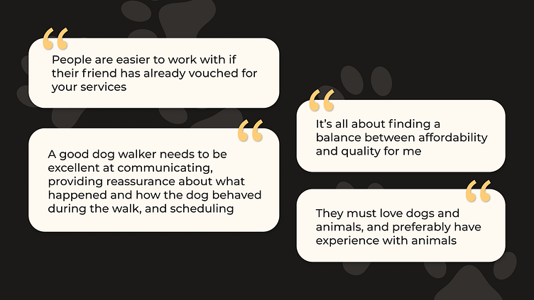
Discovering these unique pain points involved interviewing both dog owners and dog walkers about their challenges, in addition to gathering quantitative data about user habits and behaviors. From this research, I found that both dog owners and dog walkers want an easy booking experience and a way to ensure that the person on the other end is trust-worthy. Communication is key, so creating multiple communication options was a key take away.
I also found that time-sensitivity was crucial, as it can be hard to find high-quality dog walkers lat-minute. I wanted to focus on this aspect to create an option to quick book (and get connected with someone automatically) or to browse dog walkers and move through the traditional booking flow. In order to ensure trustworthiness, I envisioned multiple design solutions, from profile image galleries, reviews, badges and descriptions.
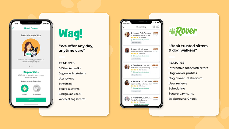
Market Research
Part of the research involved observing competitors and the pros and cons of each service. I researched both Wag and Rover, the main dog walking and pet sitting apps on the market currently in 2022. Both services emphasize trust and safety, and support those values with features like GPS tracked walks, background checks, and user profiles.
I found both of these interfaces time-consuming to navigate, especially in the onboarding phase. I opted to reduce the number of pages necessary for onboarding and adding profile information to create a quicker flow with fewer clicks. The design minimizes text throughout the design to create a concise and efficient experience.
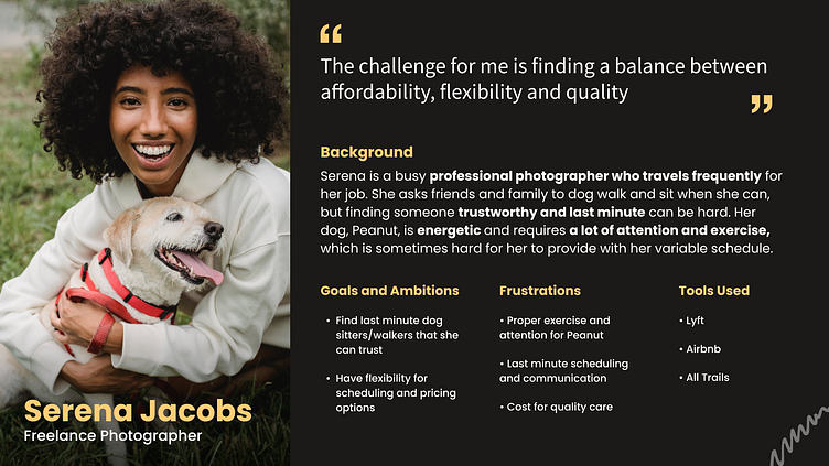
User Persona
Based on the user research, I created a user persona to guide the design. This persona is a busy professional who needs a quick and easy solution to find dog walkers fast. She sometimes has last-minute trips, and needs a back up for these time-sensitive situations.
Based on this persona, I created a design that offered a “quickbook” option throughout the app that allows users to find someone fast for specific, last-minute dates. I wanted to create flexibility for users to browse as they please or book fast if they don’t have time.
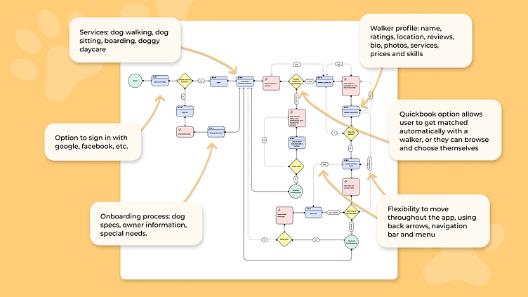
User Flow
Before creating design systems, I created a user flow to map the navigation of the app. My goal was to allow for a variety of navigation options and flexibility to move throughout different screens without feeling stuck.
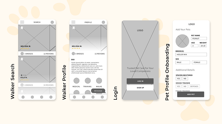
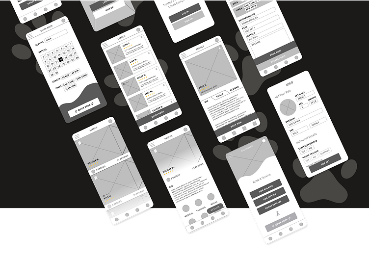
Wireframes
With the user flow mapped out, I started designing some rough wireframes for the overall look and feel of the app. I explored a variety of onboarding and search options to see which would offer the most effective search, browse and booking functions. I opted for large imagery throughout the design and minimal text to create a streamlined experience.

Visual Design
To create a visual look for the app, I first created a mood board to guide the overall design direction. My main guiding words were happy, warm, inviting, minimal, modern and friendly. To achieve this, I chose to include large images, gold, cream and brown color tones, sans serif fonts, text overlayed on images, videos and smooth gradients.
I was inspired by designs that included smooth, scrolling effects and overlaid text for a modern stye. I noticed that many dog walking platforms make use of cartoon-like illustration, so I opted to create a totally different design direction that focused on relevant imagery and bold typography, while still feeling friendly and warm.
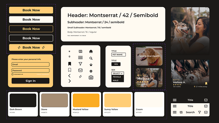
Design System
In order to create a cohesive look, I created a set of design styles for typography, icons, colors, buttons, headers and components used throughout the app interface. These styles and components are key for effective cross-functional collaboration and consistency.
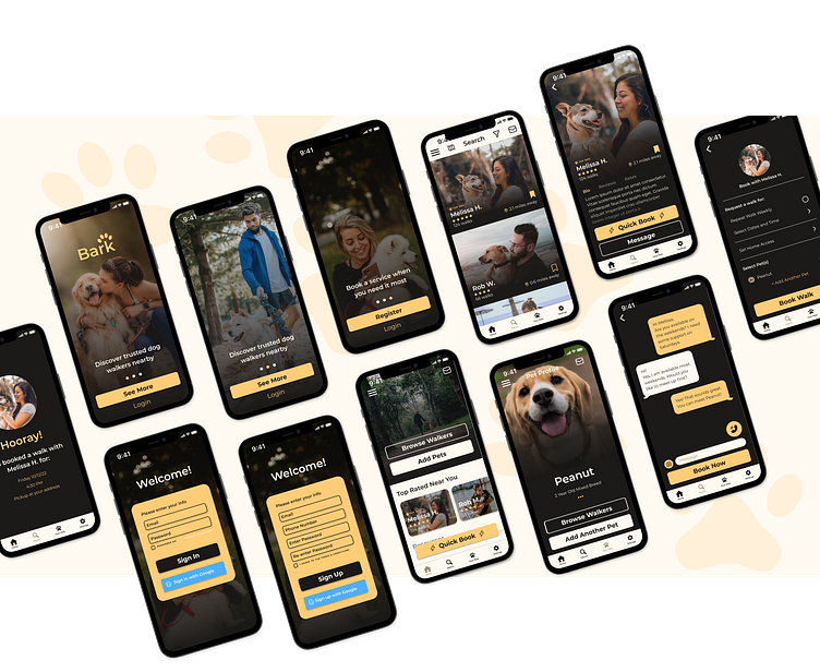
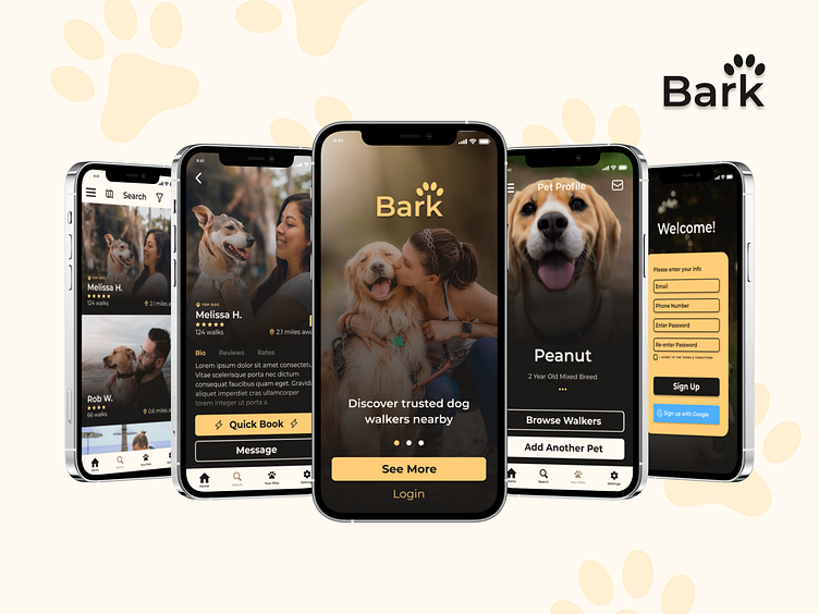
Visual Designs
The final designs showcased the clean, easy-to-use flow that I envisioned throughout my research, and offered a different look to the dog walking app marketplace. This interface stands apart from the rest of the dog-walking apps with its warm, deep color scheme and sleek image overlay styling.
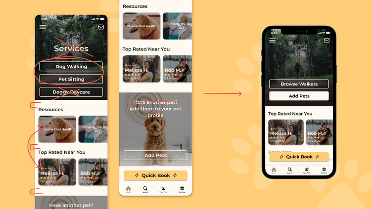
Prototyping & Testing
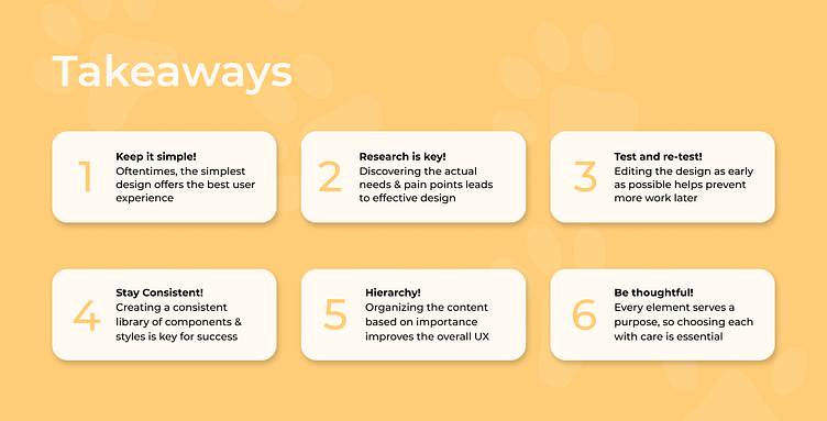
Prototyping is key to understanding if the design can work in the real-world. To understand the actual functionality of the design, I tested the onboarding and booking flow with a group of users in order to get feedback. I made changes to information hierarchy. contrast, spacing and typography based on the feedback to provide a superior final product.
Results
I learned so much about the UX/UI design process through this project, from research, user flows, design systems and prototyping to produce a functional, effective solution for design problem. I created an interface that flowed smoothly through the onboarding and booking flow that stood out visually from the rest. The next steps would include expanding the design and protoypes to all screens and honing in on the color styles for the best visual experience.