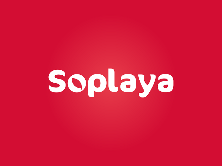
Soplaya - Branding


The two faces of the logoype represents the two main entities of the Soplaya community: chefs and producers that are part of the same environment.
Susteinability, transparency and technology are the
keywords used to conceive this logotype.

Susteinability
We recreated two leaves in the letter “o” and “y”. These leaves represent the word susteinability and is a strong recall to the circular economy concept and to an eco friendly production chain.
Transparency
This logo is as it is. The word “Soplaya” is our logo. We want to make the agri-food chain democratic and transparent. We put our face on it! How can be more transparent than that?
Technology
The future of technology lies in simplicity, this is what Soplaya wants to be: a high-tech instrument simple to use for the final user. Using a 2D/3D shape we do represent a more complex world in a simple way.
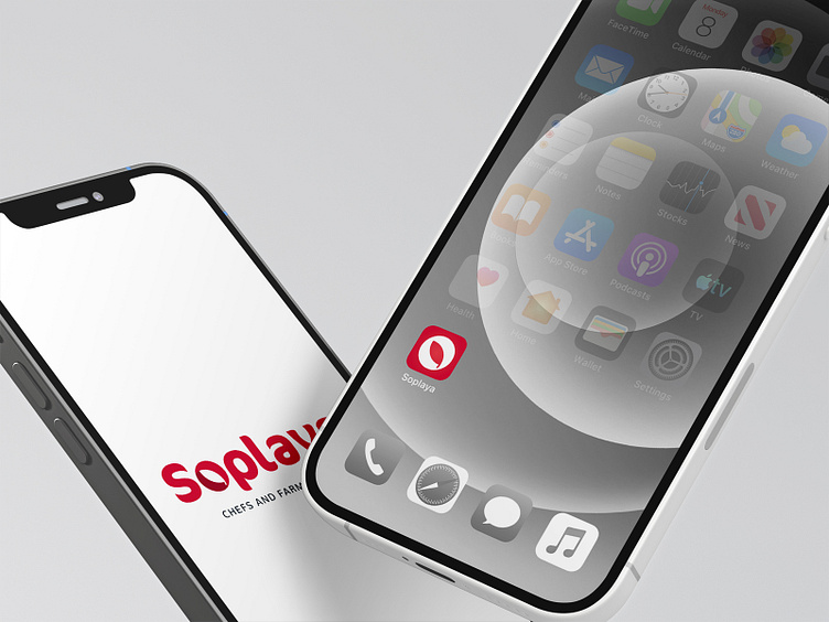
Applications