THE PERFECT WEATHER APP UI DESIGN

What ?
This is a minimalistic weather mobile app design. Truly focusing on user needs and core functionality.
The problem
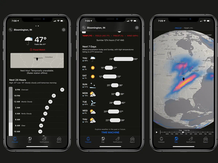
We all used a weather app once; it does a very simple job : informing the user of the weather !
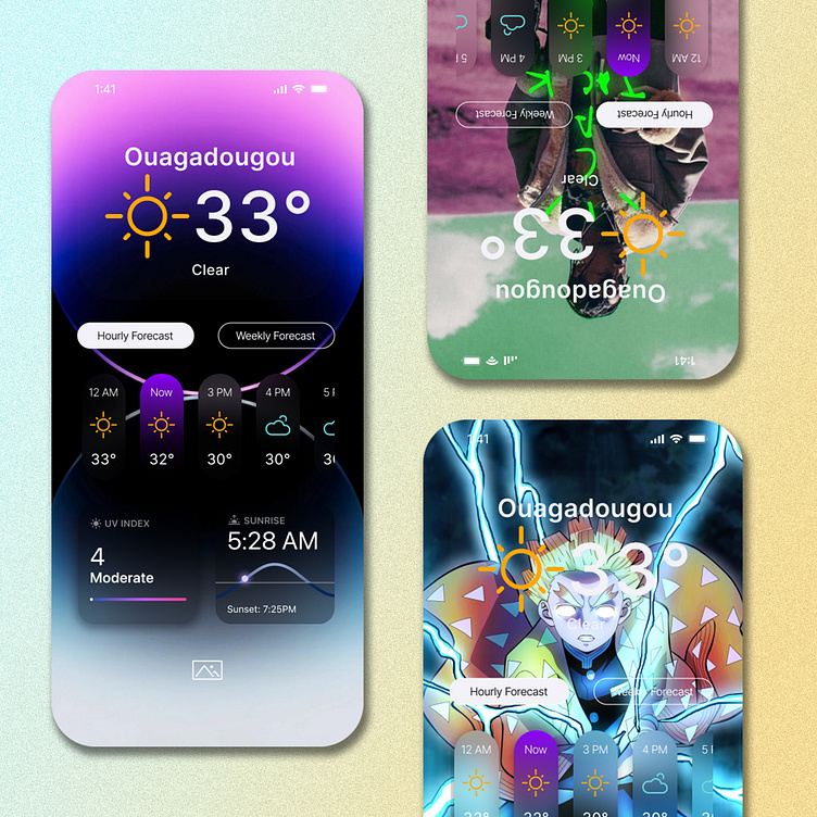
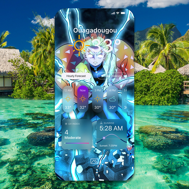
Design wise, weather apps are usualy complicated, with tons of features that in fact, the user don't use, or even understand (-see the picture above-)...
This overload of information adds weight and reduces readability, also impacting the visual aspect.
Simplicity is a key strategy in User Interface design and is essential in such an app.
We want the user to access the data he needs, quickly, while enjoying the experience ;
The solution
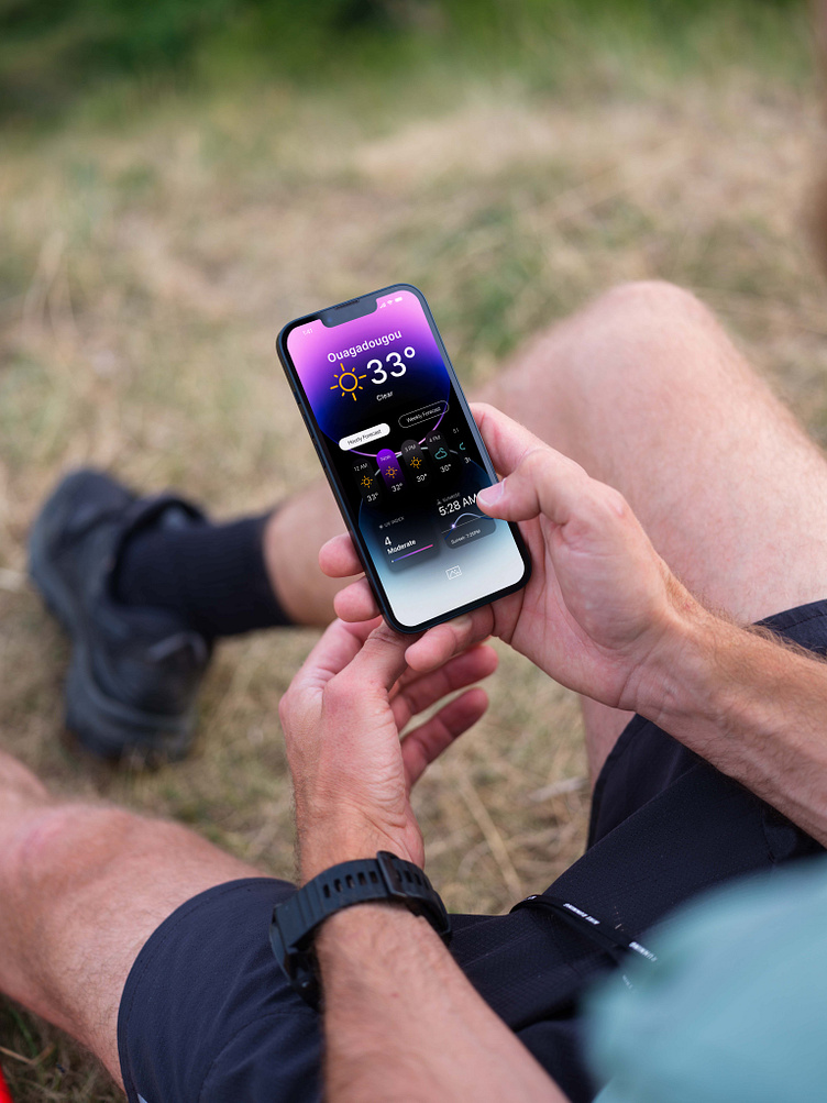
I designed an efficient, straight to the point User Interface :
1 - The important data, and the one the users are really searching for before getting lost (temperature, place, forecast, UV index, Sunrise/sunser) are the only ones displayed = Improved readibility
2 - No fancy shapes, sliders or animation here ; only clear cutted text, simple bold colors. The user immediatly knows what to do and acces the data he needs in a flash = Improved functionality
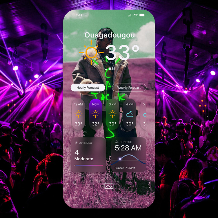
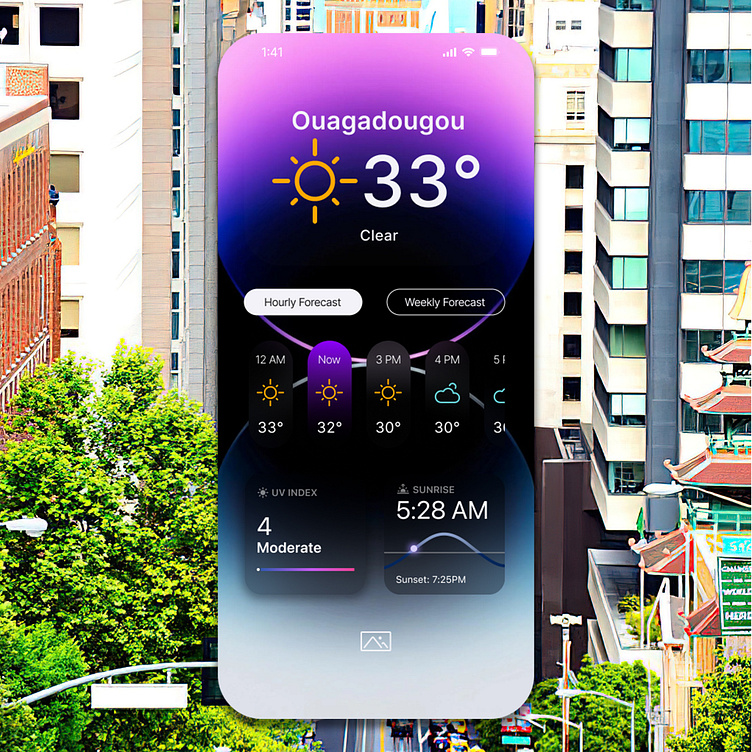
3 - This UI allows the user to set a wallpaper of his choice ; since the interface is minimalistic, using transparency, it really gives the interface a whole new ''mood'' according with the background. A simple but well thought feature that improves the User Experience and design appreciation.
Leave a like :)❤️
Contact
Have a project in mind? Let's work together!
Follow me on Instagram
Contact & business inquiries : gadstudiopro@gmail.com