Xihluke Visual Direction

About the client
Xihluke offers professional services for all types of organizations with the aim to provide customers with convenient service methods, and team collaboration to achieve organizational goals.
The Challenge
As a young company founded by black women in the Technology Industry with vast experience in consulting and development, they offers professional services for all types of organizations with the aim to provide customers with convenient service methods, and team collaboration to achieve organizational goals.
The company wanted to be eye catching, creative logo, easy to read, and bold.
The Solution
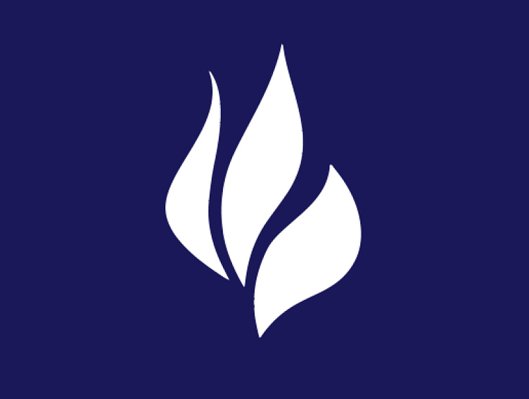
Since the name had simple in it, we emphasized more simplicity and minimalistic design using basic shapes.
The Result
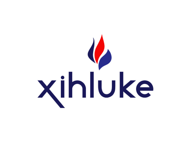
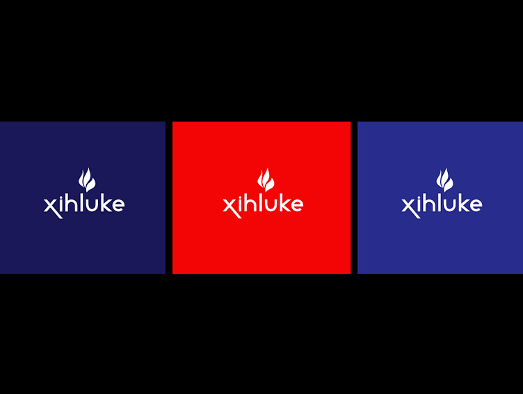
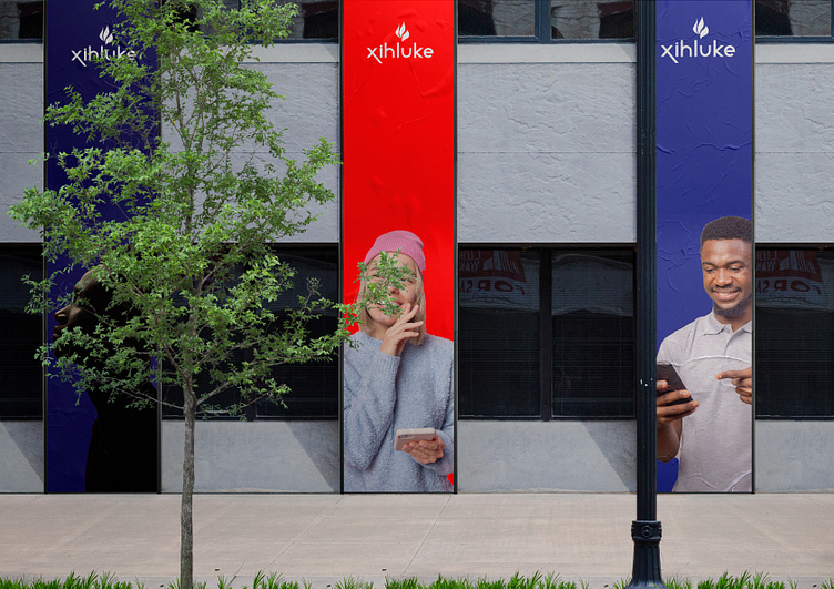
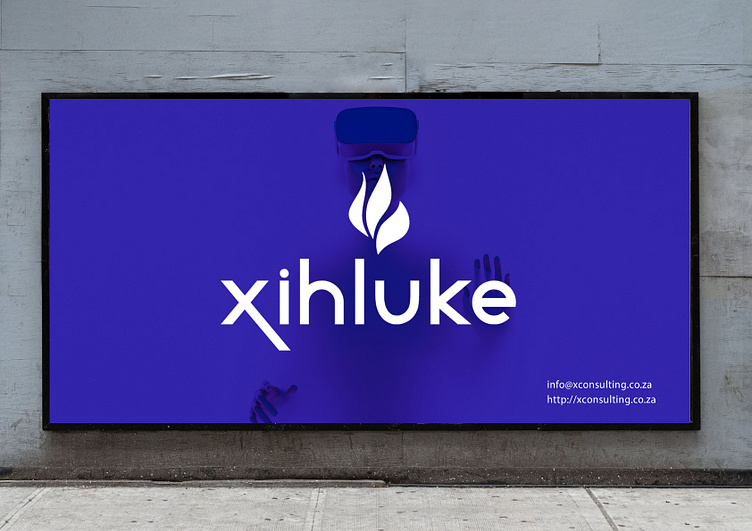
The criteria of redesigning the logo was "Simplicity with the modern touch of bold and unique colors".A fire is a universally understood symbol for energy, passion, drive, motivation and creativity. Whenever you want to reference vigor, strength and enthusiasm, a fire symbol can convey this meaning effectively.
Client Thoughts
"Creativity, Reactivity and always a very pleasant and attentive team."
We’re open for making your brand more meaningful by creating awesome digital presence. Interested? Send brief to: hello@rozavisual.com
We are ROZAVISUAL a creative design studio working with brands to express their unique visual identity, from branding to digital and interactive design.
Let's chat 👋
Feel free to reach out via email hello@rozavisual.com
Check us out at www.rozavisual.com