Critter Case Study

Overview
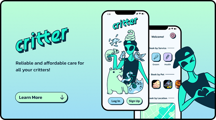
Critter is a new approach to a “dog walking” app, created out of love of all animals and a desire to make pet care more inclusive. Although the initial prompt only required I create a dog walking application, through conducting interviews and competitive research I found there was a major gap in the market for a more inclusive service. Using Figma, the final project included building a UI Library, creating a functional prototype, and the case study you’re reading now! Critter is a friendly, straightforward, and trustworthy way for clients to find a variety of care for their special critters.
Situation
Dog owners sometimes need help caring for and walking their dogs. Create a service to connect dog owners with dog walkers. Consider how we can help dog owners trust their dogs are in safe hands.
Research
Through conducting interviews and competitive research, I discovered only a handful of dog walking apps provided additional services like boarding, training, and even fewer provided services for different pets. This seemed to be a feature people were interest in and I decided to take my app that direction.
Problem Statement
There are not enough reliable, trustworthy, and easy-to-use applications that provide services for a wide variety of pets.
User Persona
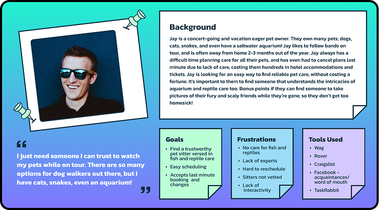
My user persona, Jay, was based on the problem statement, and my perception of the app’s potential client base - derived primarily from my interview responses. The overwhelming theme of these responses was “well, I have more pets than just dogs!”. I did not come across many people that only wanted dog walking services, I believe there is a bigger market opportunity offering other services for pet owners seeking care for their pets while away from home.
Moodboard
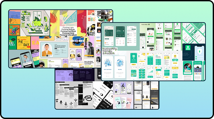
With the problem statement and user persona in mind, I began to brainstorm different directions for the look and feel of of this app. The potential directions I wanted to try were inspired by themes of Quirky, Sophisticated-but-Fun, and Trustworthy. I began to put together 3 different moodboards based on these themes. Before I was finished, I already felt myself leaning towards a more “Trustworthy” vibe due to this being a primary user concern, but wanted to hash out some basic splash screens before I made any final decisions.
Explorations
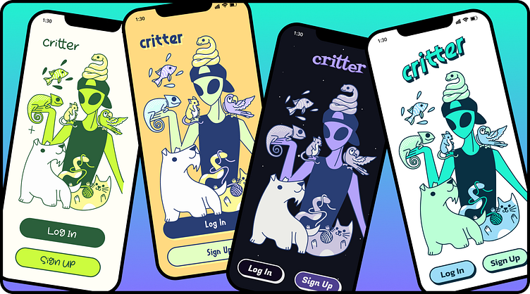
Feeling inspired by my moodboards, I got to work on a few different versions of an app slpash screen. I used my illustration skills to draw up an eye-catching image I could quickly adapt to any approach I decided on.
Design System
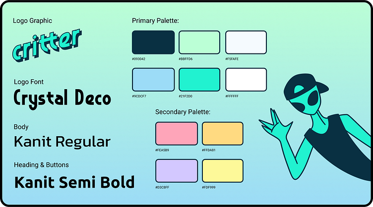
I ultimately did decide to expand upon the “Trustworthy” direction, and stick to a primary palette of mostly greens, with a touch of blue to add variety. I also drew some inspiration from my “Quirky” experimentation for the brand logo and secondary color palette.
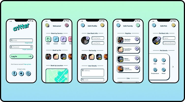
Design Considerations
Now that I had decided on color palette, typography, and overall look and feel, I needed to start considering what my other functional screens might look like based on this system. Other screens I needed to adapt to this design system included:
A better refined splash screen
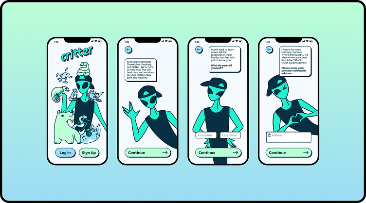
Login screen
Signup flow
Home screen (upon login)
Edit user info
Edit pet family
Edit individual pet
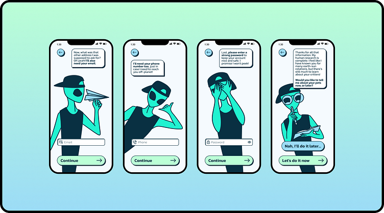
I wanted to focus first on sign up and account creation and editing. Some future considerations that I did not cover during this iteration are:
Booking pages for various services
Scheduling
Service provider details
Messaging
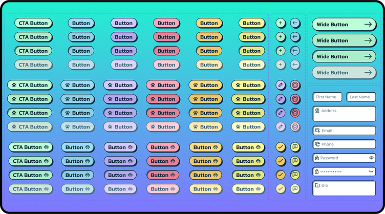
In order to start tackling these pages, I would also need to start defining and refining reusable components on each screen, such as:
CTA button(s)
Profile Images
Icons and other detailsI
illustrations for sign up flow
Results
Delivered design several design explorations and tracked my progress
Created a new visual language
Designed high-fidelity UI screens
Created UI library with type styles, color palette, components, and modules
Created a Figma prototype
Created a case study! ;)
Reflections
I’m so excited to present to you my final design. I hope to be able to revisit my design soon, and continue to learn and make improvements. I also would like to expand to complete more screens, this time focusing on the booking experience itself, not just the sign up.
Please feel free to take a peek at my functional prototype here. Thanks again for checking out my design!