Simple mark for wellness brand

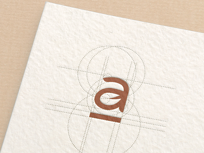
L'apotheque was looking for a simple, memorable mark that was easy to implement in their physical goods. We integrated the leaf inside the "a" as a way to communicate the organic, healthy choices from the brand, as well as added a line under the letter to embrace their business model and communicate it (storefronts). It makes it look sleek, solid, yet feminine and soft.