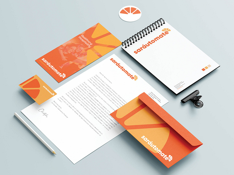
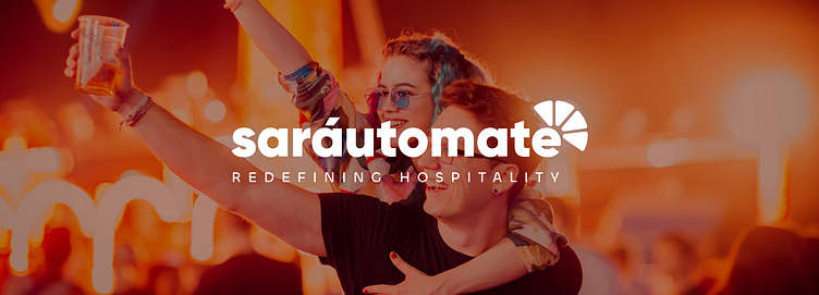
Sarautomate / Branding

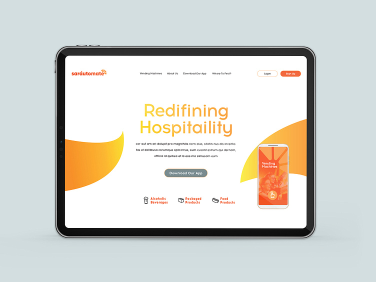
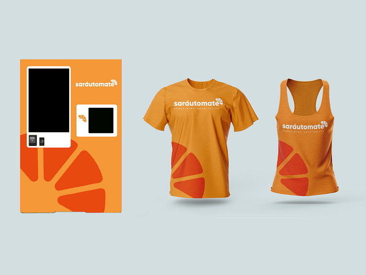
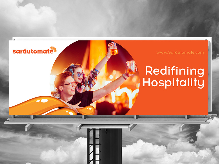
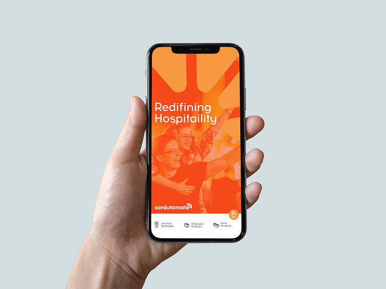
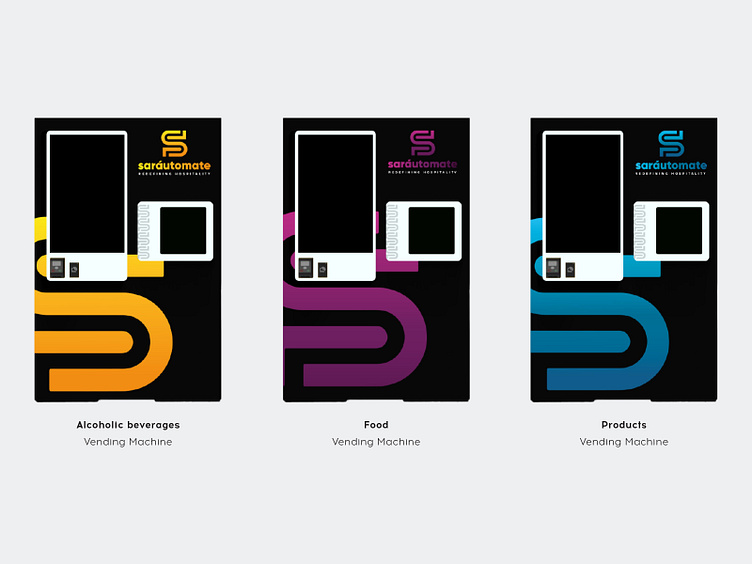
When Sarautomate came to us for their rebranding we were more that delighted to help. They are in the entertainment business making vending machines for alcoholic beverages to eliminate long lines and queues at venues. The machines can be found at places such as bars, stadiums, halls and at concerts arenas. Their purpose is to expand and eventually have vending machines with food and also with products.
In our debriefing they told us about a) what was behind the idea and their target audience, b) where they wanted the brand to go and c) how the brand would develop in the future. They were happy about some of the elements in their current branding which they wanted to bring in to the new branding. However when we first met them they were called Drink Easy. But due to their change in strategy they felt that a new name would be more suitable. Hence Sarautomate was born.
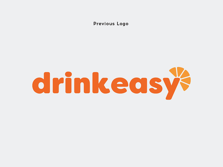
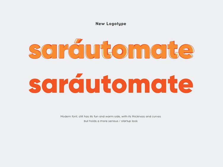
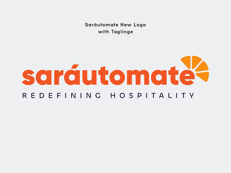
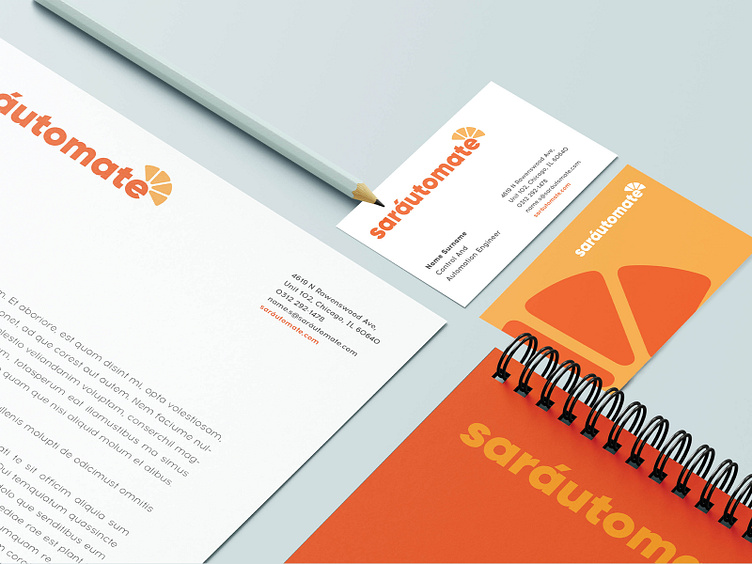
From the beginning we were able to see that their current logo was more appropriate for one part of the company’s mission and not the whole. We knew that the typeface needed a change and that the icon needed adjustments. We chose a type face that was similar to the old one but had a good balance between business and fun. Both typefaces are bold, however the old typeface has rounded corners giving it a more young look while the new type face protects the fun element but also adds a bit more seriousness which holds true to its original friendly and trustworthy tones. This typeface also is one that is more coherent with start-ups.
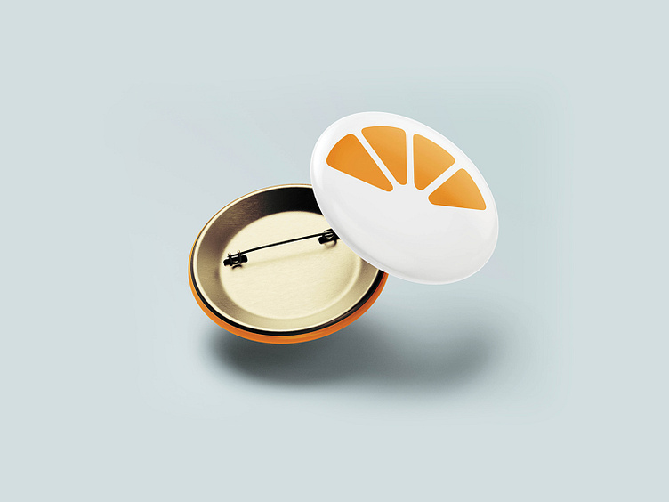
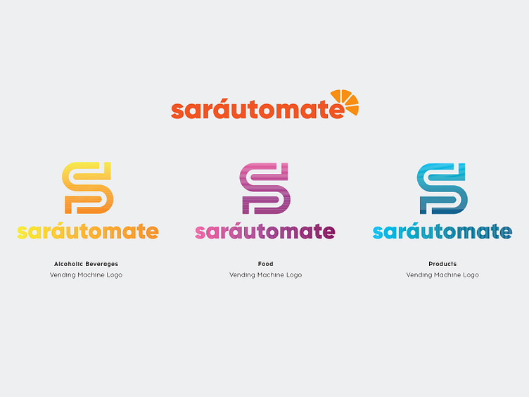
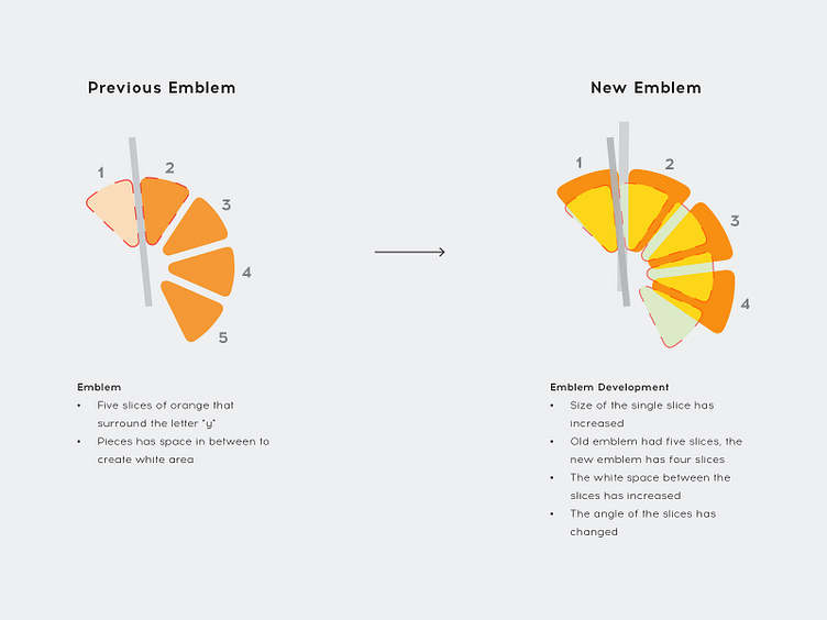
We kept the orange icon with its color but made a few adjustments to the slices. In the original orange icon there were 5 slices by eliminating one of the slices we were able to make the icon bigger. Also this gave us more space between the slices. This way when the logo is made smaller the slices can still be visible. Also we slighted changed the angle of the icon so that it sits better on the letter “e”.
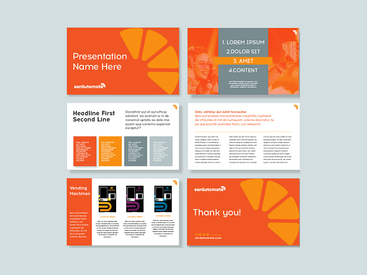
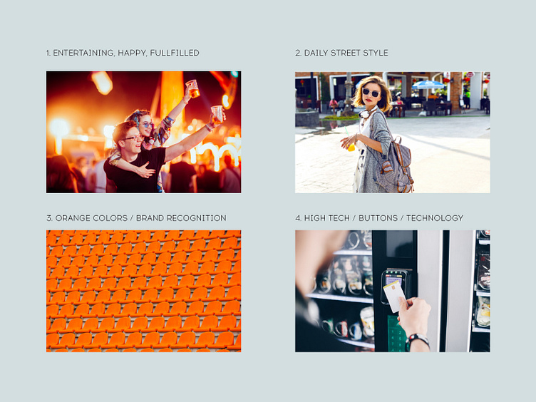
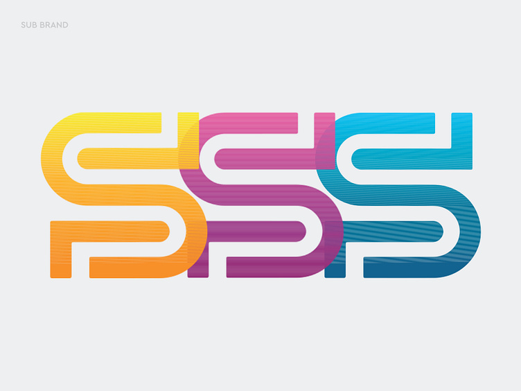
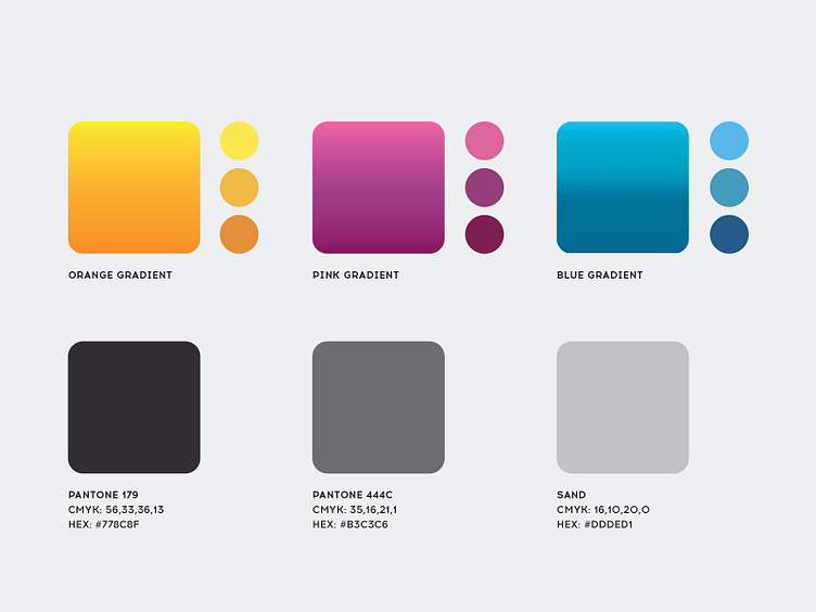
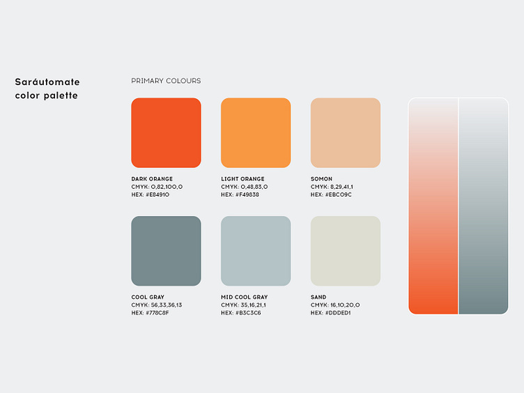
Through our conversations with sarautomate it had been decided that the orange slice logo would be for the mother ship and that they wanted the machines to have a different icon. So we began to play with idea of the vending machine and how it works - the letter “s” seemed to be a good letter to play with to illustrate this motion. Simple, clean, spacious and understandable, flat icon design was our choice of style. Majorly because of its simplicity and class. People have moved past the flashy icons and are now preferring something that is just simple. But not too simple to be boring. Flat designs and flat icons offer a soothing and sophisticated look that reflects virtue and style. That’s why we wanted to make a design which is clean and has crisp edges with a flat two dimensional graphic layout. This type of icon focuses on gradient colors and flat graphics to illustrate technology. We used color scheme based on trendy digital elements to combine the feeling of both entertainment and lifestyle. We knew their strategy was to expand to food and products that is why we proposed color palettes for the future. In the end, whether the company expands or not, the design solution offers them flexibility to add more categories.