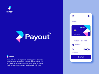
P letter minimalist logo for a fictional Payout e-banking system
Hi Dribblers🏀
Thanks for attention.
"Payout" is an fictional e-banking system.
It mainly provides services through money transactions. Money can be transacted very easily, quickly and safely without any hassle through "Payout" in different countries of the world.
Here is the logo I've designed for the "Payout". Logo icon letter P with a attractive symbol. That works for minimalism too. Typography is made to look modern. Above all, it presents a minimalism-friendly and attractive e-banking system logo. I have tried here to focus on unique mark.
we can give it some more names like - paymoney, wepay, paysend, sendpay etc.
( It available for sale also available for name change.")
Happy to hear your thoughts about this concept!
Looking for an original identity for your startups?
Let's discuss your project:
Gmail:- freelanceramit52@gmail.com
WhatsApp:- +8801789087943
Follow me on:
Thank you :
Best Regards💖💖
Amit

