Figma Application Design Challenge
I work in Figma every day as a product designer. I love Figma, so this "Design Challenge" for myself was a longshot attempt to making improvements that was completely assumptive and absolutely so fun to work on.
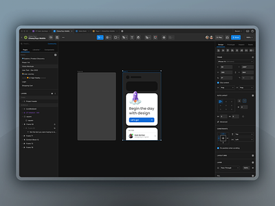
Does this look the same? What were some key improvements?
Improve icons visual aesthetics using more rounded corners and a thicker stroke
Introducing more container-based components for buttons and menus
Revealing features that are generally more hidden
Rearranging top action bar to improve document name visibility and to give the tools the room they deserve
Remove the Home Button in the top tabs and merging the function with the document name
Improving tabs for both left and right panels giving them for visual recognition and a more recognizable clickable component
Revealing "Styles" as a new tab as this has been a hidden feature that displays only when unselecting an object
"Assets" is replaced with "Libraries", plus I separated Assets from Components where I introduced a new tab dedicated to only "Components"
What's next?
I'm now working on prototyping this to show-off a variety of dynamic content for each of the tabs to expose some of the new features, such as Libraries, Components, and Styles. Much more to come!
Hope you enjoy. Leave a like!