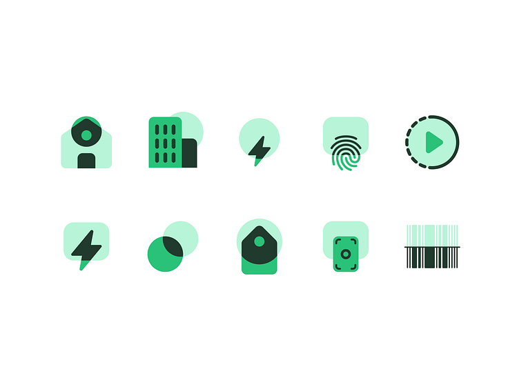
Multi-Tone Icons

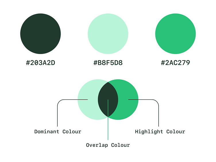
For these icons, I focused on using the darkest green for overlaps and farther objects. I tried to use the main green as sparingly as possible so the effect could be more pronounced.
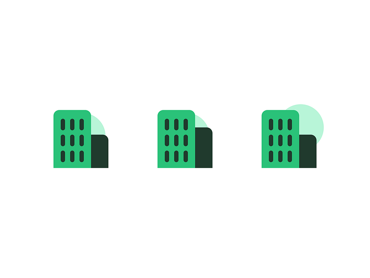
Office Building Variations
For office hours, I worked on the morning, evening and noon variations of this icon. This happened as a result of chance and not intentionality but I decided to lean into it and run with it.
Home Icons
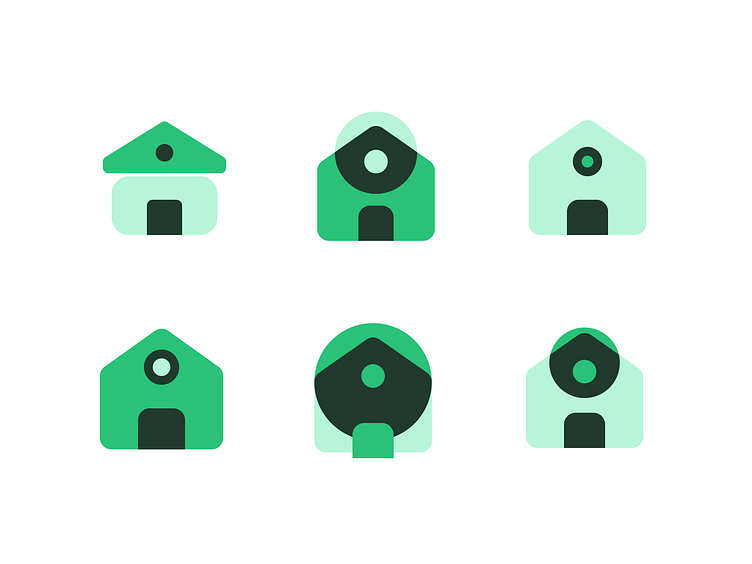
Here are some of the outrageous attempts at the Home Icons. I finally decided to go with the bottom right because it suits the style I was going for. A very close call was the bottom left. I chose not to go with this variation because it didn't seem audacious enough.
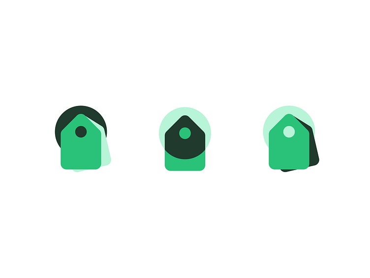
Variations of the shopping tag. I went with the middle one because it had all the attributes of the icon set. It was also simple enough.

A glimpse of my workspace. A lot of funny explorations here.