Roketo. Branding & Website for financial platform

context
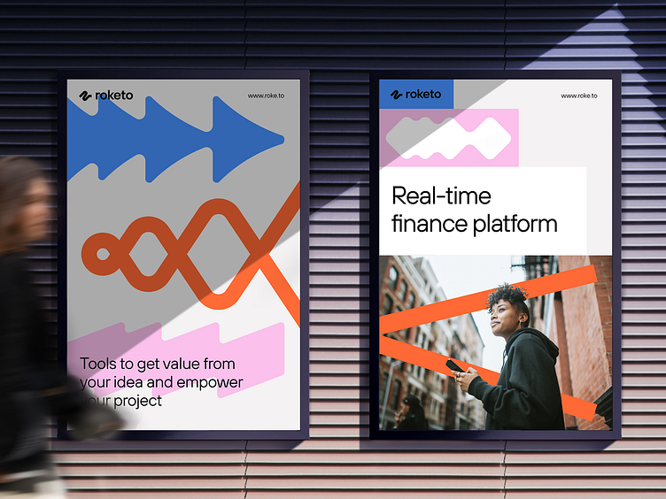
Roketo is a real time financial platform on the NEAR blockchain protocol. Basically, it’s a set of products and tools that help crypto projects to handle their incomes, paydays, investments, token airdrops and boost token utility through persistent.
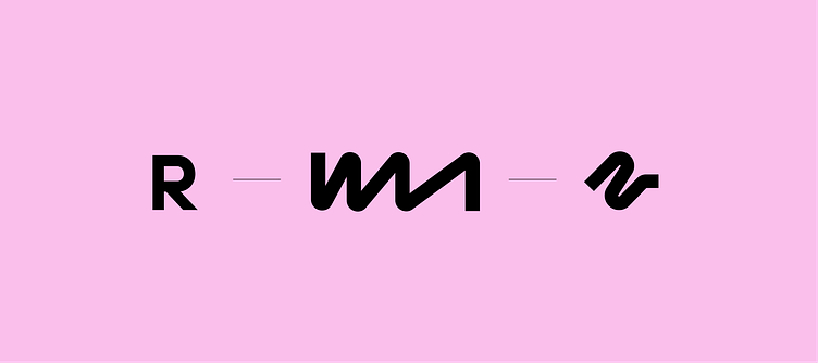
logo idea
Roketo used the letter “R” early on in the project where the rocket nozzle reflected the idea of boost and speed. After the strategy session we came up with an idea that there’s much more. The key goal — is to show the modularity of universal solutions for any project and payment flows.

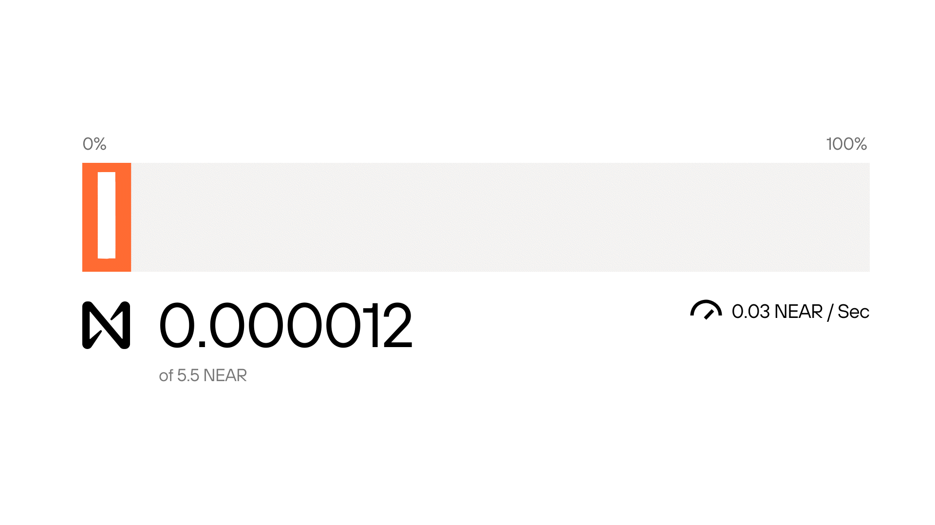
From the user’s perspective it was important to create a dynamic interface that creates a sense of growth and movement.
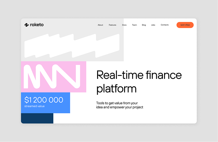
shapes
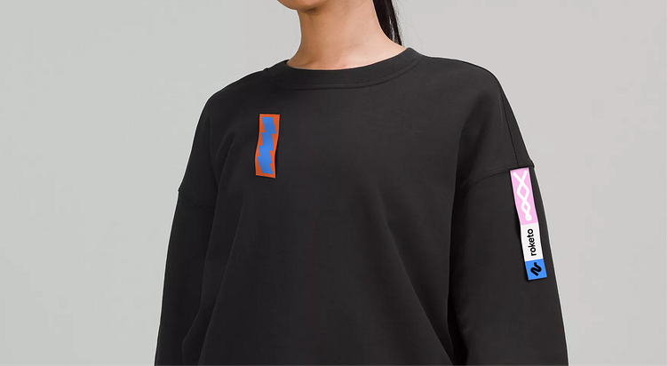
These elements have the same design principle, unique shapes and flexibility in the use, so all these objects can be stretched without losing the recognizable shape.
We are Kidults —
a decentralized design agency with experience launching our own startups and tailoring new businesses. For case studies, go to our website
Follow us on Instagram / LinkedIn / Facebook
Got a project? Then drop us a line at: hey@wearekidults.com